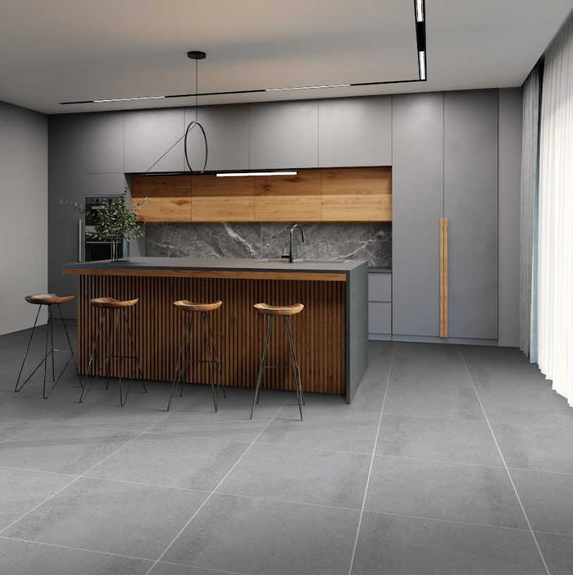
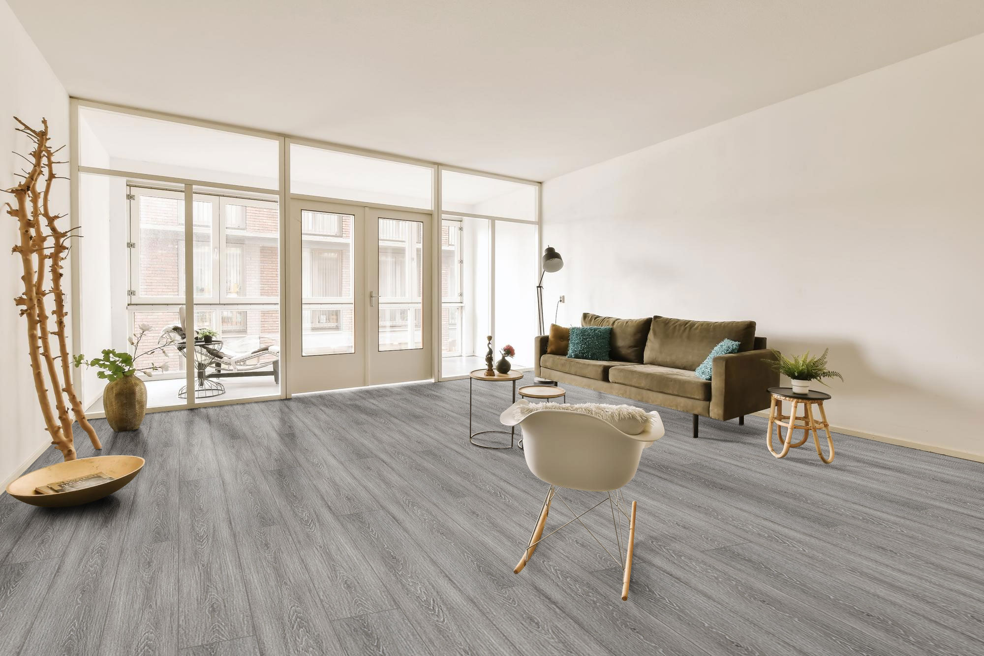
4 Tips for an Ultra-Modern Home

4 Tips for an Ultra-Modern Home

What are some tips for an ultra-modern home?

  1. Use sustainable materials
  2. Focus on architectural lighting
  3. Decorate with metallic finishes
  4. Keep it neutral


The rise of the sustainability movement has led to a number of innovations in modern interior architecture. Homeowners are no longer trying to cramp as much decor, furniture, and unnecessary elements into each of their spaces. Instead, they’ve turned towards more restrained practices and ultra-modern home tips to achieve the elusive functionality.

In any ultra-modern home, ergonomics, function, and form take the reins. The ultimate goal of this style convention is to be timeless — as seasons and new trends pop up, ultra-modern will continue to be relevant and viable. Transforming your living space to be consistent with this kind of design, therefore, relies on a few key tricks. It’s all about using sustainable materials, custom-fit architectural pieces, and stylistic lighting — all the while keeping a neutral backdrop that doesn’t become outdated. Check out these tips below for an absolutely stylish ultra-modern abode.


Use Sustainable Materials
Use Sustainable Materials

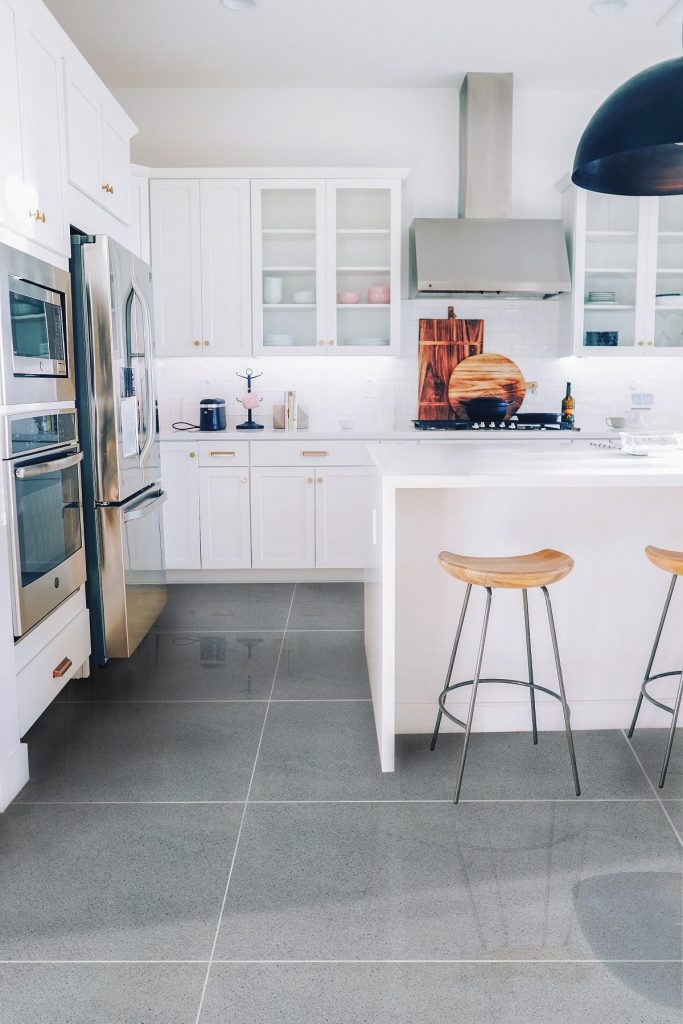
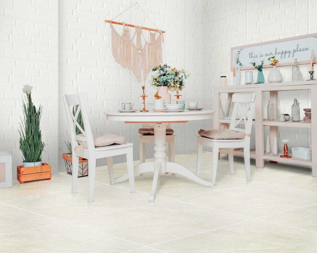
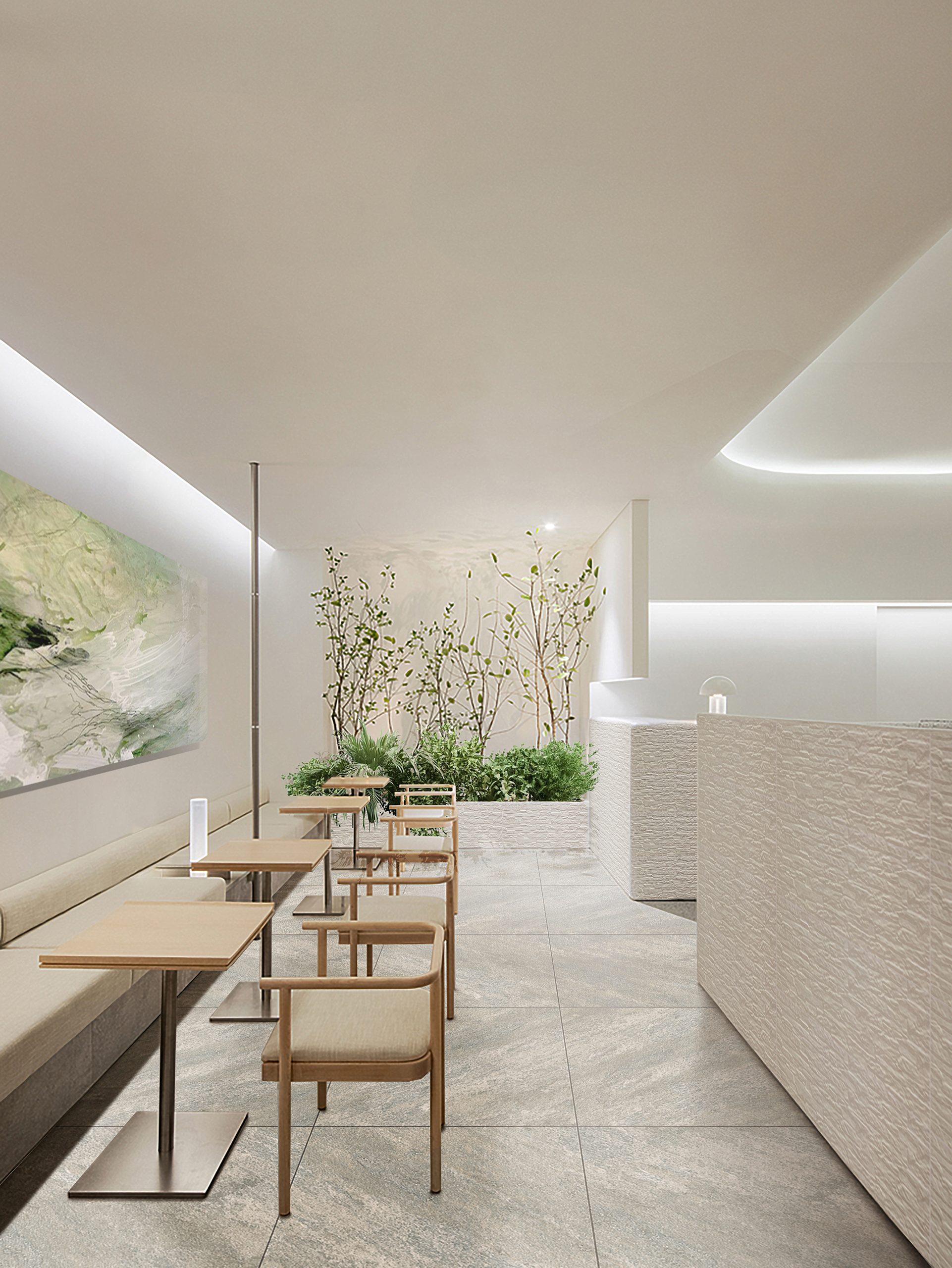
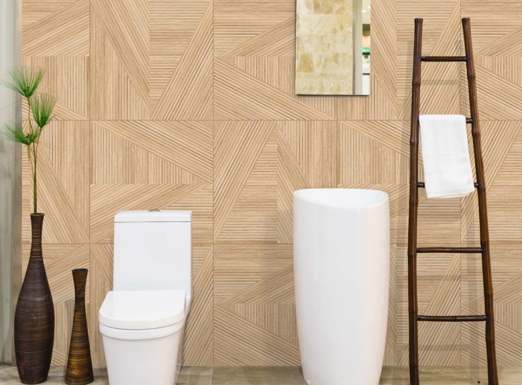
[60×60] P133

When decorating anything ultra-modern, keep in mind that your choice of materials will be crucial in making the entire house look cohesive. With this, you’ll want to choose materials that have been sustainably manufactured or don’t make use of resource-intensive raw materials.

Some great examples include bamboo, reclaimed wood, steel, vinyl, or aluminum. An ultra-modern bathroom can have a customized bamboo hanging rack in place of plastic or even aluminum windows instead of non-biodegradable PVC ones. If you ever plan on painting your walls, opt for toxic-free paint materials that don’t emit any VOCs (Volatile Organic Compounds).

When you go sustainable, you’re not only staying true to what ultra-modern means. You’re also benefiting from healthier indoor environments, lower maintenance, and increased property value, should you decide to sell it in the future.


Focus On Architectural Lighting
Focus On Architectural Lighting

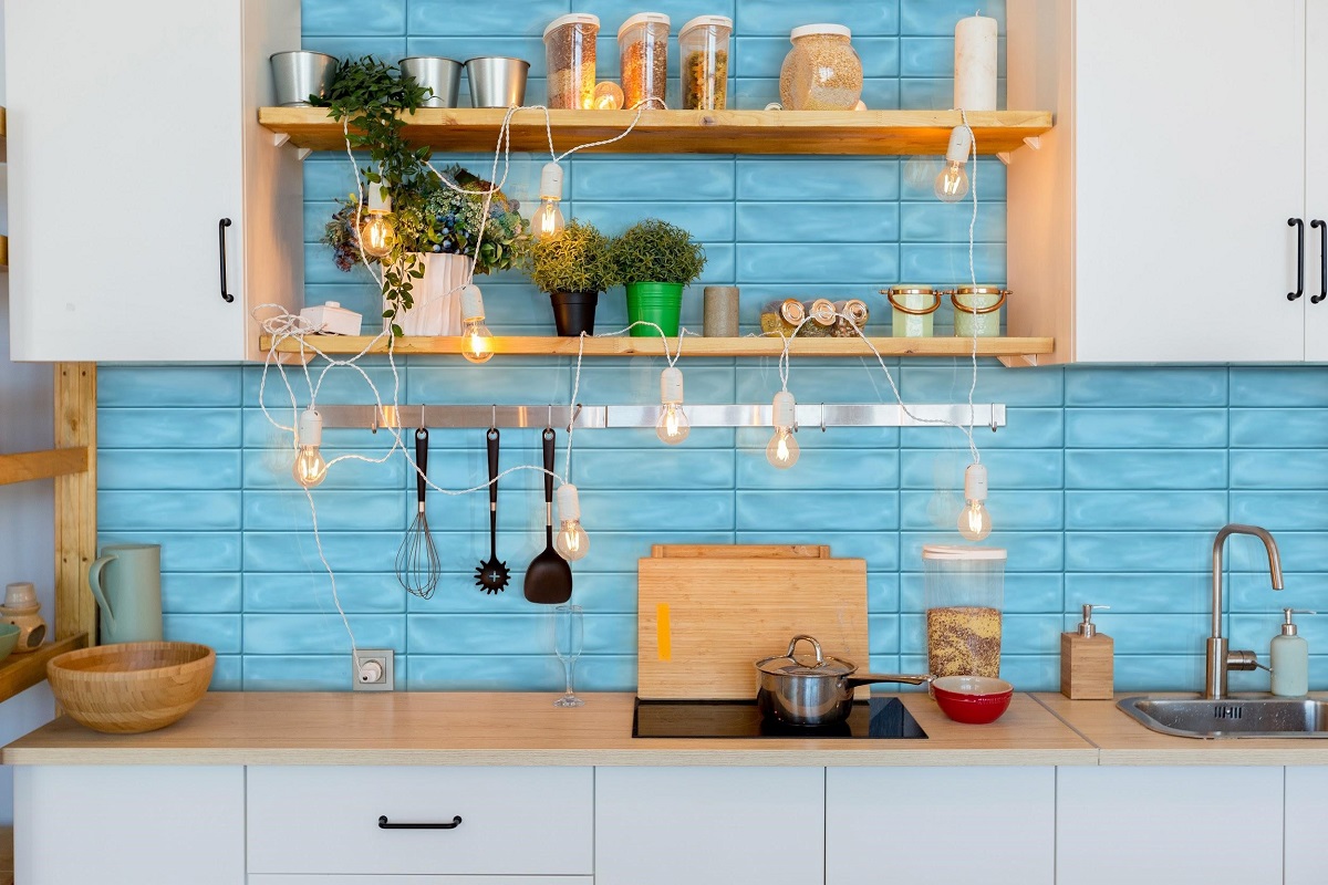
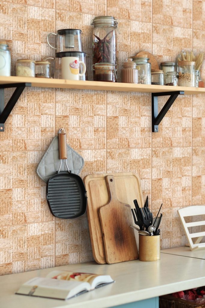
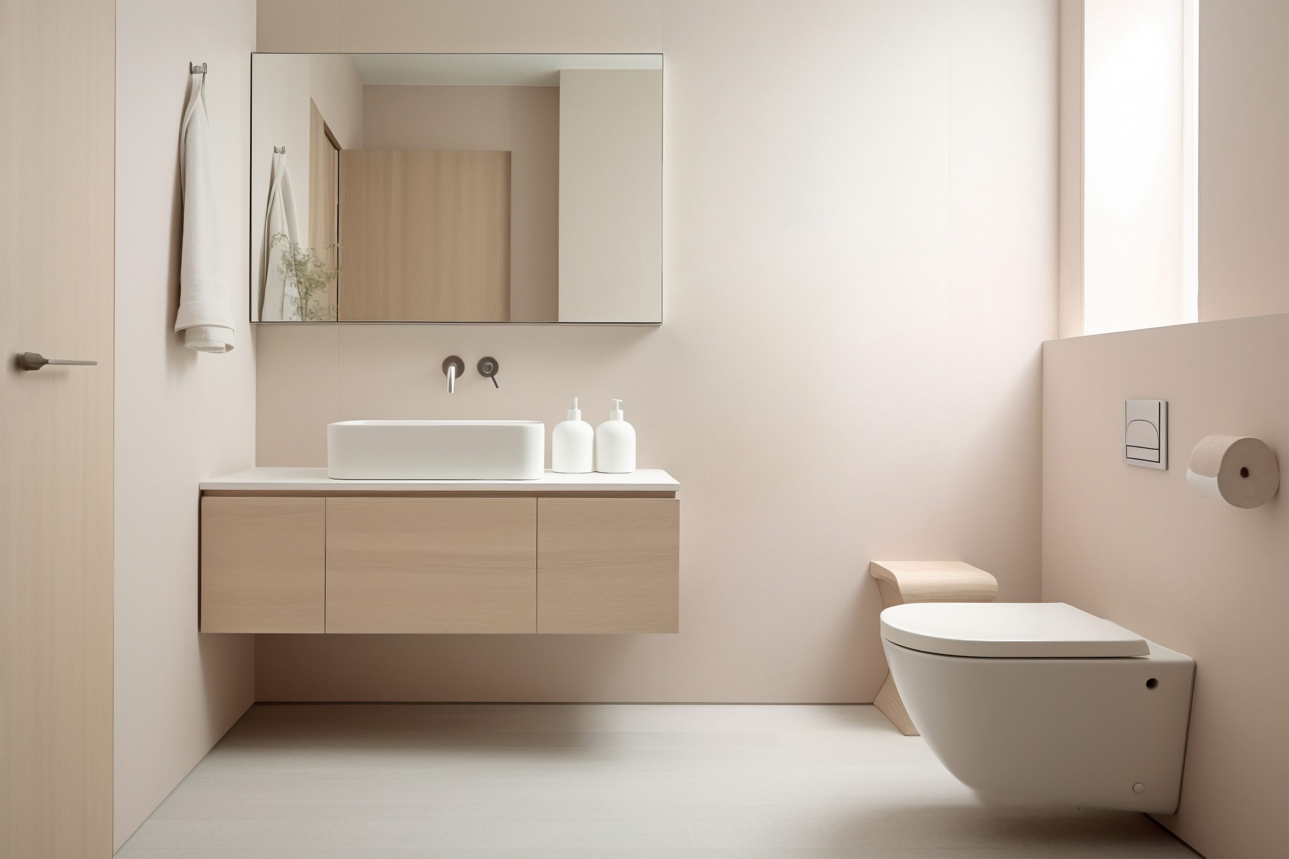
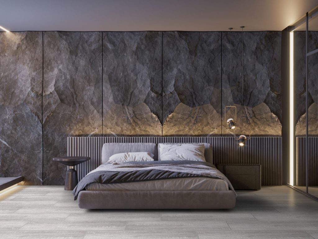
[20×100] AI208

As mentioned before, the color scheme for your ultra-modern dwelling will focus mainly on neutral shades and hues. Add a unique contrast by turning your attention towards the type of lighting that you use.

Any ultra-modern inspired lighting should follow the following fundamentals — sleek, functional, mesmerizing, durable, and structural. Before you even think about purchasing a typical buffet or a country-style lamp, it may be best to stick to geometrical designs and custom-built fixtures.

The slender build of arc lamps is a great addition to any space-saving ultra-modern living room, for example, while installing strips of LED lighting in your ceilings gives them a more modern vibe.


Decorate with Metallic Finishes
Decorate with Metallic Finishes

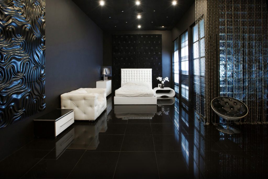
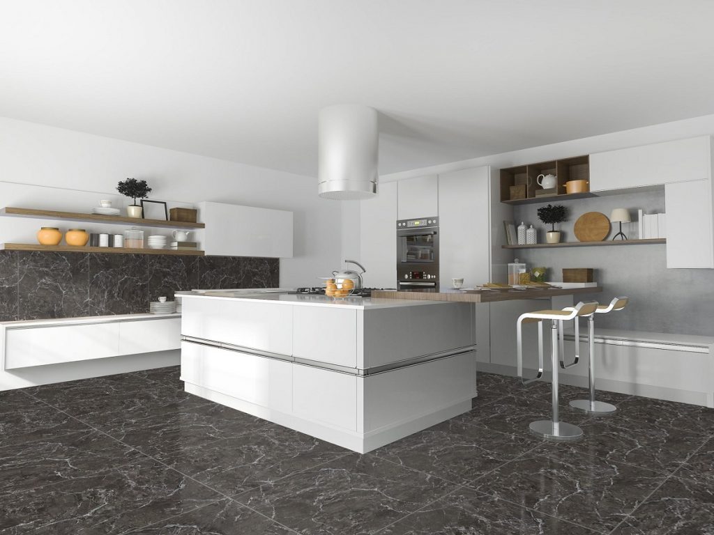
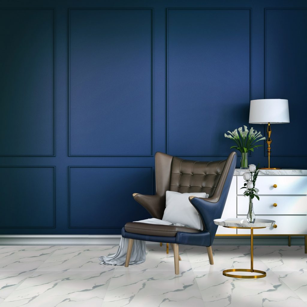
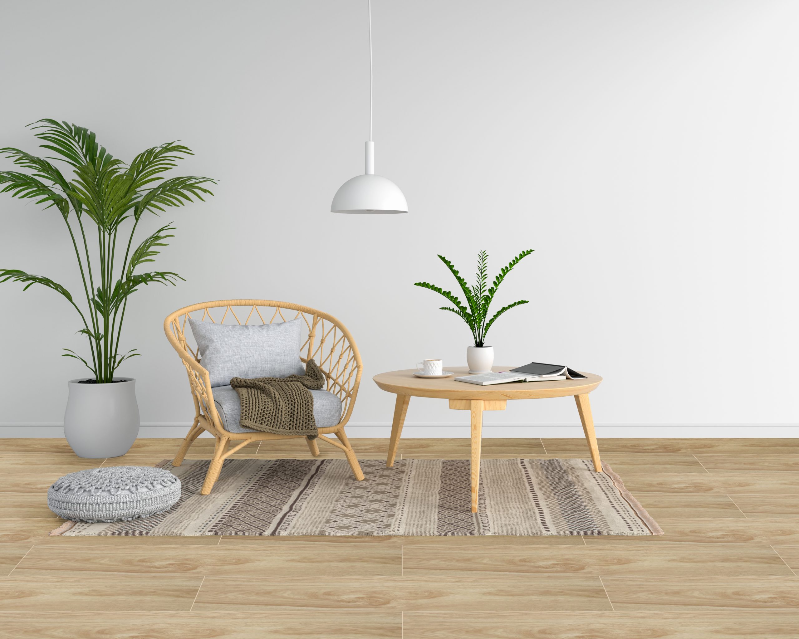
[60×60] CL12 + [30×30] 390T

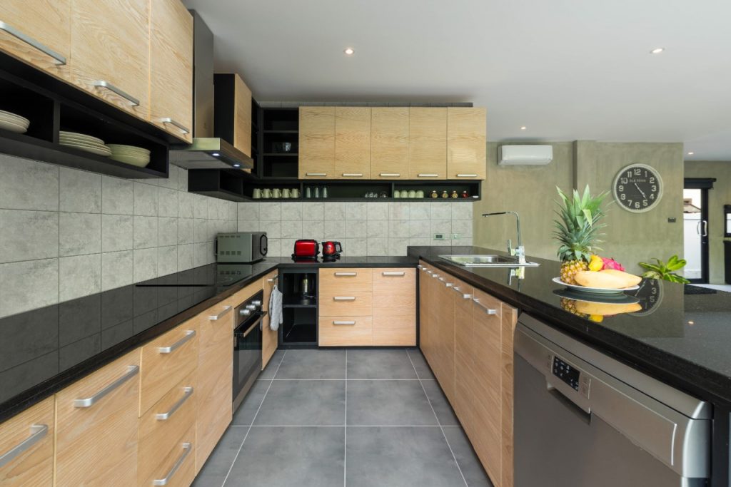
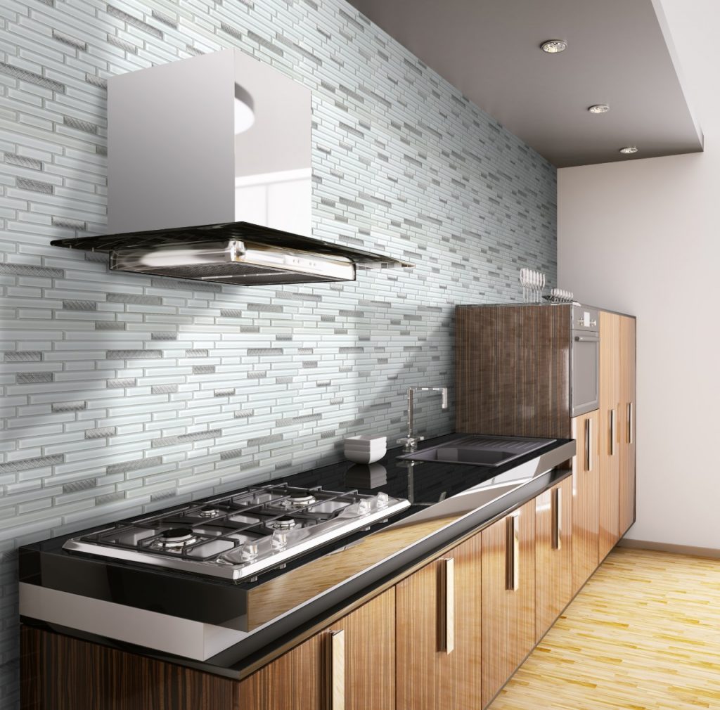
Aluminum and steel are two of the most sustainable metals and construction materials of choice. It makes sense that you should also complement other ultra-modern elements with metallic objects and decor.

Your kitchen, for example, can do well with a new set of kitchen cabinet hardware that is lustrous and modular in appearance. This gives the entire space a more consistent feel with the rest of your home. To add to that, it can also elevate the look and function of any traditional kitchen area, especially if you have a new set of stainless steel appliances.


Keep It Neutral
Keep It Neutral

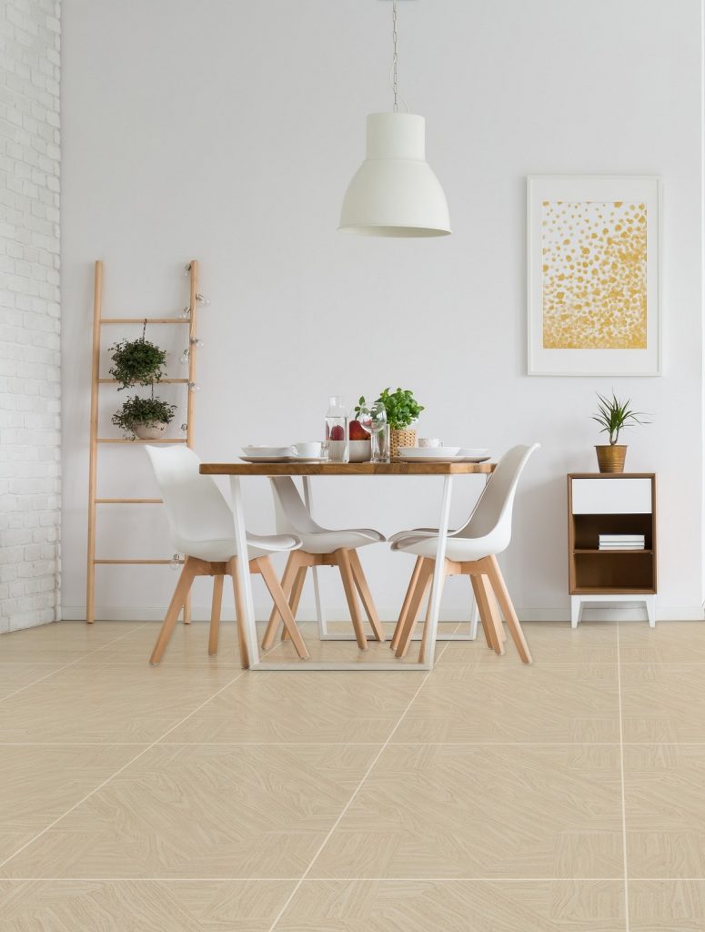
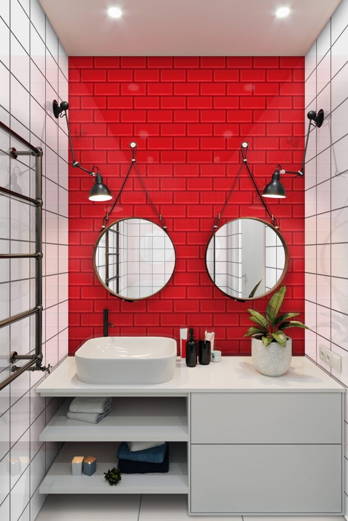
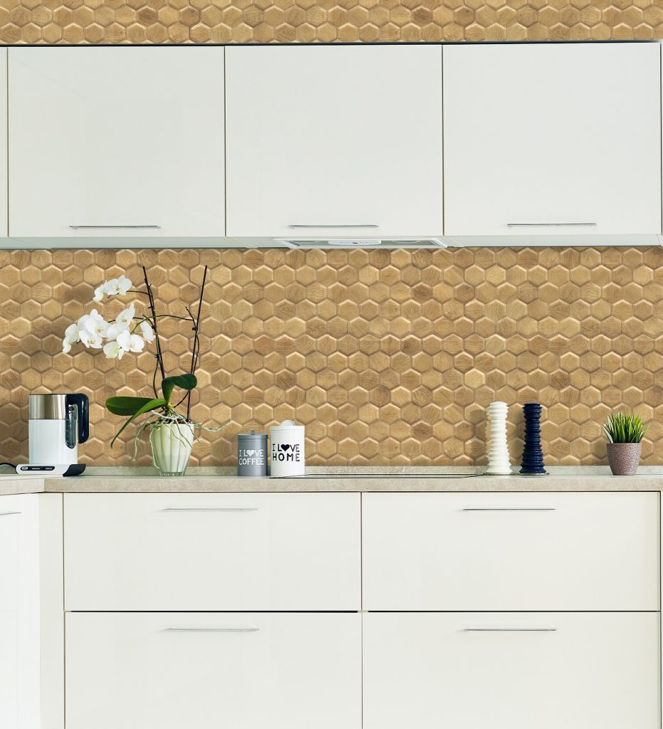
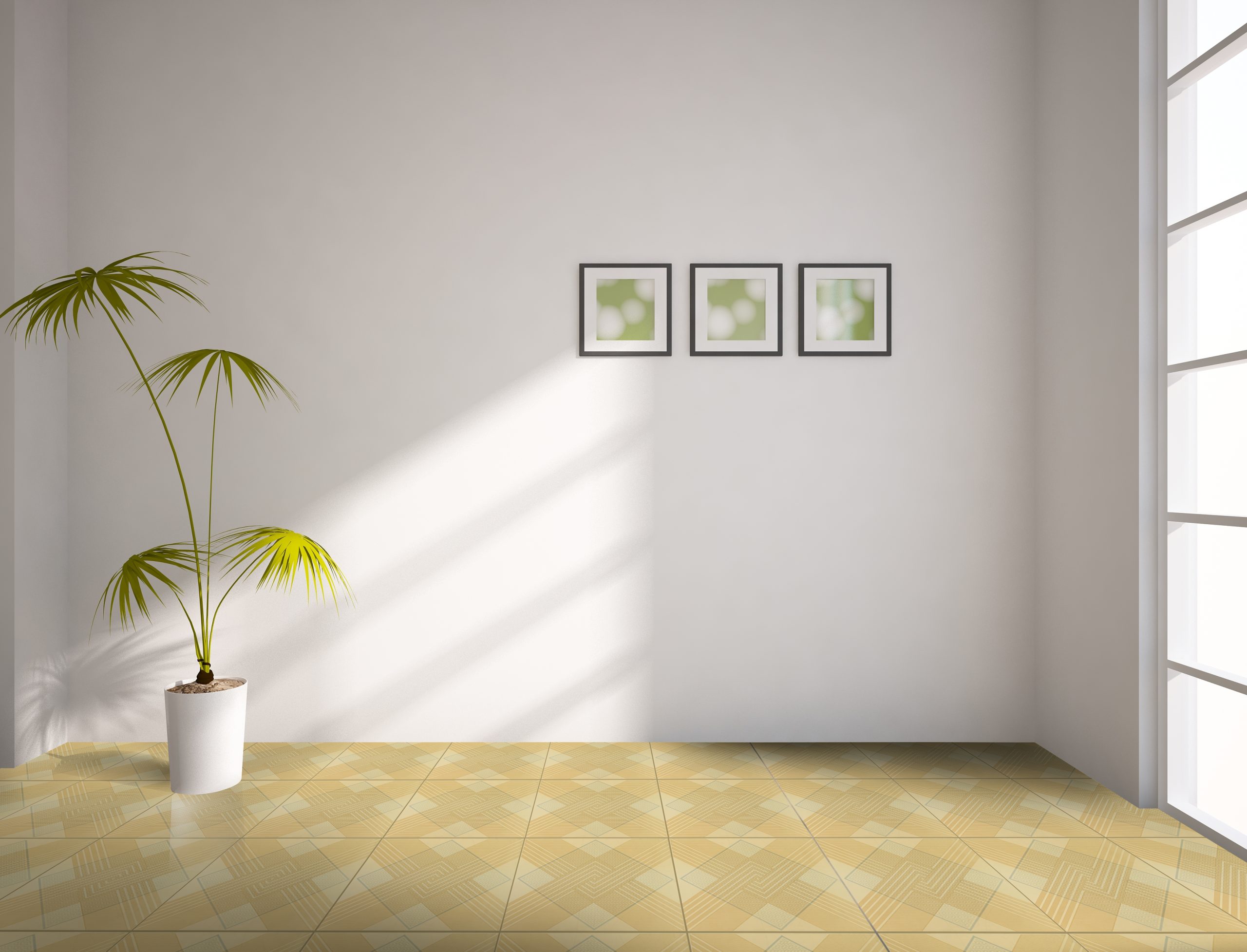
[30×30] W-02

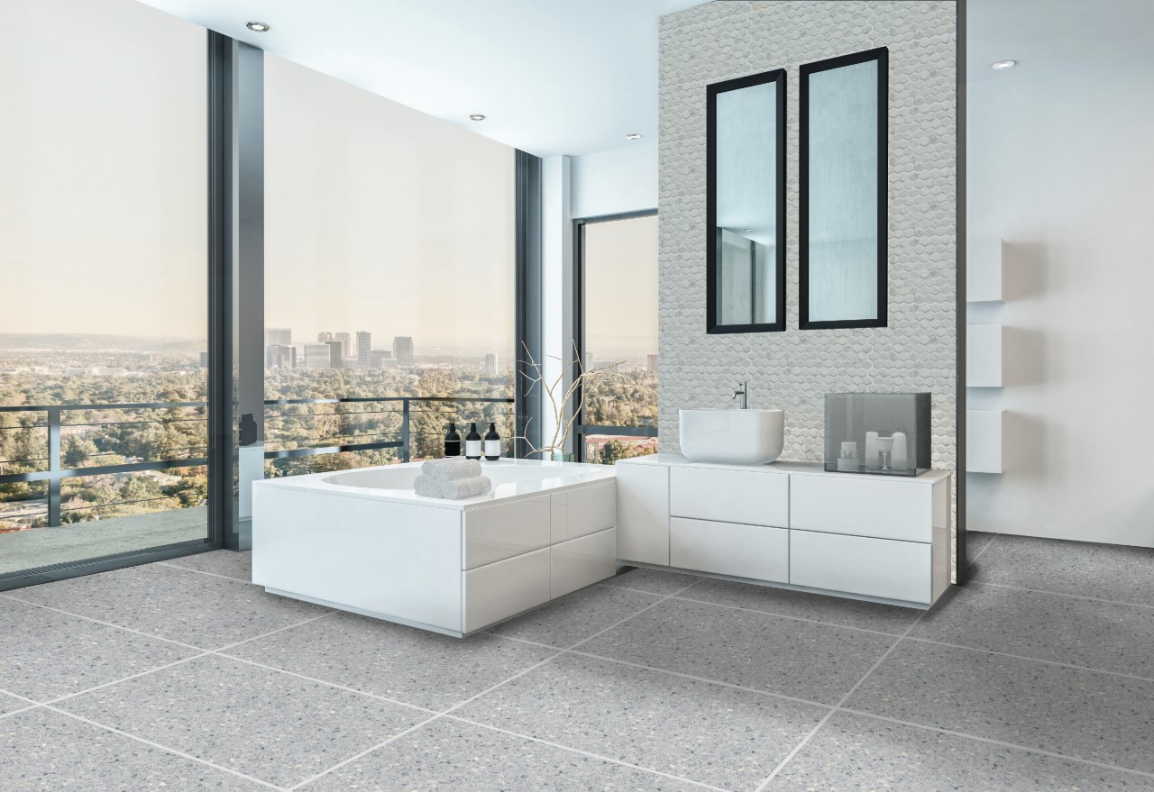
You’ll definitely be working with neutral colors for the rest of your ultra-modern home’s interiors because they offer a clean and sleek palette by which you can build your fixtures, home accessories, and furniture on. While beige, cream, and black are all good places to start, you can also explore other shades, like white, light/dark grey, or even various undertones.

Adorn your walls and rooms with decorations that come in neutral shades. For example, a large wall centerpiece depicting geometric or abstract artwork can blend in well with the rest of the space.

Choose neutral wherever you go, but don’t make your rooms feel too bland or derivative by using the same colors over and over. Practice this whenever you’re adding a certain piece, be it a rug for your bedroom, or even a kitchen countertop.


Key Takeaway

We’ve listed some of the most essential ultra-modern home tips in this guide that will make your living area more stylish, sustainable, and sought-after. The trick is to be restrained with any interior or alternatively, exterior design choice that you make.

Don’t go overboard by littering the space with mismatched additions, instead only focus on the essentials and what will make it as livable as possible. Be smart about the decisions you make when it comes to lighting, furniture, and material. Practice these tricks consistently and you’ll definitely be on your way to designing an ultra-modern house that stands the test of time.

Ready to start with your ultra-modern project? Let Floor Center’s tiles help you build the perfect interiors. Check out our Styles & Ideas Guide here for more design inspirations! We are also inviting you to be a part of our FC Tile Viber Community Group for all you need to know on the latest tile tips, tricks, and trends.
3 Eclectic Home Design Ideas

3 Eclectic Home Design Ideas

What are some eclectic bedroom design ideas?

  1. Stick to the basics
  2. Add diverse elements
  3. Combine different furniture styles


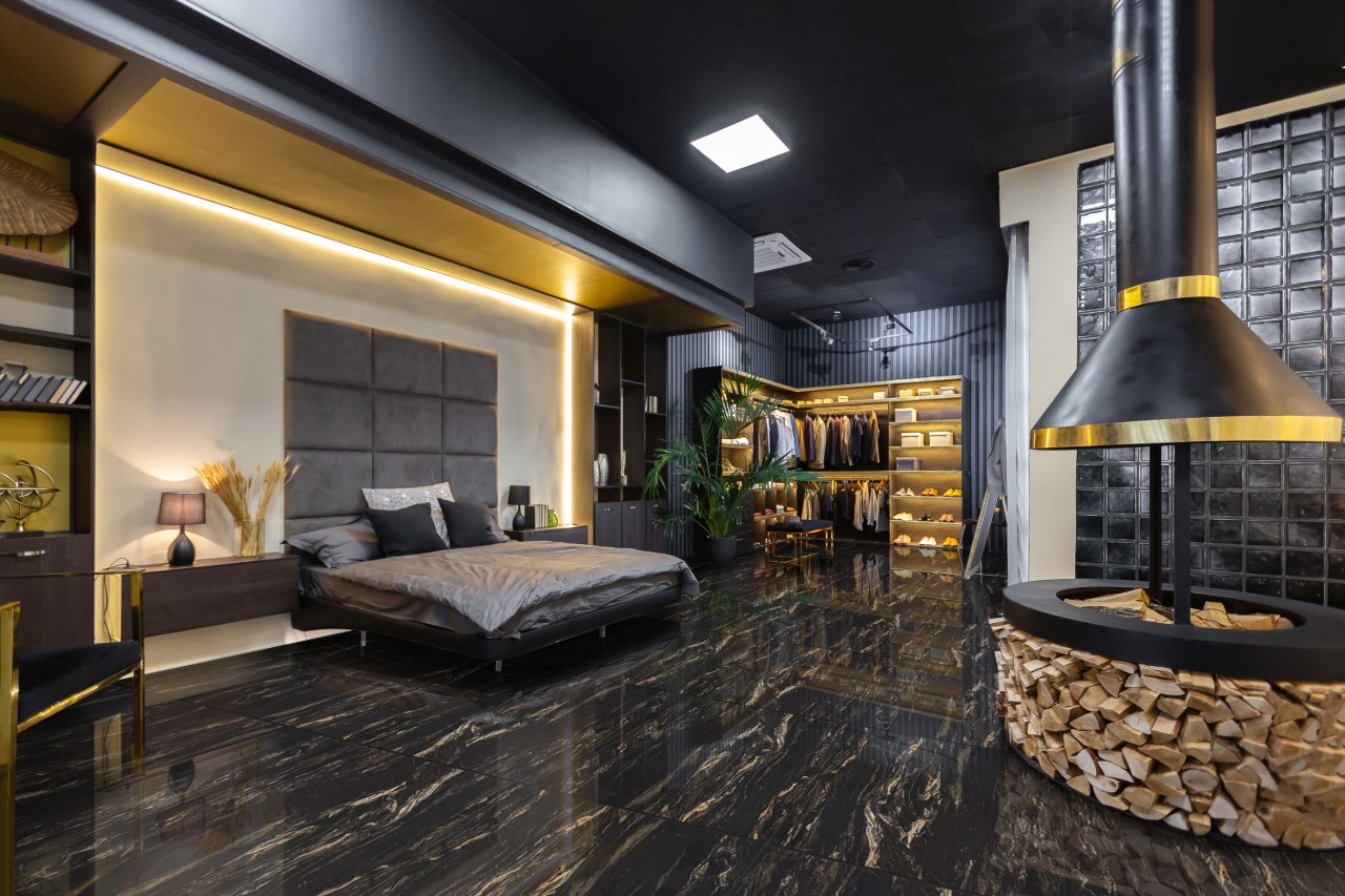
Eclectic designs are a great approach to mix various design movements and conventions to come up with a unique interior. Think about two or more of the most popular ideas you can think of, and there’s a good chance that they can work together to create a cohesive, yet striking look that’s perfect for your home. If you’ve long been dying to achieve an eclectic bedroom that hits the mark on a plane of styles, then there are a few great eclectic bedroom design ideas that just might work for you.

With an eclectic bedroom or any interior for that matter, there may be a tendency to just use two vastly different styles that you can think of. Unless you know how to properly execute them, you might end up with a zany and mismatched bedroom with each element feeling more like an afterthought. You certainly don’t want your bedroom to exude chaos, do you?

Fortunately, the key to nailing the eclectic bedroom lies with a simple concept — harmonious contrast. Don’t be daunted, because it’s all about experimenting and trying out different techniques and decorations. Let these tips below help you get started on the right foot to a stunningly designed eclectic bedroom!


Stick to The Basics

Stick to The Basics

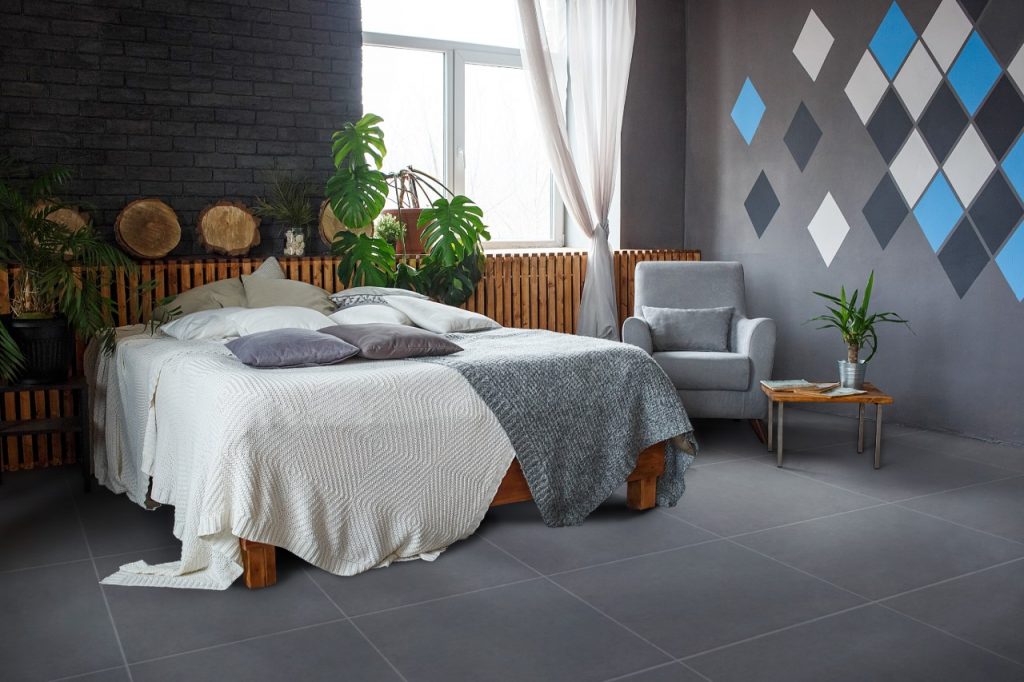
[60×60] ME6615

The first rule of eclectic interior design — don’t overthink it. Instead, start by adding a few splashes of color in a dull-looking room. You can choose from a different spectrum of cool shades, such as green, blue, or even purple. These colors can easily be paired with natural finishes and textured materials when incorporated with a minimalist touch.

This doesn’t necessarily mean that you have to find exactly purple or blue-colored decor. You can keep it natural by choosing beautiful indoor plants, for example. Set up a few pots around the master bedroom — on top of the vanity or bedside table, or wherever you would prefer. Complement these potted greens with decorative accents such as throw pillows, bolsters, duvet, thick blankets, and the like.

You can also focus on the rest of the space by creatively scattering around little adornments of different materials. For example, a wooden music box and Newton’s cradle can work perfectly, especially for a bedroom that also doubles as a home office. It all depends on which two different materials you prefer.


Add Diverse Elements

Add Diverse Elements [15x60] IAI023

[15×60] IAI023

Diverse elements or colors act as the grounding force in any eclectic design, which is why they should also be a part of your bedroom decorating. When mixed with a personal touch, these are some of the easiest styles to work with — they provide you with limitless design freedom without any need for major renovations. They also act as versatile accents, be it on walls, floors, ceilings, or trims.

This is the part where you can begin layering your bedroom with different textures that add both dynamism and casualness to your eclectic-inspired bedroom. Focus on building a solid foundation using soft materials. For example, you can add neutral colored, yet heavily patterned rug that creates a breath of fresh air to single-toned pillowcases, blankets, or furniture.

If you also prefer a softer and fluffier material, jute, silk, and wool rugs may just do the trick. Make sure they sport a neutral tone so that they can work well together with other decors, such as metal glass lamps, textured pieces, and so on.


Combine Different Furniture Styles

Combine Different Furniture Styles

[60×60] K6004

Have you ever seen a rustic farmhouse cabinet being paired with a stainless steel side table? If you’re new to eclectic interiors, you should know that furniture is one of the best places to begin with. Don’t be afraid if the idea seems too incongruous in your head — you’ll be surprised at the appeal that they provide once executed.

If you have a tufted sofa couch just sitting in your bedroom, enliven it by incorporating another furniture style, such as minimalism, for example. In this case, a modular couch works best, as its simple geometric design ties in well with the softness that the tufted couch offers. Just make sure that they come in more or less the same color palette to achieve both a high-contrast, yet harmonious look.


Key Takeaway

Ready to start decorating an eclectic bedroom? These electric bedroom design ideas above will guide you towards the correct path for this unique, popular, and wholly personalized interior design style.

Keep in mind that although eclecticism demands mixing contrasts, this also means that you have to find the balance to create a cohesive look. By sticking to the basics, layering with diverse elements, and adding different furniture styles together, you can already be on your way to creating a magazine-worthy look that’s simply you.

Floor Center’s tiles are perfect for any kind of interior design. Click here to check out our Styles & Ideas Guide and learn more about what you can do with our tiles! You’re also invited to join our FC Tile Viber Community Group! Be on the frontlines of the latest and must-have tile tips, tricks, and trends for better and beautiful interiors and exteriors.

4 Wood Look Tile Ideas for 2021

4 Wood Look Tile Ideas for 2021

What are some wood-look tile ideas for 2021?

  1. Herringbone style
  2. Dark wood pattern
  3. Minimalist porcelain style
  4. Walnut design


Wood designs offer a unique presence in any modern home. Whether outdoors or indoors, they’re a popular option due to the practicality and visually appealing design that simply works. If you’re planning a few home renovations this year, there’s no doubt that going for wooden-style finishes for your floors, walls, and surrounding fixtures would make a sound choice. Many wood look tile ideas for 2021, when executed properly, will elevate the look and feel of your humble abode.

You can experiment with all sorts of ways to incorporate wood-look ideas in your home or building. The best part is, you won’t experience the drawbacks of actual wood — granted they may look expensive and all-natural, but they’re extremely difficult to maintain. With wooden-inspired tiles, patterns, and arrangements, on the other hand, you have the freedom to transform your interiors and exteriors into something undeniably cozy and stunning. Take the year’s design ideas to the next level with these wood-inspired looks. Check them out!


Herringbone Style

Herringbone Style

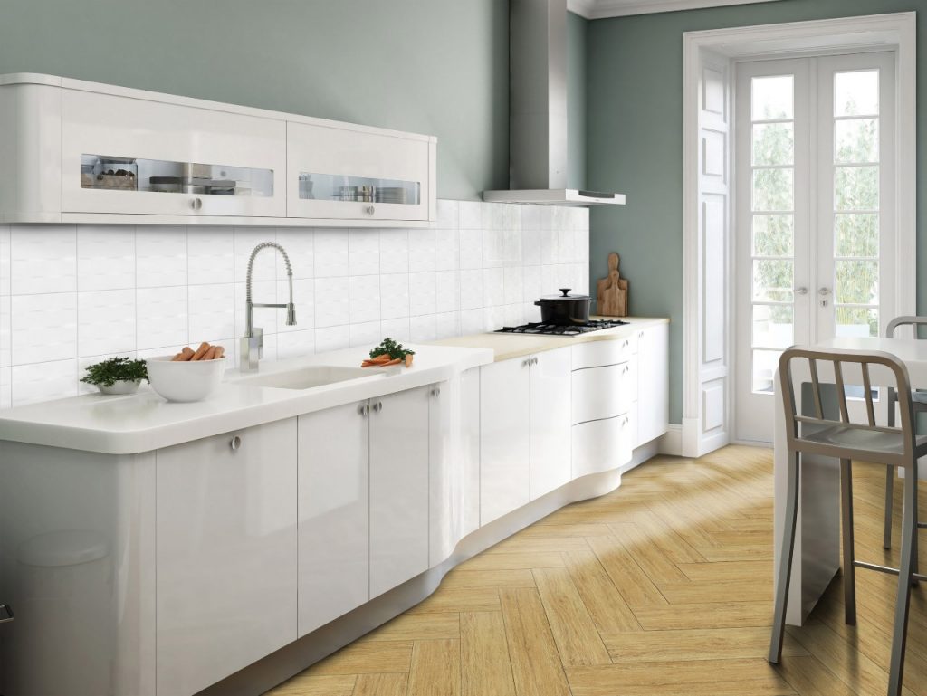
[20×20] + [15×60] 22AW1H, A1562

While it may not exactly pertain to a type of wood, the first design on this list refers to the pattern or the way by which the tiles are applied. For the Herringbone style, rectangular tiles are arranged in such a way that they create a zig-zag pattern. Since each tile or plan is precisely cut, the ends meet together to create a beautiful, yet fun design that’s ideal for any avant-garde villa.

Herringbone pattern tiles are best done on tile shapes that have longer widths. This 15×60 tile, for example, is the perfect fit for the Herringbone look, complemented by a creamy white, and yellowish mahogany shade.

Try this out in your kitchen or dining room. Bring out the look of your tile pattern by adding a white color contrast on your countertop, cabinet, or backsplash of your choice. Even a simple pattern can already bring out the charm of your dining space.


Dark Wood Pattern

Dark Wood Pattern

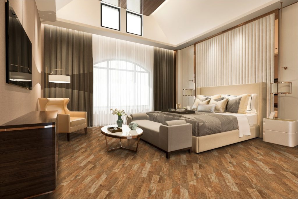
[60×60] CL06

Most wooden-inspired tiles are made out of porcelain or vinyl, but this doesn’t take away from the fact that they look wholly natural and alluring. Their versatility remains unmatched, which is why you can pick out virtually any part of your home and incorporate a fresh layout of these tiles.

Dark wooden tones, in particular, can introduce a vibrant, yet lovely and welcoming feel into a space. Coupled with effective techniques, you can definitely design a bedroom, living room, or an open-plan space with beautiful, dark hardwood-inspired flooring.

Opting for single-planked wooden tiles that have to be installed one by one can be time-consuming, which is why you can turn to pre-set patterns. The large-format 60×60 tile above sports a diagonally-offset pattern that emulates the appearance of true wooden floors. Its dark tone matches well with similar dark textures and an interior color palette that plays with different rustic shades — white, cream, beige, and brown to name a few. Finish off the decor by layering it up with soft cushioning, box pleat curtains, or any decor that you think would work best.


Minimalist Porcelain Style

Minimalist Porcelain Style

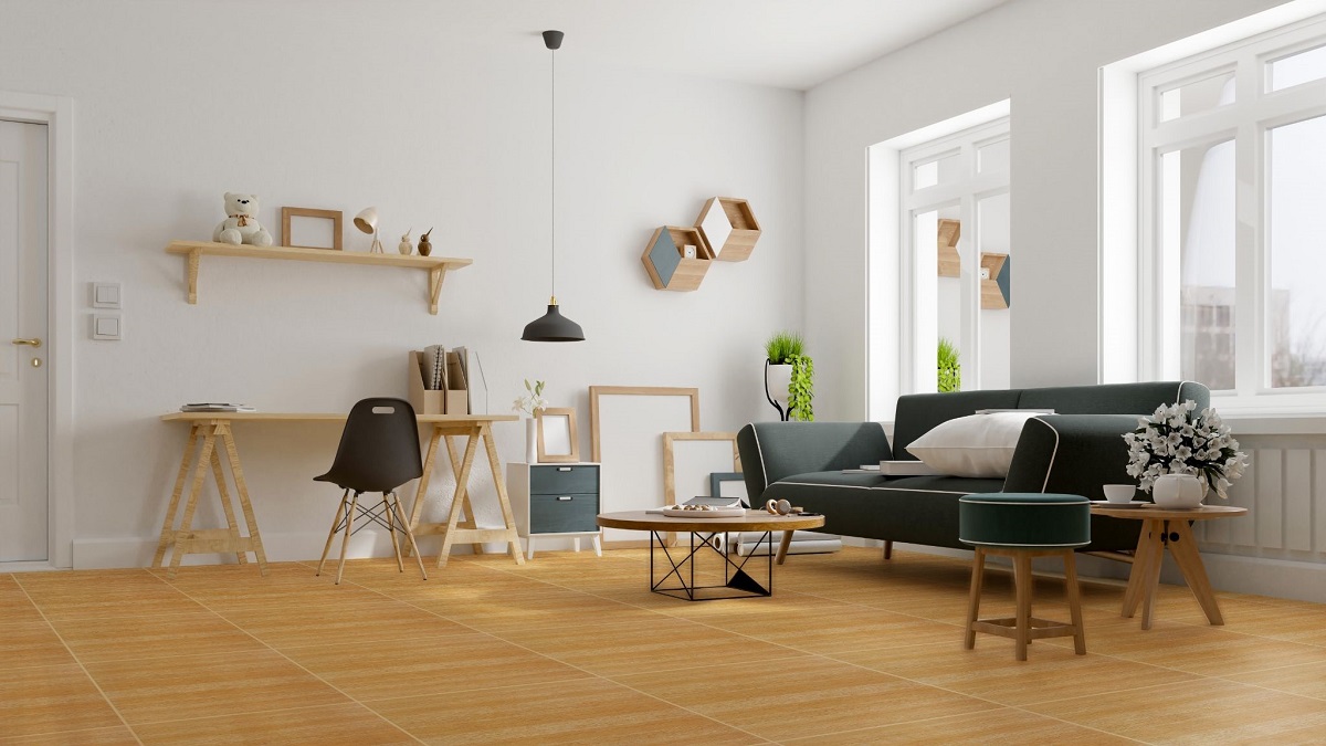
[20×100] 2100P2

Contrary to what you may think, wood is not only a popular fixture in rustic homes. In fact, they’ve slowly found their way into even minimalist, modern styles that emphasize relaxation, functionality, and practicality. If you’ve been dying to find a balance in designing a traditional, yet ultimately contemporary space, then the porcelain wood-look tile might just be your best bet.

Simple and no-frills — not much needs to be considered when designing with a set of wood-look flooring for a minimalist environment. Choose small and low-height furniture that will fit well into a small, but ergonomic space. For example, you could go for a small round coffee table paired with a rattan chair for the living room. Add a pop of color with stylistic decors, such as a large wall centerpiece, or a few potted plants to achieve that natural, yet minimalist vibe.


Walnut Design

Walnut Design

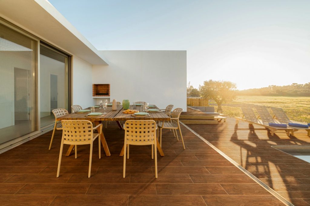
[15×80] 1580P3

Staying true to its natural environment, a wood-look tile setting can also be executed in any outdoor space. In fact, many homeowners have found them to be the perfect choice in achieving exquisitely-built decks, patios, or any other outdoor area.

This walnut-shaded wood-look tile by Floor Center makes all of that happen with its charming design. You can use this tile for any type of outdoor look — be it in platform areas or as part of a small swimming pool or hot tub. To come up with a completely stylish look, pair the deck with a matching set of outdoor furniture, picnic tables, chaise lounges, and what have you. Soon, you’ll find yourself retreating to a well-designed, wood-look space that you’ve always dreamed of.


Key Takeaway

In need of fresh wood look ideas for 2021? Bring your design aspirations to life with Floor Center’s unique collection of wooden-inspired flooring! Whether it’s a minimalist living room or an exquisite outdoor area, you can never go wrong with our options.

Curious to learn more? Check out our Styles & Ideas Guide here! You’re also invited to join our FC Tile Viber Community Group! Exchange fresh new ideas and about the latest tile, tips, tricks, and techniques for better interiors and exteriors.

How to Create an Outdoor Living Space on a Budget

How to Create an Outdoor Living Space on a Budget [60x60] ZX-W6613AGA-HT

How can you create an outdoor living space on a budget?

  1. Build a patio
  2. Spruce it up with outdoor tiles
  3. Make it cozier
  4. Add ambient lighting


Ever wanted to learn how to create an outdoor living space on a budget? It’s not as challenging as you may think. Sometimes, you might find yourself focusing too much on your home’s interiors, that you forget this overlooked part of your home. A cost-friendly redesign might elude you, but there are a few key tricks that you can do to enliven this space.

Don’t have a relaxing outdoor area to retire to at the end of every busy day? Building a patio might just do the trick. Coupled with fitting outdoor tiles, furniture, ambient lighting, and the like, your once-humdrum outdoor area will soon become a sight to marvel. Read on to learn more about these affordable, yet insanely impactful design tips that you can do for your outdoor spaces!


Build A Patio

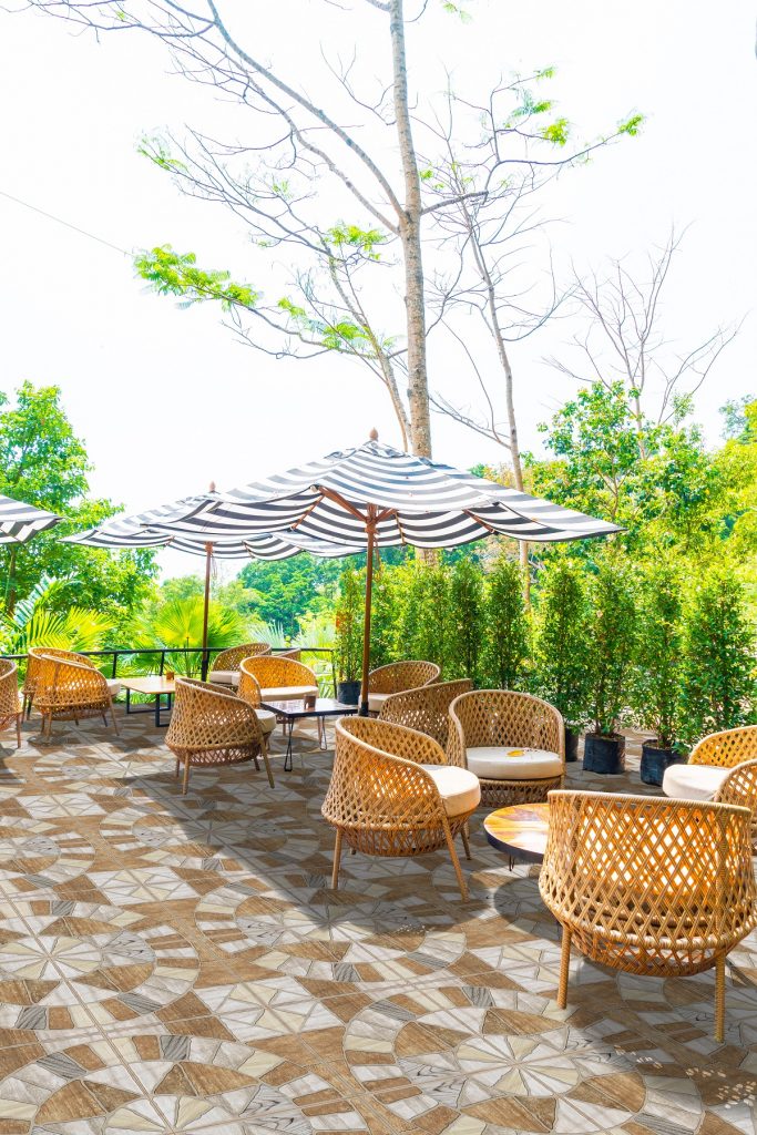
Furnitures with empty chair and table

[60×60] M151-4 + [30×60] VLM6680

When you hear the word patio, the first thing that might come to mind is an expensive outdoor wooden deck with a matching pergola, varnished paneling — the works. Full-fledged patios can cost as high as 100,000 pesos which might be way above your budget.

To make sure that you don’t go overboard with your patio expenses, it’s important to have a few key elements in mind. For example, instead of buying a carport kit or a pergola, you can opt for a high-quality garden umbrella that can easily be set up in your preferred outdoor location.

Fill the cool space with a few extra chairs or a furniture set that’s perfect for the outdoors. The best thing about it is that you don’t have to buy new ones! If you have some spare furniture you’re not using or simply tucked away in your storage, a little dusting and cleaning can have them outdoor-ready.


Spruce It Up with Outdoor Tiles

outdoor patio chair and table

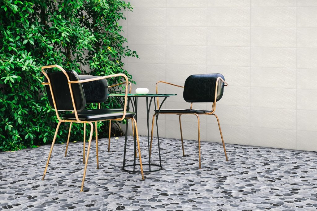
[30×30] 3032P

Small outdoor areas are perfect canvasses for a fresh new set of floor tiles. You don’t have to go for natural stone walkways that not only take time, but also money to accomplish. Instead, you can opt for affordable and more versatile designs.

Floor Center’s 3032P tile, for example, is a great choice to achieve that rustic outdoor feel. If you feel like there’s still something missing with your custom-built patio, then this tile can complete the entire look and give off an all-natural vibe without the cost drawbacks.

Complement your newly-renovated patio floors with matching furniture. Iron chairs make for a suitable fit, but you can also go with light wooden furniture that matches the color of the floors. To add contrast, try to focus on how you can make your outdoors greener — a few potted plants or colorful blooms can definitely go a long way.


Make It Cozier

empty outdoor patio table and chair with cushions

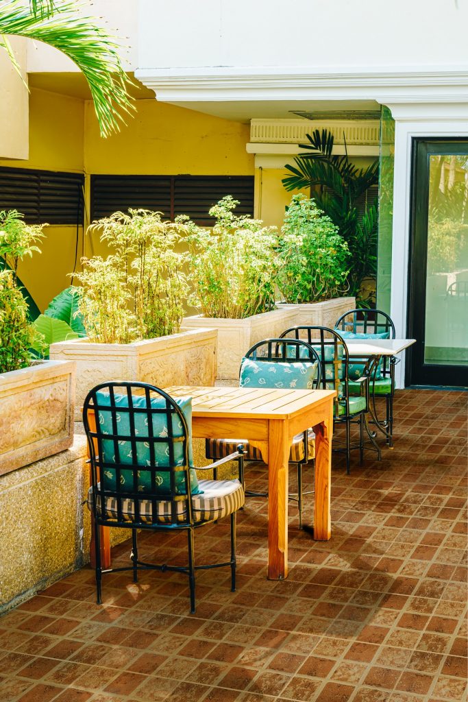
[30×30] I-3465

In many ways, your outdoor area or backyard is simply a living room located outside your house. As such, comfort should be your priority when coming up with a budget-friendly design. At the end of the day, lounging about your patio should be something to look forward to, which is why you’ll want to make it as cozy as possible.

Unless you can afford soft furniture, a great way to add a cozier feel is to add cushions wherever possible. For example, you can adorn hard furniture with small decorative pillows for cushioning.

You can also layer it up — if you have a wooden porch, protect it with a soft rug with a design of your choice. In the cool evenings, it’s also handy to keep a blanket or two and a few pillows on a bench. Whenever you feel like heading out and spending a few moments on the porch at night, these small, but comfortable additions make all the difference.


Add Ambient Lighting

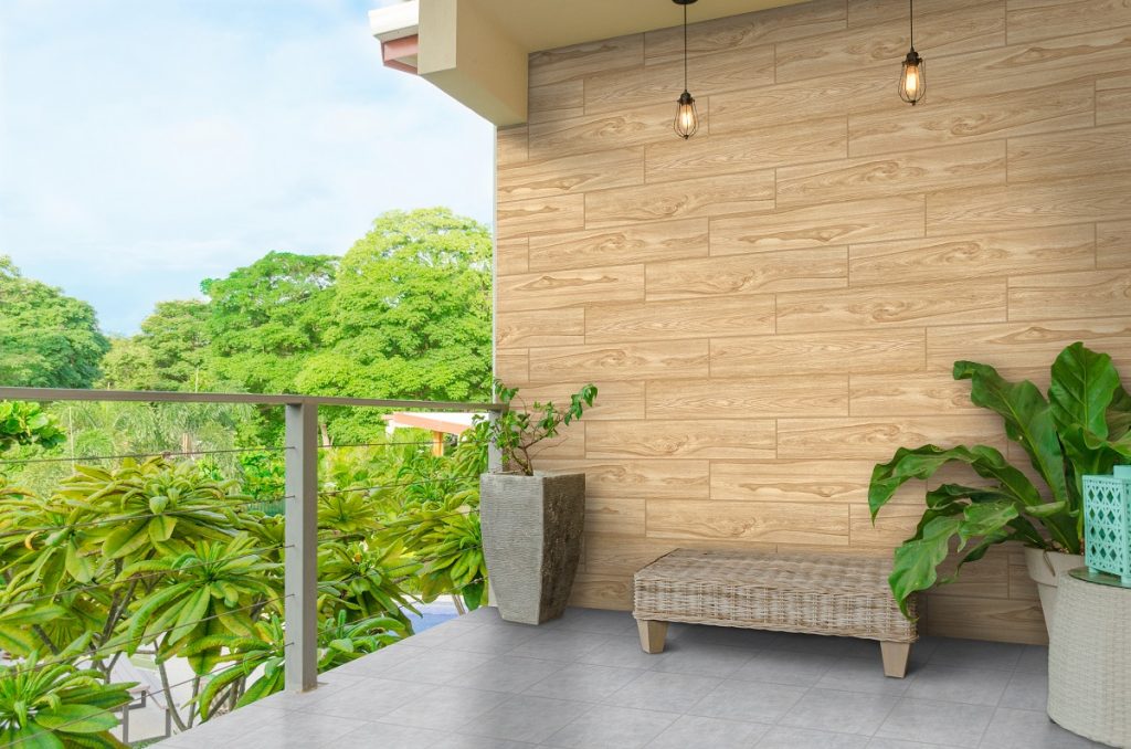
Balcony with green view and light blue sky,, lamps, plants and b

[20×100] 2100P2 + [30×30] L44

The right ambient lighting for your outdoors can help you set the tone and mood of your surroundings, especially in the evening. When the sun is still out, you get to take advantage of natural lighting that brings more vibrancy to your outdoor area. But when the sun has gone down and the cool breeze starts to greet your beloved outdoors, then ambient lighting can beautifully illuminate the space.

Some lighting fixtures you may want to add include hanging lights, wall lights, or post lights. In this case, you’ll want to go for warm lighting that adds a touch of soft glow — choose bulbs that resemble the distinct incandescent color of yellow or light orange. Take it up a notch by lining your pathways — if any — with task lighting or a few lamp posts that are strategically spaced.


Key Takeaway

In this guide, we’ve highlighted a few tricks that you can do. When decorating your outdoor area, think of it as a haven for comfort. The best piece of advice is to not be afraid to exercise your creative input. Combined with the tips above, you can easily personalize an outdoor area that you’ll want to visit every now and again.

Looking for more design tips? Floor Center’s Styles & Ideas Guide contains everything you need to know. We’re also on Viber! Join our FC Tile Viber Community Group and be in the know about the most trendy tile tips and tricks.

4 Best Dining Room Trends for 2021

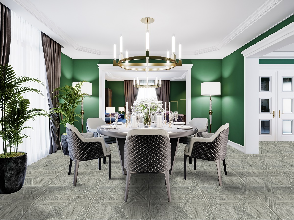
Luxurious dining room in a large house, with a round table for s

What are the best dining room trends for 2021?

  1. Clean White
  2. Center Island
  3. Ultra-Modern
  4. Side chair

For 2021, the best dining room trends can help you go all out with one of the most underrated parts of your house. It doesn’t matter if you have a kitchen and dining room all-in-one or a small dining nook near a windowsill, there are tons of ideas you can execute to create a personalized space.

While the first three months of this year have come and gone, it isn’t too late to redecorate your dining room’s appearance and transform it into something chic, modern fun, and stylish. In the list below you’ll encounter a range of designs — from the simple and clean white kitchen space to the ultra-modern dining area that inspires beauty. Bid farewell to 2020 and say hello to these gorgeous dining room designs for the year 2021. Check them out!

Clean White

Clean White

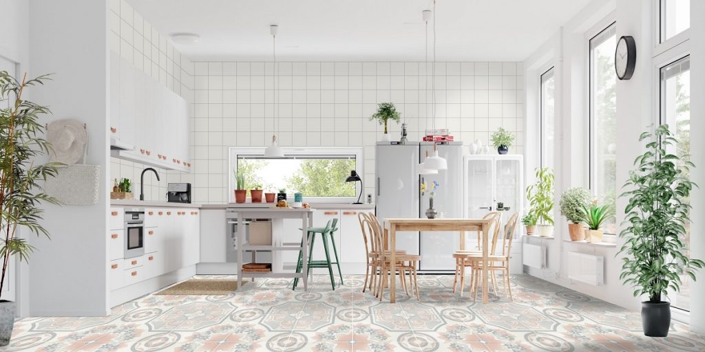
[40×40] 4040A + [15×15] 15AW1

In this first look, the name of the game is white. That’s right! You don’t need to think too much when it comes to incorporating this color into an integrated dining room + kitchen design. As a refreshing color, white gives the appearance of cleanliness — and for a busy area such as the dining room, you’d definitely want to be spic and span all the time.

Focus on key furniture, such as the dining table and the chairs. To add contrast to white, find furniture that sports a wooden design or any darker shade that pops out from the predominant color.

Designing with a white dining room shouldn’t be difficult, as long as you figure out ways to add splashes of color into the area. For example, you can place different types of indoor plants that will not only add a bit of green into the space, but also keep the room cool and fresh.

Center Island

Center Island

[60×120] Y1AC-51QE

The modern kitchen center island has been a fixture in everyday homes since the 1950s. Ever since its rise to popularity, it seems that homeowners just have to have this dining room addition. While kitchen islands have since evolved from the traditional four-legged wooden table, you can still creatively work with both traditional and modern reiterations of this must-have dining room unit.

For example, you can go for a simple wooden cutout that not only saves space, but also offers seamlessness when keeping your dining room tidy. Of course, your center island-slash-dining-table wouldn’t be complete without matching chairs! Opt for backless counter stools that are both comfortable and functional. Choose a design that adds a significant contrast to your center island to emphasize the entire look.

Ultra-Modern

Ultra-Modern

[60×60] LF6816

In the world of interior decorating, you’ve probably heard this buzzword thrown around one too many times — but what exactly does “ultra-modern” mean? To put it simply, ultra-modern is a design movement that places modern sensitivities to the fore — think sustainability, eco-friendliness, and functionality. Ultra-modern styles celebrate open plans and interconnected spaces, which can be perfectly executed in a dining room as well.

To achieve your own take on the ultra-modern dining room, focus on the kind of building and furniture materials that you’ll use. You can choose, for example, kitchen appliances made out of steel or stainless steel which can be recycled indefinitely.

Store your appliances in modular cabinets or customized floating countertops that give the appearance of a completely free-flowing space. Finally, complete the look with natural flooring designs, such as stone, wood-look, or even marble patterns that can add depth to the entire dining room.

Side Chair

Side Chair

[60×60] V-K

Your current dining room likely makes use of the typical armless side chair. However, you might want to try taking another good look at it. Does it match well with the rest of the space? Or is it already too outdated to make any kind of impact on the overall appearance of your dining room?

If you answer no to the first, and yes to the second, then it’s time to focus your dining room redesign on a completely new set of side chairs. Since your dining room is all about the furniture, turn these furniture pieces into a cohesive statement centerpiece.

Try finding side chairs with soft cushioning for added comfort. The color you choose depends on the overall design of your dining room. With a white-washed dining room, for example, side chairs on the same color palette do well to bring the entire space together. The same convention goes for other dining room styles, be it rustic, contemporary, indie, and the like.

Key Takeaway

In this list, you’ve been acquainted with just some of 2021’s best dining room trends. As said before, it isn’t too late to work on a wholly new dining room redecoration, even if we’re already three months into the year. What’s important is that you make small changes here and there that can help you revive the space into something fresh, new, and vibrant.

In need of more design tips? Floor Center’s Styles & Ideas Guide has every bit of everything for a dining room, bedroom, kitchen, living room, outdoor space, and more! You’re also invited to join the FC Tile Viber Community Group! Be at the forefront of the must-have tile trends, tips, and tricks for the year 2021.

3 Weekend Home Improvement Projects

3 Weekend Home Improvement Projects

What are some weekend home improvement projects you can do?

  1. Decorate your space
  2. Add custom kitchen shelves
  3. Buy new furniture

You might think that you need a week to make renovations and home redesigns, but did you know that simple weekend home improvement projects can already bring more life to your space? That’s right! You don’t need to spend countless hours just to transform a room into something wholly different and refreshing. Especially if you don’t have the luxury of time, sticking to projects that you can do in a short period can already add more value to your interiors.

In this guide, we’ve rounded up some simple redesigns that you can do over the weekend. From changing the decor of your room to adding customized furnishing, these small changes will definitely make any space come alive. Read on to learn more!

Decorate Your Space

Decorate Your Space

[60×60] M91-3 + [30×60] P-3610

Take a look at any room you want to improve on. Is there something missing? Do the elements seem bland? If the answer is “yes” to both of these questions, then it may be time to exercise your creativity and add decorations to the space.

Choosing the right decor doesn’t have to be difficult. First, you need to consider the kind of room that you’re working on. For your own personal bedroom, for example, you can populate the walls with a variety of decor, such as hanging lights, relaxing landscape paintings, posters, or even vintage objects.

Although these decorations seem different from one another, stick to a consistent theme and color palette. Doing so can make your room feel livelier, but also relaxing.

Add Custom Kitchen Shelves

Add Custom Kitchen Shelves

[20×30] I-23XD

The kitchen is arguably one of the messiest parts of a home — there are just too many appliances, utensils, jars, pots, pans, knives, and cutting boards stored all over the place. Without proper organization, your once-beautiful kitchen may be marred by the clutter that’s just lying everywhere.

To keep your kitchen space cleaner and more aesthetically-appealing, adding simple, yet sturdy custom kitchen shelves might just do the trick. You can skip those bulky and expensive kitchen cabinets and drawers. Instead, opt for low-profile designs that are perfect for a rustic and minimalist home.

For example, you can make a custom floating shelf using only two primary materials: plywood and some triangular brackets. Here’s how:

  • Whether DIY or with someone, simply attach wall anchors to your bracket.
  • Then, drill holes into specific sections of the plywood after it has been cut.
  • Assemble the pieces together, then mount the shelf onto the wall by drilling in a few more nuts and bolts — your custom shelf will be ready in no time at all.

Buy New Furniture

CLassic blue room /3d render

[40×40] 4040V

Before buying furniture, you should already have an idea in mind. Aside from thinking about the design, size, and how it will fit into a room, it’s also important to stick to a theme. Doing so will create harmony across your space and maintain the cohesiveness of any given room.

To achieve a modern appeal, for example, stick to a platform or low-height metal furniture that brings out that spacious, yet luxurious vibe. For something more rustic, you can go for the traditional wooden furniture that incorporates wood finishes and curved designs.

When rearranging your furniture, prioritize balance. Make it the centerpiece of any given room, be it the dining area, bedroom, kitchen, or living room. Try not to push back the pieces into the walls — instead, leave only a small space between the walls and the backs of the furniture.

Key Takeaway

In this guide, we’ve rounded up some of the easiest and most beautiful weekend home improvement projects that you can do over a span of two days! Who says home improvement has to be difficult? Definitely not these tricks. Through simple activities, like redecorating, buying new furniture, or even building custom shelves, any part of your home will look good as new.

In the mood for more home improvement ideas? Check out Floor Center’s Styles and Ideas guide here! You’re also invited to join our FC Tile Viber Community Group! Be the first to know about the latest tile-related tips, tricks, and trends.

5 Ways to Elevate Your Life’s Tile

Happy Asian family on white background2

What are the different ways to Elevate your Life’s Tile?

  1. Focus on rhythm
  2. Choose the right tile pattern
  3. Add statement colors
  4. Experiment with different tile surfaces
  5. Separate spaces


There’s nothing that offers more versatility than designing with tiles. In every Filipino home, tiles have been a staple — from the humble bungalow to the luxury-contemporary abode, tiles have found themselves gracing such spaces. Curious for ways to Elevate Your Life’s Tile? Floor Center’s beautifully-designed tiles can transform any kind of space into something more extraordinary!

For more than 20 years, Floor Center has committed itself to bring only the most stunning tile designs for every Filipino from different walks of life. Whether it’s a residential space, a high-rise building, retail store, or a casual restaurant, our tiles have brought color and magic to any kind of structure.

To help our loyal customers make the most out of their tiles, Floor Center has worked to provide useful tips and styling tricks through our comprehensive Life’s Tile Book. Here, we’ve outlined the secrets on how you can personalize any space with your tiles. Although tiles are simply a fixture of any room, Floor Center encourages you to take them up a notch by focusing on rhythm, choosing the right patterns, adding statement colors, experimenting with different surfaces, and focusing on space separation. Check it out!


Focus On Rhythm

Focus On Rhythm [60x60] CL06_

[60×60] CL06

To make your tiles seamlessly blend in any kind of space, consistency and uniformity are the key things that you should look at. Ultimately, you want to go for a cohesive design with all the elements matching well together. Keeping this in mind, you’ll want to find your tile rhythm by choosing colors and decor from the same palette.

For example, if you choose wood-look tiles, you need to make sure that your surrounding fixtures sport a similar design. Think of wooden ottomans, coffee tables, mini-bookshelves, or chairs. Complement this choice by arranging your room decor in such a way that it tells a story that invites you or a visitor to scan the room and gain a sense of fulfillment.


Choose The Right Tile Pattern

Choose The Right Tile Pattern [60x60] LF6807

[60×60] LF6807

If you’ve worked with tiles in the past, you’ll know that they often come in square or rectangular shapes. Don’t just limit yourself to patterns you’re familiar with — if you want to truly elevate things, try experimenting with these patterns.

If you’re designing a small space, you’ll want to make it appear larger. To achieve this, layout small tile patterns diagonally — this makes the floors seem as if they’ve expanded. For trim tiles, for example, you enhance your floors or walls by placing them in corners and combining them with your regular rectangular or square tiles for more depth.


Add Statement Colors

3d rendering. Interior of a modern bathroom with a mosaic on the wall. Ceramic mosaic of red and white colors.

[10×20] 12GEK1 + [20×20] 22AW1H-1

Your tiles should do their job of making a statement. While they may not necessarily be the focal element in your room, you’ll definitely want to incorporate visually appealing color combinations that simply work.

If you like working with contrasts, a good tip would be to go back to the basics, that is by consulting the color wheel. Check which colors are on the opposite side of your choice. Say you want to layer your blue-colored tiles. Its opposite color on the wheel is orange — you can choose this color as is or find a lighter shade that complements the dark blue hues of your tile.

Alternatively, you could go for a calmer and more relaxing space. Make it happen by choosing tones on the same side of the wheel. If your primary choice is a dark, solid color, go for lighter shades in the same half of the wheel for a standout design.


Experiment with Different Tile Surfaces

Kitchen interior

[29.2×58] NHC63014

The tile surface can also determine the entire vibe of a room. Glossy, for example, is more apt for locations that easily get dirty and grimy — think kitchen and bathroom walls. On the other hand, matte surface tiles have a more functional appeal. They’re non-glossy and provide good traction to any space.

The two tile surfaces above are usually found indoors, so if you want to focus more on the exteriors of your structure, go for a rustic tile that comes in muted, earth tones, or natural colors. They match well with other outdoor elements such as natural stone, trees, or even lawns.


Separate Spaces

Separate Spaces [60x60] G0JBM-06E

[60×60] G0JBM-06E

Finally, tiles are the perfect choice in achieving an ideal separation of spaces. The feel and aura of any room are important for any kind of structure. You’ve likely encountered this in the form of “ambiance” which defines the overall mood of a room. Much like achieving rhythm, separating spaces allows an area to feel more functional and livable. It’s a subtle quality which is why even the slightest outlier can feel off-putting.

When separating spaces, identify these key functions: social, relaxing, in-between, and kid’s spaces. For example, since social spaces demand interaction, style your tiles in such a way that reflects this attribute — go for achieving comfort, aesthetics, as well as ample distancing.

Use the same principle when designing other types of spaces. First, identify what they are and what they will be used for. Then you’ll want to choose decor, fixtures, and set up lighting in such a way that it feels just right for the space.


Key Takeaway

There you have it. In this list, Floor Center has laid out some of the ways to Elevate Your Life’s Tile with our unique tile selections. It’s all about focusing on rhythms, choosing the right patterns, playing with different tile surfaces, adding statement colors, and separating your spaces. Keep all of these in mind and you’ll be styling away with your favorite tile designs, patterns, colors, and shapes!

Looking for more tips and tricks? Floor Center’s Style & Ideas Guide features must-have design ideas that you wouldn’t want to miss out on. Click here to check it out!

You may also join our FC Tile Viber Community Group. Be at the forefront of stylish trends, tips, and tricks that you can do with our tiles.

Top Kitchen Decorating Ideas

Top Kitchen Decorating Ideas

What are the top kitchen decorating ideas?

  1. Moroccan-inspired
  2. Fresh white
  3. Grayscale
  4. Italian-inspired
  5. Modern minimalist


Styling your home kitchen can be fun but it can also leave you with so many questions, especially if you don’t know where to begin. You want it to be stylish, but you also don’t want to sacrifice its functionality. If you’ve always been the type to stick to the basics, your kitchen design can certainly make this a foundation. However, if you want something more chic and sleek, then you might want to check out fresh kitchen decorating ideas that can wholly transform this part of your home into something awe-inspiring.

A kitchen redesign is all about mixing and combining various elements that just seem to work — whether it be the lighting, the cabinets, shelves, countertops, fixtures, and other accents that you may want to include. Listed below are just some kitchen looks that you may want to try on your own. Read on!


Moroccan-Inspired

Moroccan-Inspired

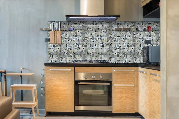
[30×30] K3742

For lovers of anything from the arts, this artistic kitchen style might just be what they’re looking for. A standout in this design, are these lovely backsplash tiles that feature intricate Moroccan patterns. It’s perfectly completed with light wooden colors and stainless steel additions that truly make this kitchen come alive.

To achieve this style, stick to custom-built fixtures that not only add to your kitchen’s aesthetic appeal but also serve a purpose. For example, you may want to incorporate stainless steel hanging racks that are fitted to your backsplash. Your kitchen cabinets and shelves, on the other hand, can arrive in a flat-panel look or any customized modern furniture that you can think of. Come up with a finished kitchen look that you definitely won’t want to miss out on.


Fresh White

Fresh White

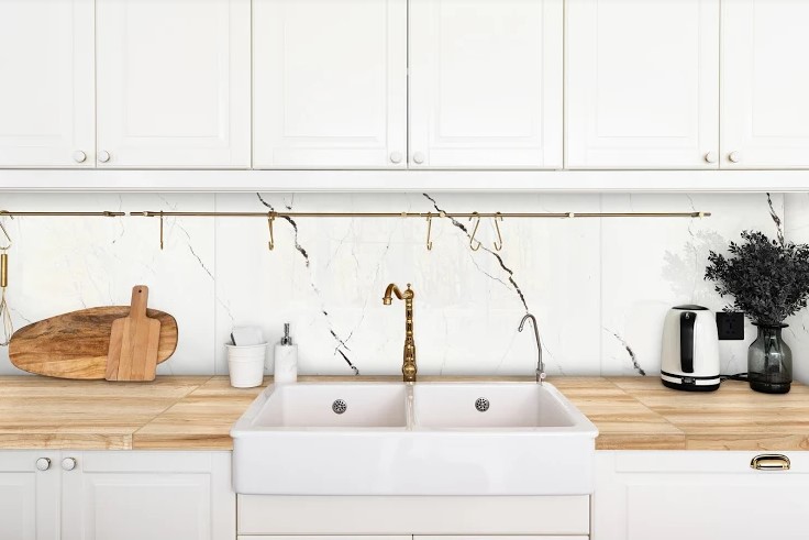
[60×120] Y1GL17GE

At first, the idea of whitewashing your kitchen might not be something that you’re inclined to do — and who can blame you? The kitchen is where you’ll be doing most of the cooking and cleaning. You’ll definitely consider the occasional tough stains and grimy surface that can leave an obvious, spotty surface.

However, an all-white kitchen isn’t necessarily something that you should be afraid of. Instead, take this opportunity to come up with a clean, spotless, and most of all, beautiful kitchen design that you can be proud of.

Start off by choosing white-painted wooden storage spaces for your shelves and cabinets. Add a striking contrast to the white hues by mixing in some light wood countertops — you can play around with different stains like ash, white oak, or alder which you can varnish to your preference.


Grayscale

Grayscale

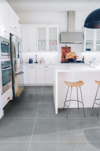
[60×120] Y1AC-51QE

If you’ve always wanted to create a grayscale kitchen, then you can certainly do so, as long as you know how to work with such a versatile design. Take note that this color is all about subtlety and nuances. It strikes the perfect balance for a relaxing and gorgeous kitchen space that just feels like home.

In this kitchen look, you can focus on various neutral and gray colors. It just gives off such a balanced and calming vibe that’s pleasing to the sight.

To achieve the look, try combining wooden and stainless steel/metal elements. It may be the perfect time to buy a new stainless steel refrigerator or range hood for your burner or induction stove. You can also include a small white dining nook with matching wooden-metal stools for seating.


Italian-Inspired

Italian-Inspired

[20×30] I-23XD

This Italian-inspired kitchen is every bit as wonderful as you can imagine. There’s simply nothing like having your own kitchen space that’s reminiscent of 19th-century spaces. You’ll definitely get a phantom whiff of all the delicious meals that have been invented in such humble, yet lively sanctuaries.

With this design, customization is key. Add a fun, wall-mounted condiment rack where you can put all kinds of shakers. Attach it to a beautifully-tiled glossy wall that comes in a light brown or beige color.


Modern Minimalist

Modern Minimalist

[20×20] 22AW1H-2, [15×60] A1562*

The most distinct feature about this modern minimalist kitchen is the rounded-corner kitchen cabinets that certainly add a fun, playful touch. It’s sleek and clean — two things that you definitely want out of your kitchen space.

This design idea combines features from traditional, whitewashed, or modern kitchens where stainless steel furniture is a staple. Highlight all of these elements by making sure that your kitchen has excellent natural and synthetic lighting. You can try buying fun pieces such as modern pendant lighting or even adding a glass panel door that can truly bring out the vibrancy of your kitchen.


Key Takeaway

In this list, we’ve explored some of the most popular kitchen decorating ideas. There’s every bit of everything for everybody, whether you love minimalist designs, contemporary looks, grayscale, or even Moroccan and Italian-inspired looks. You need only experiment with and combine components that just fit together.

As always, Floor Center’s tiles are the most suitable choice for any type of kitchen redesign. To learn more tips and tricks, check out our style guide here! You can also contact us for more information about our available tiles.

You may also join our FC Tile Viber Community Group. Be at the forefront of stylish trends, tips, and tricks that you can do with our tiles.