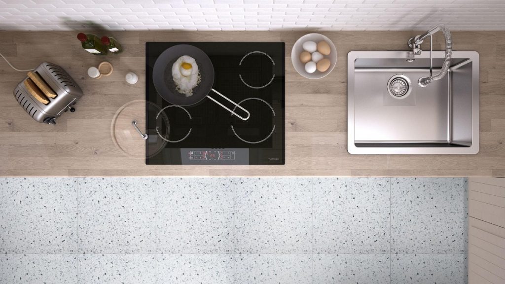
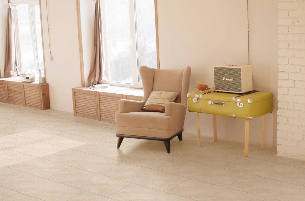
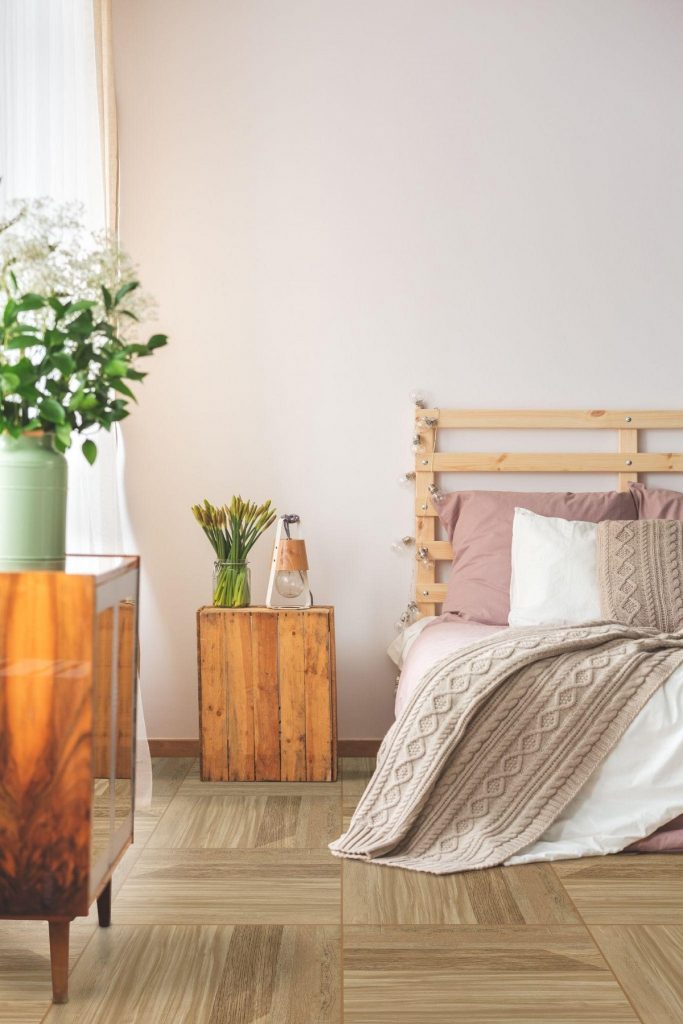
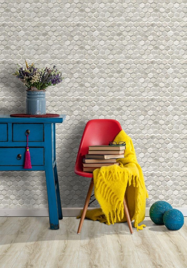
4 Design Ideas to Try with Large Porcelain Tiles by Floor Center

4 Design Ideas to Try with Large Porcelain Tiles by Floor Center

What are designs to try with large porcelain tiles from Floor Center?

  1. Classic White
  2. Sleek Marble Effect
  3. Sophisticated Black
  4. Modern Composition


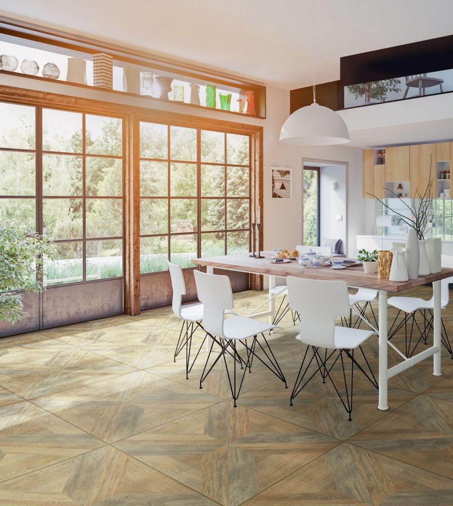
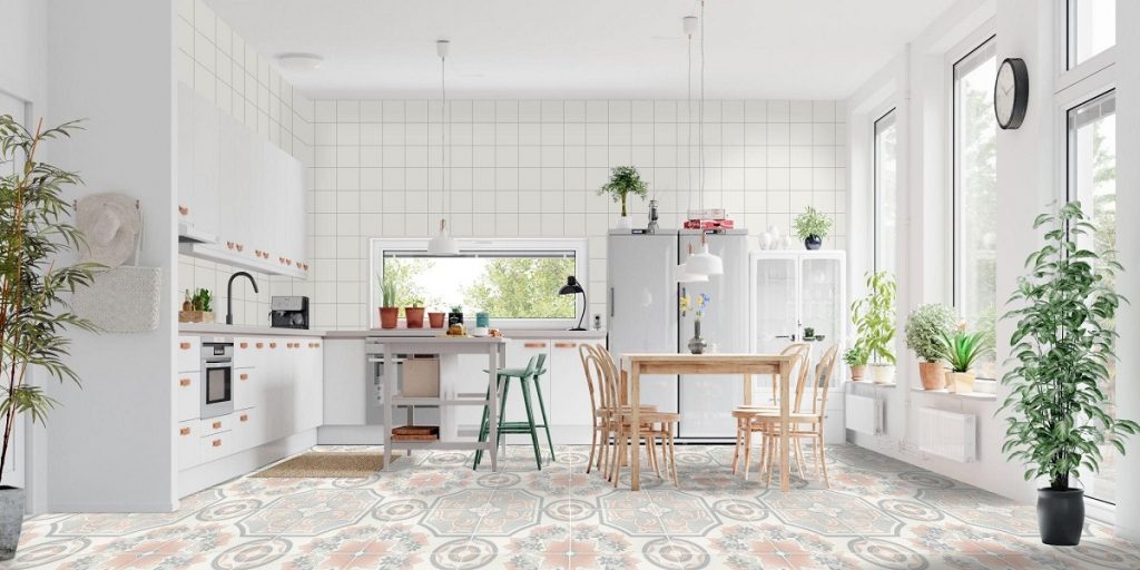
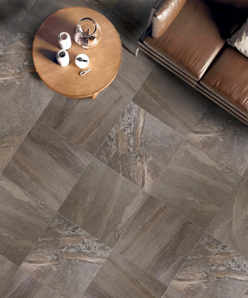
There’s just something about using porcelain tile: Whether you love using classic colors or are looking for a contemporary look, choosing the right tile design can be a game-changer. And nowadays, larger formats are trending for their aesthetics and their ability to transform any interior space. If you’re interested in using this style, you’ve come to the right place. To help you start brainstorming for a home makeover, we’ve come up with four designs to try with large porcelain tiles — made by Floor Center!


Classic White
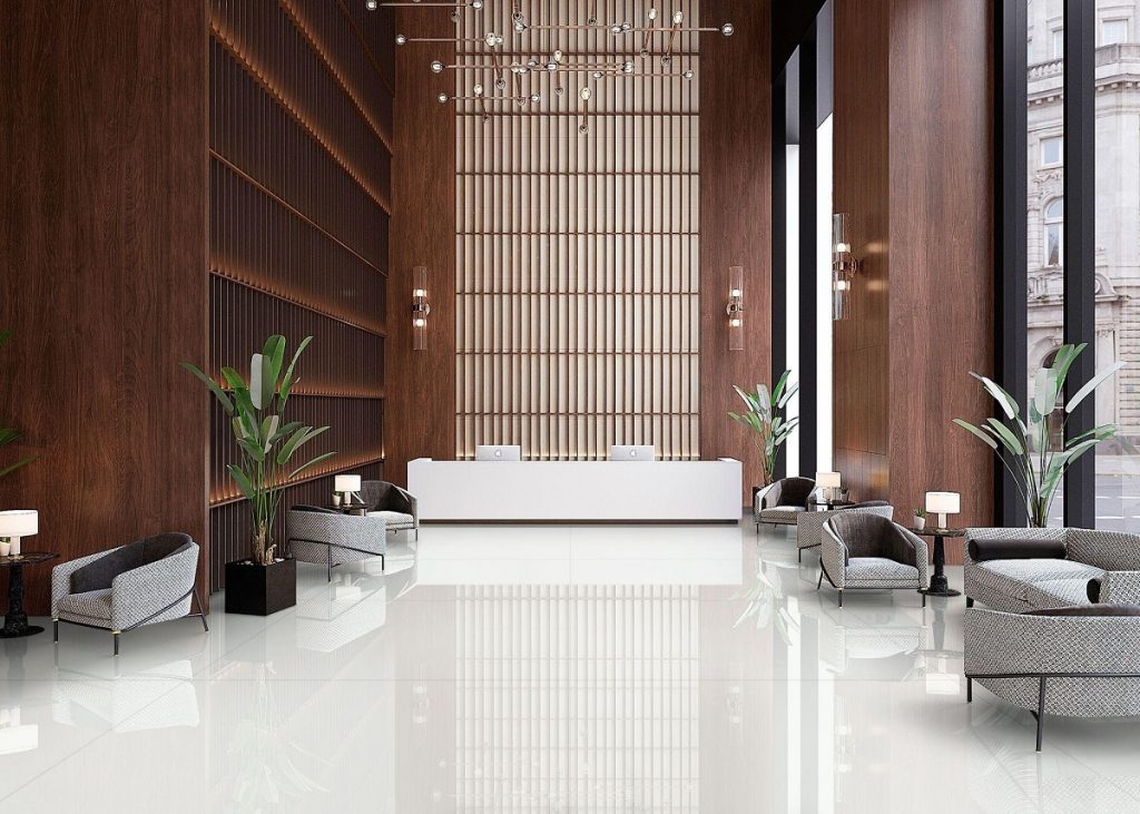
Classic White

[90×180] L0D6GA-80E

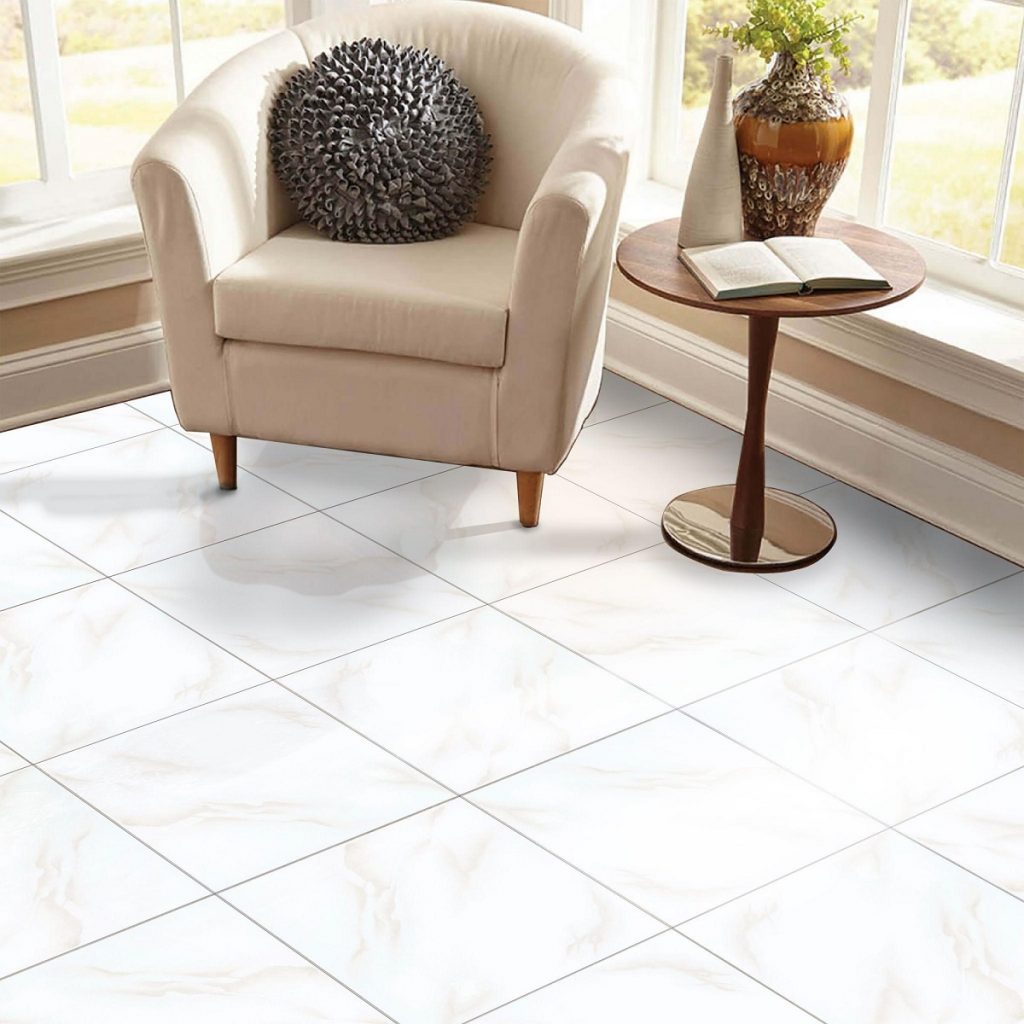
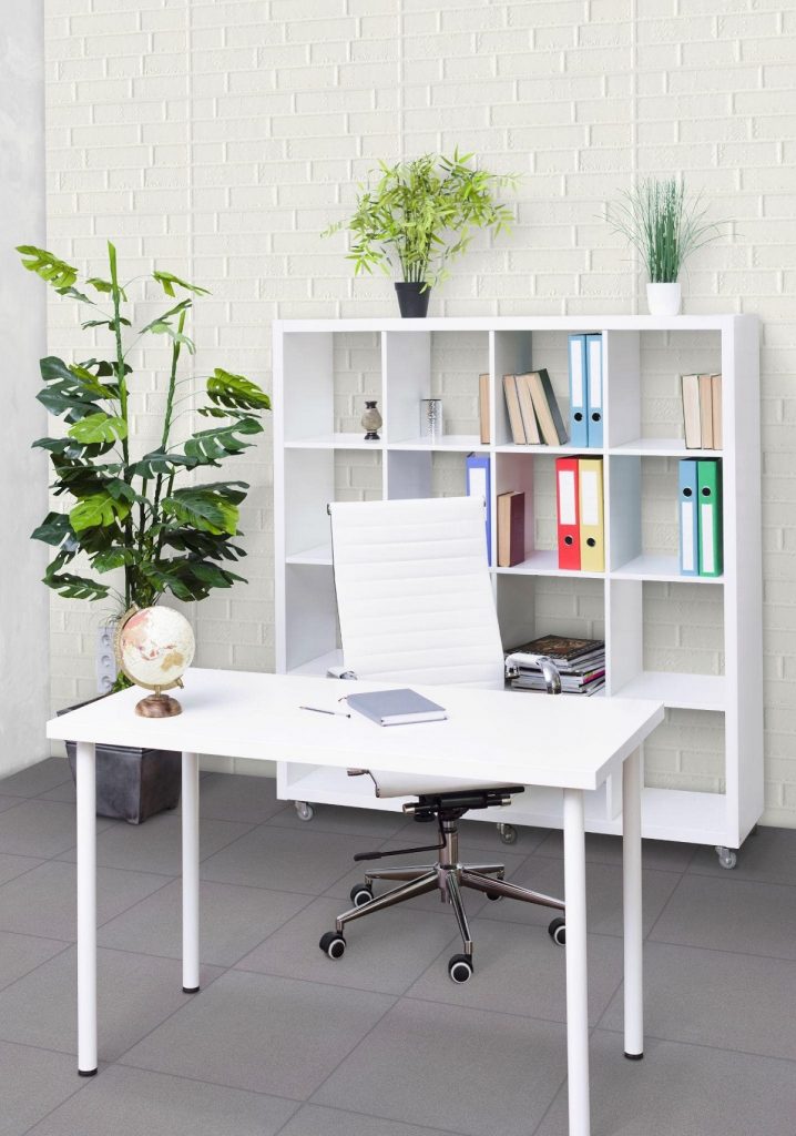
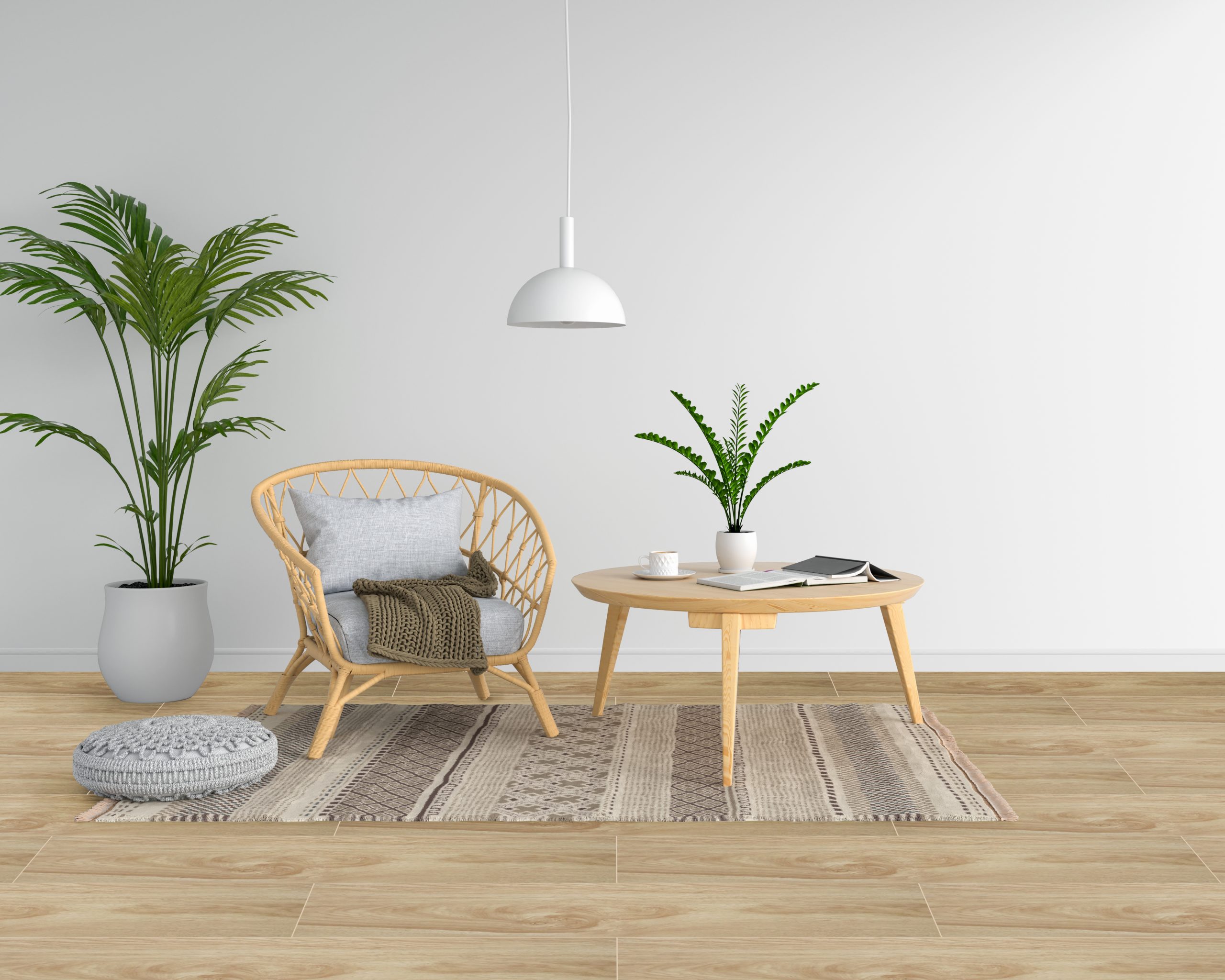
White is the staple of any modern or minimalist design. If this is the look you want for your home, our large porcelain tiles will help you effortlessly achieve this style. Our classic white tiles can make any space look bright and flawless, with an outstanding feel. This becomes more pronounced when used in open spaces, as our large tiles give the eyes relief from any distracting grout lines. The result? A room that looks and feels spacious.

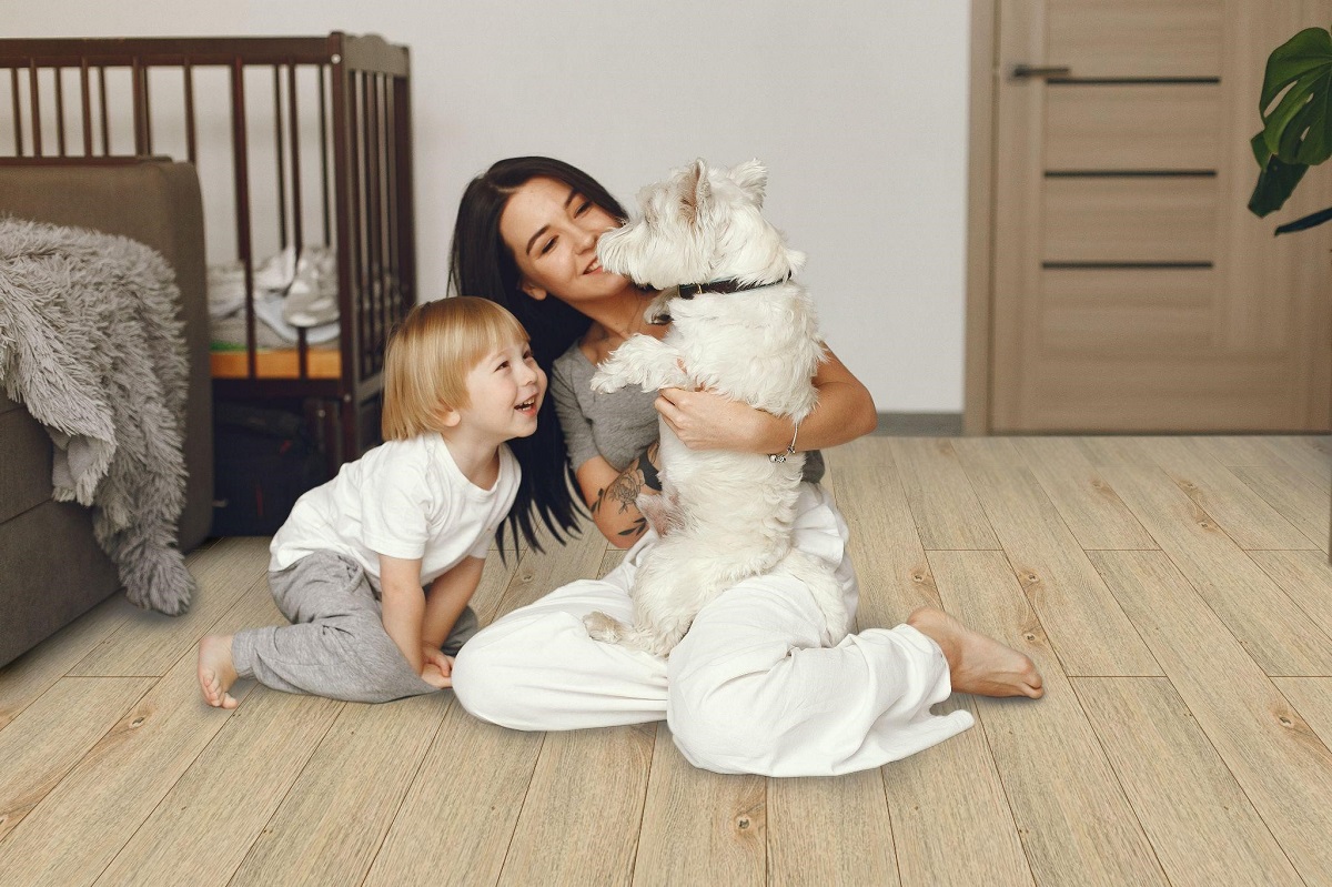
There are many ways to apply our large white tiles. You could install them horizontally, which creates the look of a wider space. You could also install them on your walls, which would make them look taller. As a plus, you don’t have to worry about any stains spoiling the image of your room. With tiles, white is a color you can fully utilize thanks to the material’s resistance to water damage, dirt, and chemicals.


Sleek Marble Effect
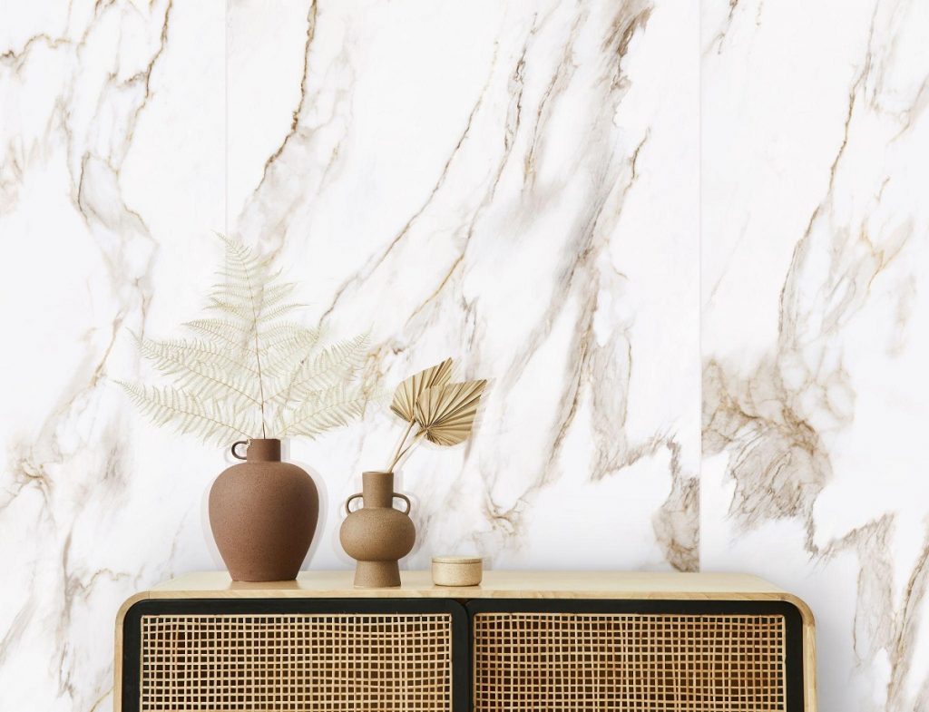
Sleek Marble Effect

[90X180] L0D6GA-02E

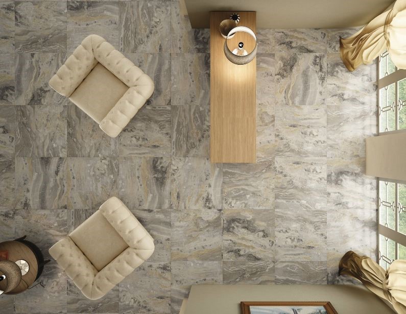
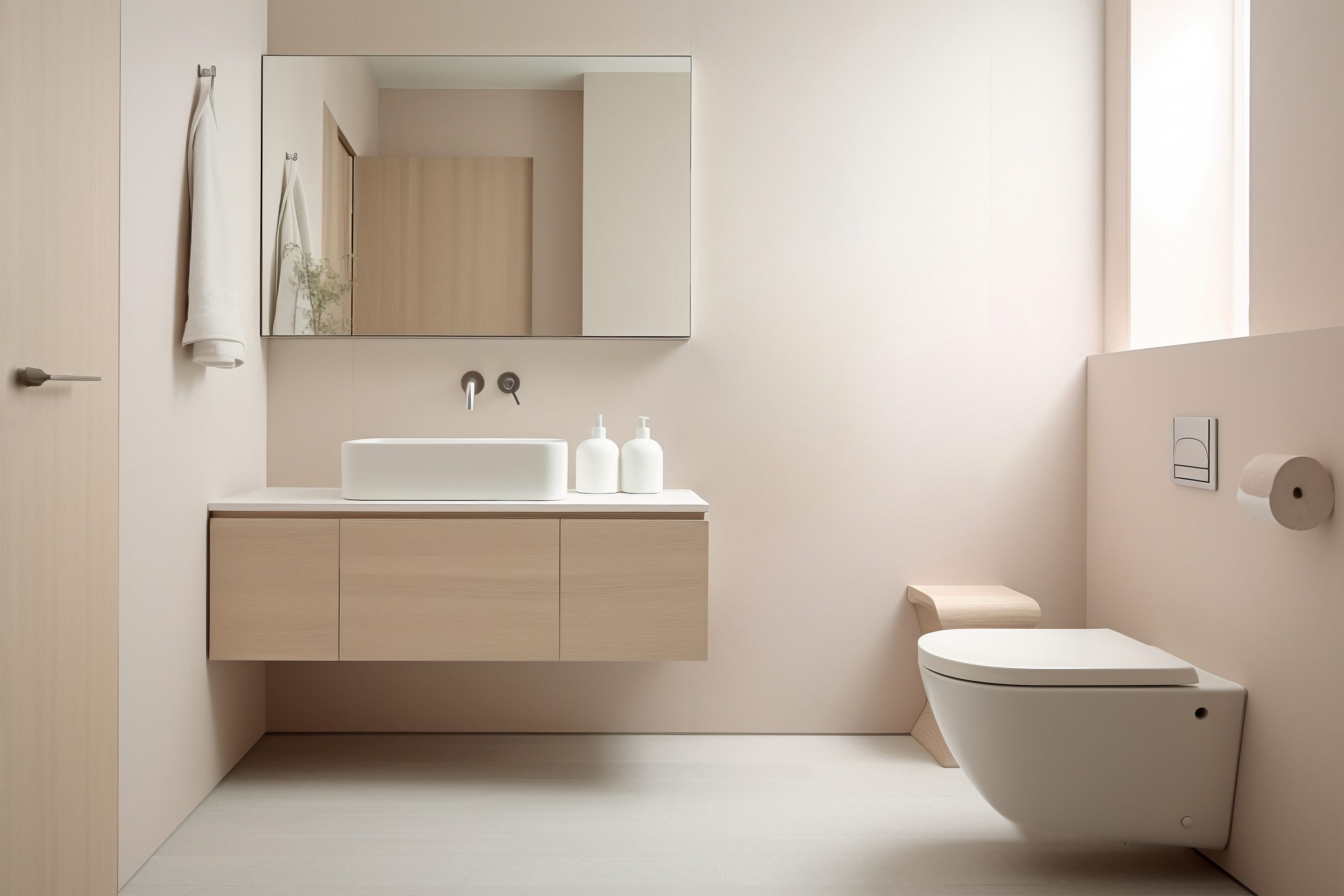
Choosing the right look for your large porcelain tiles is the best way to modernize an outdated room. In addition, using the right patterns and larger format tiles can make the space feel airier and vibrant. With our marble-look tiles, you’re sure to achieve a more luxurious feel for your interiors. Our tiles are designed to exude the sophisticated beauty of natural marble. What’s more, this design is preserved using highly durable material — porcelain. Applying our large tiles on your walls will create a timeless design that will make any home or establishment feel high-end.

For example, you could use our large marble-look tiles in smaller rooms, such as a foyer, sitting room, or bathroom. In these spaces, applying our large tiles to the walls of the room will extend the space, making it feel less cramped. The marble effect will not only update the look of the room, but also accentuate the spacious feeling. With the tile’s rich, polished white surface with marble veining, the eye perceives a larger, modern-feel room.


Sophisticated Black
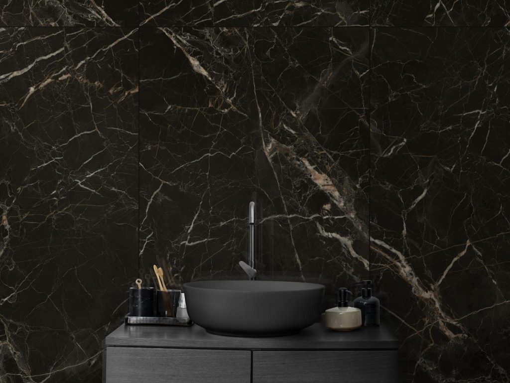
Sophisticated Black

[90×180] L9LE07BH

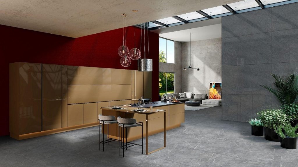
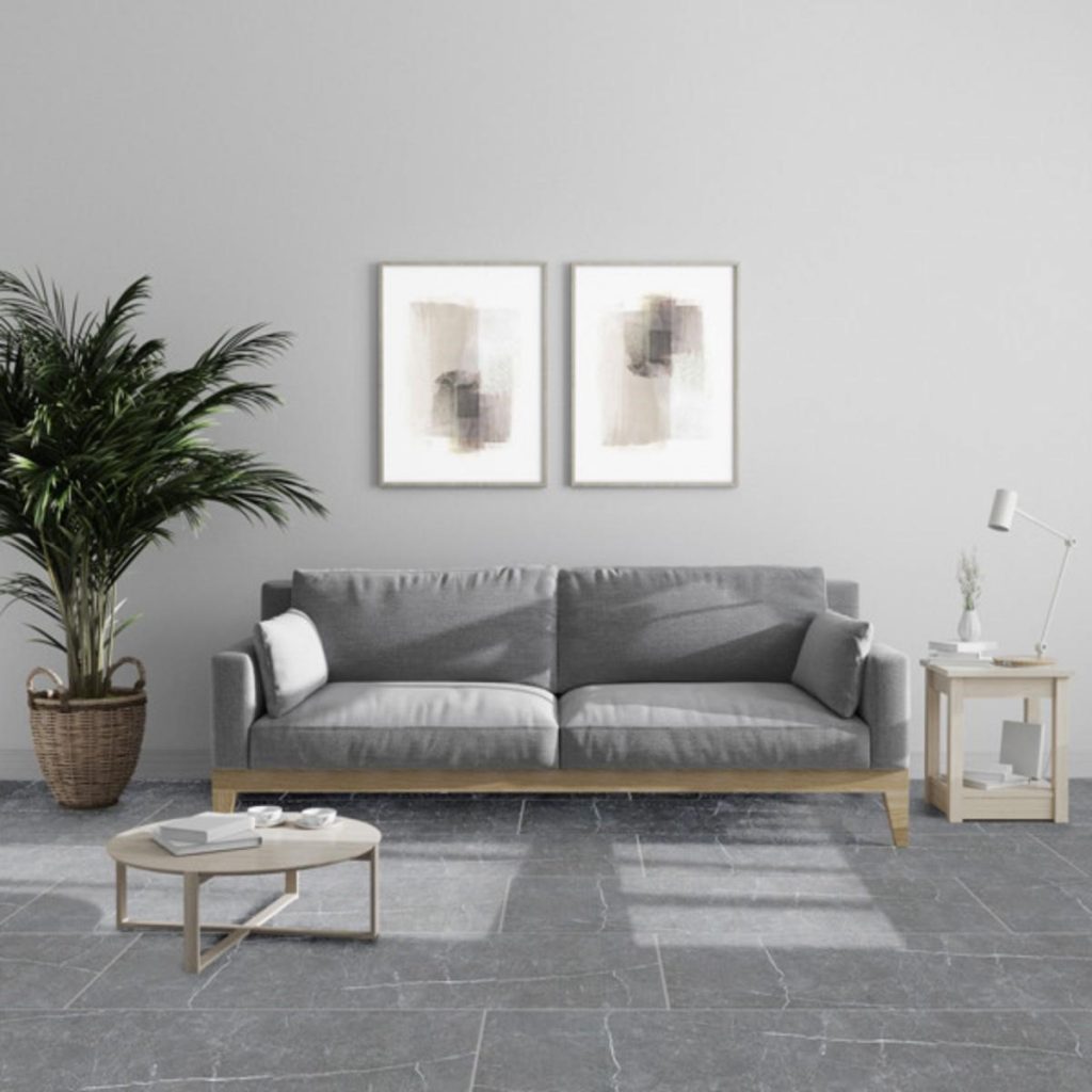
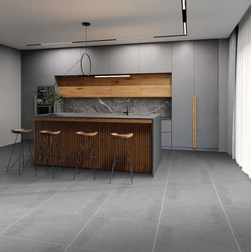
Using black creates a sophisticated yet cutting-edge aesthetic for your interior design. While using black paint to cover your walls might make a room feel smaller, this is not a problem for large black tiles. When using our porcelain tiles, you’ll be getting shiny and sleek surfaces that counteract the effect of dark colors. What’s more, our black tiles draw their finish from natural elements, creating a stone-like effect. Adding these black tiles to cover walls, counters, backsplashes, and other areas will enhance the beauty and ambiance of every room.

When using this tile, you might be wary about using such a large tile in small spaces. But don’t fret! No matter what size the room is, using large tiles will create the illusion of extra space. So, we highly recommend using this black tile in enclosed spaces, such as your bathroom. When applying this color, it is also a good idea to use the same material for both the floors and the wall, which will give a more unified look in your small space. Pairing this tile with a darker grout color will remove any lines that could distract from the décor.


Modern Composition
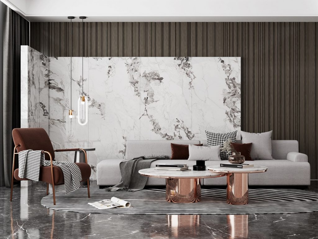
Modern Composition

[90×180] L9FL46UE

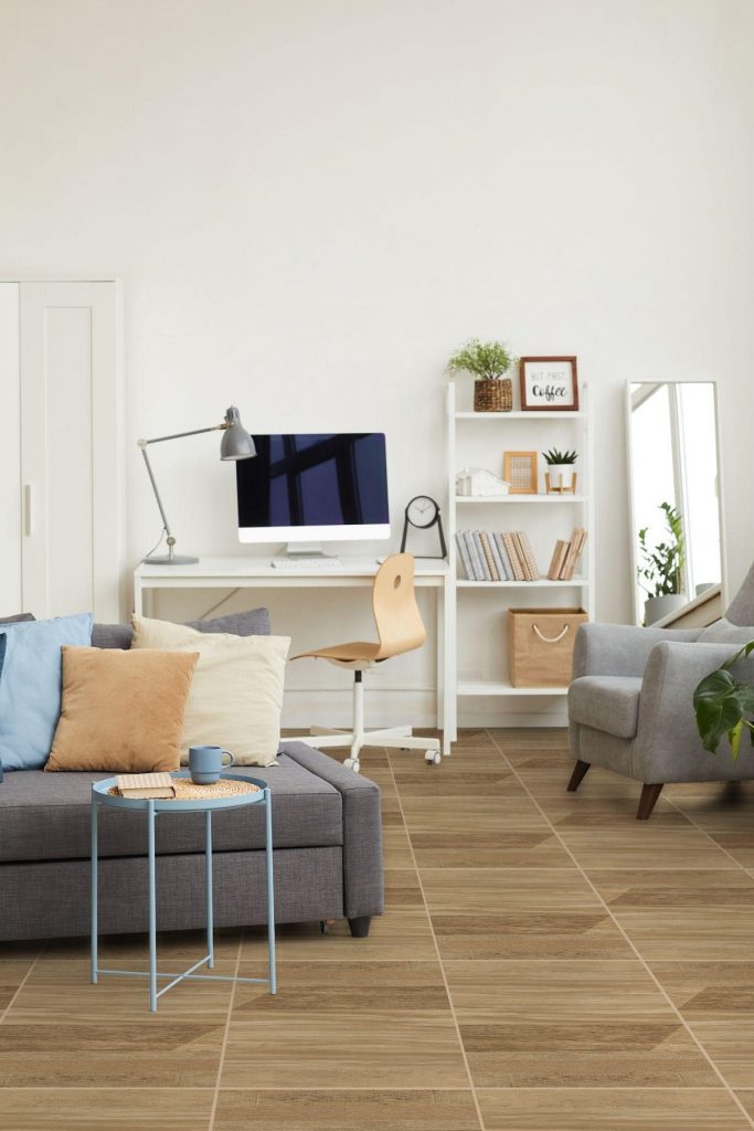
If you don’t prefer a streamlined look, then you could mix and match our large tiles to create contrasting surfaces. Consider using lighter tiles — such as our L0D6GA-80E or L9FL46UE — with the dark L9LE07BH tile. By choosing this combination, you can combine the look of a bright and dashing tile with a dark and stunning one. This bold look offers a sensational style that’s perfect for any modern home.

To apply this design, we recommend splitting your rooms into sections. Rather than using one tile for the floor and another for the walls, you can use the darker tiles for the floor and a section of the wall, while placing the lighter tiles from wall to ceiling. By using the large dark tiles to cover a majority of the space, you can create a subtler and muted environment — perfect for private areas, such as the bathroom. Furthermore, the room will still feel airy and spacious, as the lighter tile will extend the upper portions of the wall and give the illusion of a higher ceiling.


Why use tiles from the Whalemax Collection?
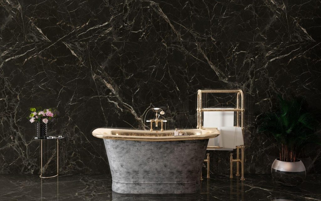
Why use tiles from the Whalemax Collection

[90X180] L9LE07BH

With the most advanced tile production techniques and equipment at our fingertips, Floor Center guarantees that our Whalemax Collection tiles are the best on the market. They will deliver high performance in any type of application, and provide a smooth, seamless look for any interior. This tile’s careful design provides other benefits, such as:

  • Made from 100% porcelain material — Every tile is highly water-resistant and can withstand high traffic and use.
  • Seamless installation — Super flat glazed surfaces with rectified edges.
  • Extremely durable — Can last a lifetime when properly installed and maintained.
  • Stylish and elegant — Timeless and tasteful designs that won’t go out of style.
  • Hygienic and eco-friendly — Free from toxic substances, with no negative impact on the environment even at disposal.


Key Takeaway

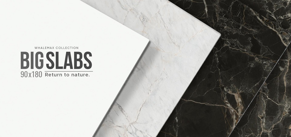
Interested in using one of these designs with large porcelain tiles? If yes, we have good news for you. These 90x180cm tile slabs are a limited collection made by Floor Center, and we’re now opening reservation slots for these amazing tiles. Reserve yours now by filling this form!

Feeling inspired? Browse through our design collections for even more ideas on how you can use tiles to transform your home. Our FC Tile Viber Community Group is also open for you to join and keep up to date on tile designs and trends.
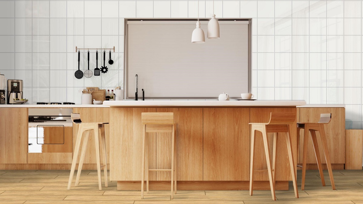
5 Timeless Kitchen Color Schemes

5 Timeless Kitchen Color Schemes

What are timeless kitchen colors?

  1. White
  2. Grey
  3. Black
  4. Beige
  5. Brown


It can be easy to get caught up in the hottest designing fad when remodeling your kitchen. However, these will soon fade out — leaving your kitchen looking dated. When you’re in your forever home, you want to choose color schemes and designs that can survive constantly changing trends.

So, it’s important to know timeless kitchen colors that can withstand the test of time, and which designs appeal to your personality and style. Luckily, we have just the guide for you! Here are some beautiful kitchen colors that can keep your home looking modern and sleek for the years to come.


White

White

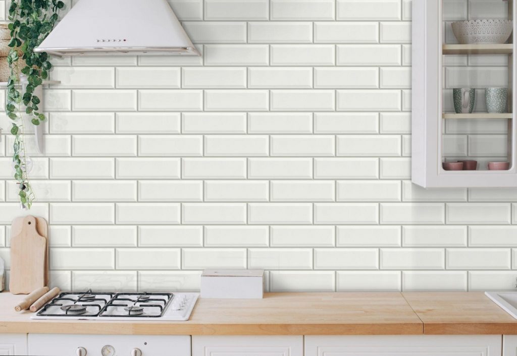
[10×30] 13GAW1

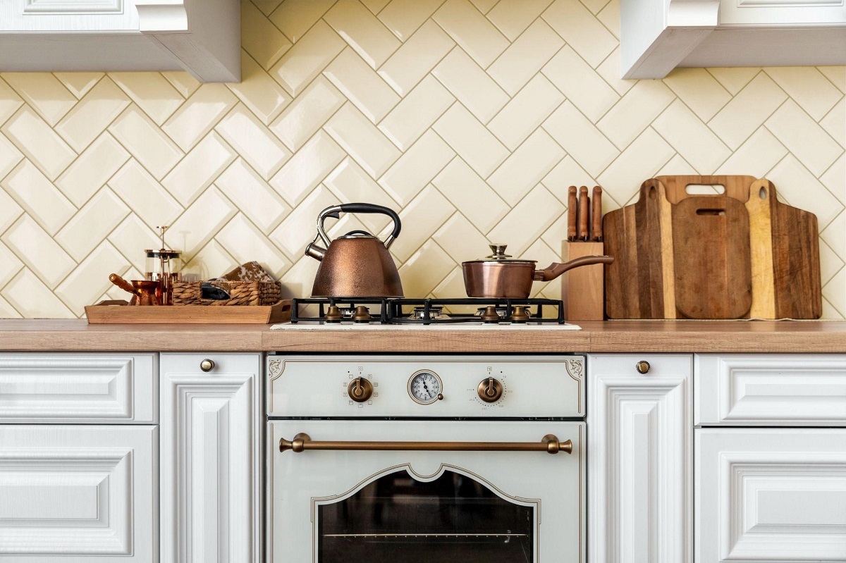
From farmhouse to ultra-modern, white-themed kitchens have been popular in almost every type of home. This is a testament to the color’s timelessness — if it can fit many different themes, then it can withstand the test of time. White is also a great color to work with, as any other addition automatically matches with this neutral color. White tile can be easily updated over the years with a change in cabinet color, or in kitchen decor.

With a white scheme, you can choose a variety of combinations. You could go for white subway tile and white floor tiles, and pair them with wooden cabinets and countertops for an all-natural look. You could also go for an all-white design using different shades of white, such as a white backsplash with off-white marble-look counters. The possibilities when using white tile are endless, and it is one of the most versatile options you can pick for your kitchen.


Grey

Grey

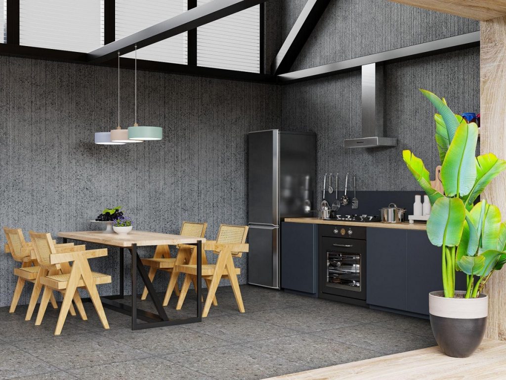
[60×60] P127-7

Pewter, dark gray, slate, concrete-like — all shades of grey tile make for an interesting color palette for your kitchen. Gray is considered a sophisticated and mature color and is pleasing to the eye. This is why many homes favor gray-colored tiles for their rooms, and why this color has been popular for years. Its popularity and timelessness have made it a staple color found in many designs, such as modern, rustic, Scandinavian, and minimalist homes.

Similar to using white, gray colors are neutral enough to be paired with many different design elements. That means using gray tile for your kitchen can fit many different styles, and can be easily updated by quick changes to the surrounding elements. For example, you could pair your gray tile with a darker backsplash, and finish the room with natural wood furniture. As time passes, you could update this look by changing the color of the backsplash, or replacing wood with steel. Whichever way you choose to go about it, using gray can bring a sense of calm into one of the busiest rooms in your home.


Black

Black

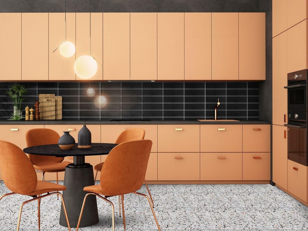
[60X60] P129-7 + [10×30] 13UDH1

Using black for your kitchen can be a more dramatic and bold choice — but it’s still considered a timeless color. While it is sure to make your kitchen stand out, the nice thing about black is that it’s still considered a neutral color. Meaning, it can blend in nicely with whatever style you choose to pair with it. Whether you’re leaning towards traditional, or mid-century modern, or eclectic, black just makes everything look good!

However, one of the things to consider when using black tile is that it can make your space feel smaller. To counteract this, try pairing your tile with brighter colors — like gold — as well as warm-toned fixtures and furniture — like warm browns and peaches. Using black subway tile as a backdrop will make these colors pop and appear more lively and vibrant. You could also use lots of light fixtures and a lighter floor tile to make the space seem less dark.


Beige

Beige

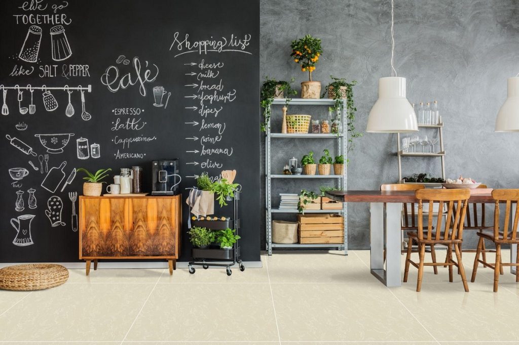
[60×60] V-C

Although white, gray, and black are the more popular colors that come to mind when you think of ‘timeless’ colors, using beige and pale creams can also be a good choice for your home. Compared to the other options, beige is considered to be one of the softer color options for your kitchen.

Like the previous options, beige is also neutral, but many people think that this color is boring and less sophisticated than the other colors. This is a misconception. You can’t go wrong with a good beige tile — it creates a comforting and timeless feel for any space in the home. This can be especially suitable for those who want earthier tones for a homely feeling in their kitchen. Using beige tiles in the kitchen works well with a variety of wood types, darker colors, and metal fixtures — perfect for mixing and matching.


Brown

Brown

[60×120] Y1AC-61QE + [60×60] P1414

Colors such as brown are naturally considered to be timeless because it reflects the colors we see in nature. Using medium to dark brown colored fixtures, such as cabinets and counters, has been a popular option since the 1970s. Up to now, this color is still one of the most preferred kitchen colors of all time.

To work with a brown color scheme, you can pair it with other elements you can find in nature. For example, you may choose to have brown cabinets and fixed appliances. In this case, tiles with a stone-like look are the go-to option for kitchen floorings. This is a modern-looking combination that can withstand the test of time.  Pairing the medium-brown elements with a cool-toned flooring gives the whole room a classic and sophisticated look, without dating your kitchen.


Key Takeaway

When remodeling your kitchen, consider using some of these timeless kitchen colors for your design. Using these colors will help you make your kitchen more stylish without becoming dated in just a few years.

Looking for supplies for your kitchen project? Let Floor Center’s tiles help you build timeless and sophisticated interiors. Check out our Styles & Ideas Guide here for more inspiration! Do you have any interesting kitchen designs that we haven’t covered? Our FC Tile Viber Community Group is here for you to share your ideas, and keep up to date on tile tips, tricks, and trends.

5 Tips in Designing Your Kids’ Rooms

5 Tips in Designing Your Kids’ Rooms

What are tips for designing a kids’ room?

  1. Keep it simple
  2. Play with color
  3. Make space for play
  4. Use decorative storage
  5. Choose safe and easy-to-clean materials


Designing your home can be a fun experience for the whole family. However, it can also be quite a challenge — especially when it comes to your kids’ rooms. Figuring out how to create a functional yet beautiful room that they will still love when they’re older is a pretty tall order.

Need some advice? We have some for you right here. These tips for designing a kid’s room are here to help you strike a balance between practicality, aesthetics, and your kids’ tastes. Whether you’re renovating an existing space or starting from scratch, you’re sure to find some helpful inspiration here.


Keep it Simple

Keep it Simple

[30×30] KLD0708-2

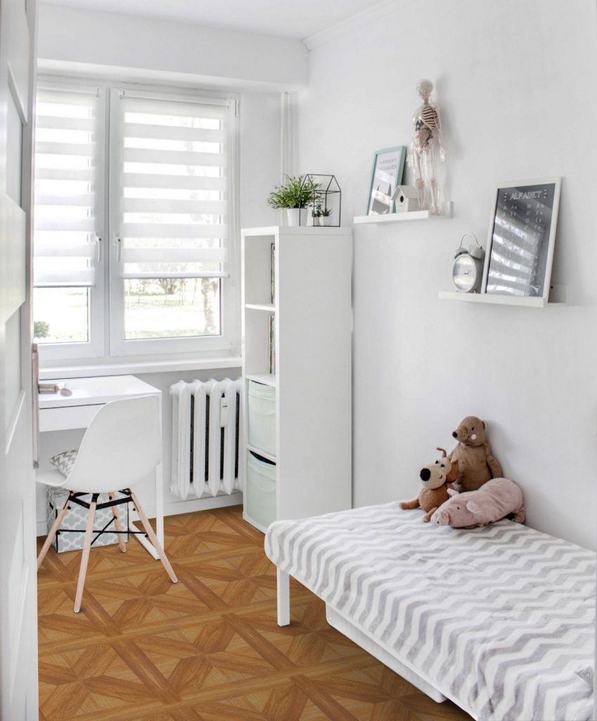
When it comes to your kid’s room, keeping it simple can work wonders. Especially if your kid is on the older side, less can be more. While bright pinks and a themed bed might seem wonderful to a young girl, a teenager probably won’t feel the same way. Many older kids may also want to start decorating their space on their own. By keeping the colors, decor, and furniture on the simple side, you give your kid a neutral canvas that they can easily change as they grow up.

For example, you could choose a white and gray color palette for their furniture, which provides a sort of blank slate for them to work with. This will give plenty of flexibility when they decide on what aesthetic they want. Pair this palette with some vinyl or wood-look tiles, and the room won’t look sterile while you and your child work on their room design.


Play with Color

Play with Color

[60×60] M77

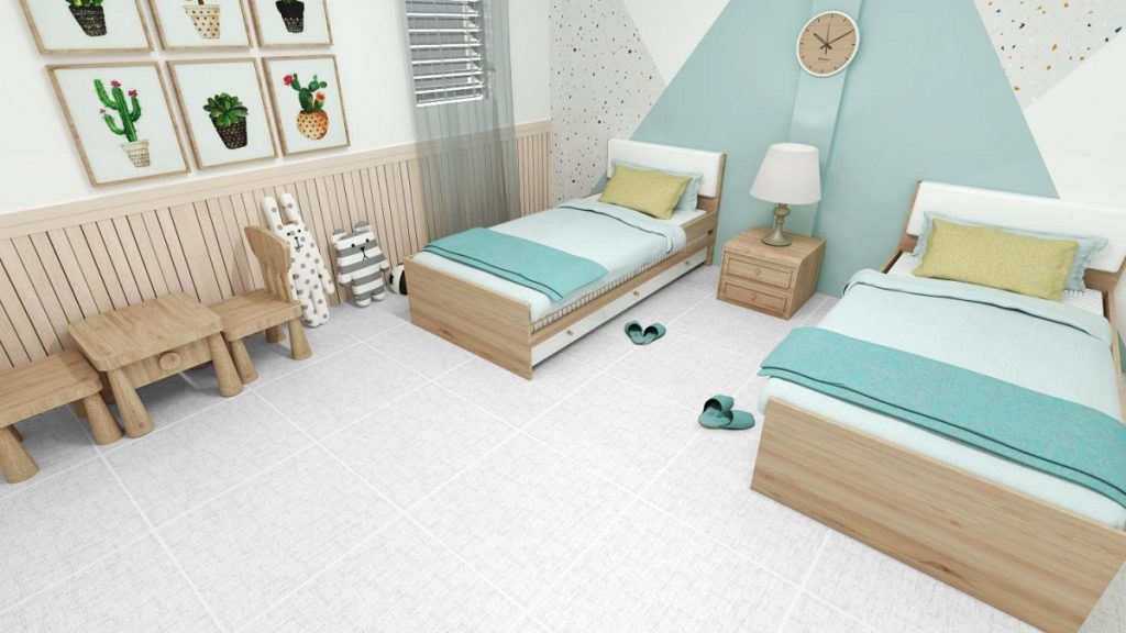
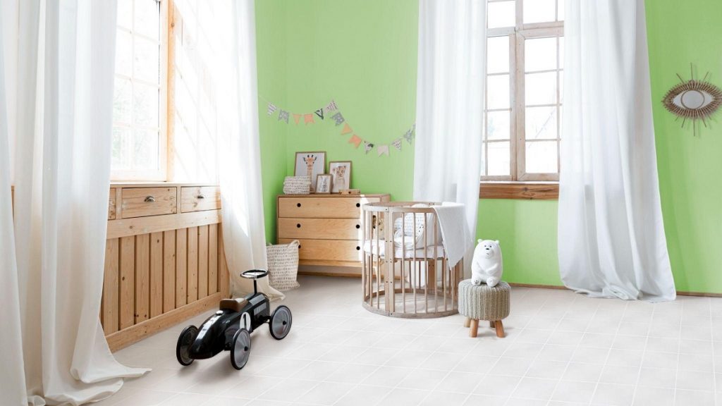
Keeping it simple doesn’t mean that you can’t use color at all. Colors are important — they can stimulate their imaginations and their mood. Kids love color, but their favorites may change over time. So, you should choose a design that won’t be displeasing for them in just a year or two.

Consider your kid’s favorite color and how you can use it to create a stimulating, but relaxing atmosphere in their room. One great way of doing so is to take the softer shades of their favorite color and pair them with complementary colors and simple textures. This is what was done in our example above — we made a colorful yet subtle accent wall. Paired with white textile tile design, it makes a calm yet cheerful look for your kid’s room. As a plus, this look is also pleasing even for older children, making it a long-lasting design choice.


Make Space for Play

Make Space for Play

[20×20] 2008

Making the most out of your child’s space is an absolute necessity — this also includes making enough space for them to play. To create a room your kid will love, make sure they have the room to do what they love the most. Houses with smaller rooms can use this trick to clearly define a play space for your kid. Use storage containers — such as shelves or cabinets — to create little zones in the room.

In these zones, give them the materials they need to work or play. For example, their play area should contain their toys, video games, and other play items. You can also use designs — such as a colorful wall or tile — in this area to stimulate their mood and imagination. Their school area could contain a small desk, a bookshelf, and storage for their school supplies to help them keep focused and organized. You can opt for neutral-colored tiles and walls in this area to help your child focus better.


Use Decorative Storage


Use Decorative Storage

[15X60] AI024

Kids come with a lot of stuff — they can collect a multitude of toys, games, books, and even clothes of all shapes and sizes. This means incorporating storage is of the utmost importance when designing your kid’s room. Having enough storage will help keep your kid’s room tidy, and their clutter out of sight.

Get creative when adding storage into their room. Make sure that your storage choices are functional, but still blends in with the theme of your room. However, you don’t need to stick with plain storage options — try some decorative ones! You could use bookshelves with interesting shapes to add some style to their room.

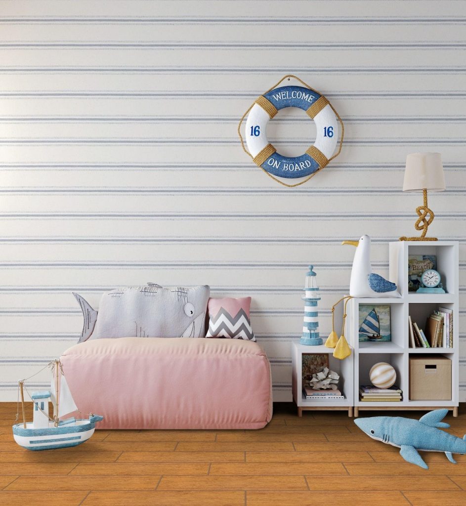
Or, you could pair some plain-looking storage with interesting toys. Placing them into different storage nooks can look great when arranged well. For example, you could use white shelves, decorate them with colorful books and stuffed toys, and complete the look with wood-look flooring. This creates an appealing yet warm look for a nautical-themed room.


Choose Safe and Easy-to-Clean Materials

Choose Safe and Easy-to-Clean Materials

[30×30] I-3460

Lastly, when designing your kid’s room make sure that you’re choosing safe and easy-to-clean materials. Kids can be clumsy and cause messes and accidents — it’s inevitable when they’re still growing and learning. This is why you should choose furniture and room materials that create fewer risks for your kid.

When choosing your furniture, avoid ones with glass pieces or sharp corners. If you currently have these kinds of furniture, you can cover these hazards with protective caps. It would also be safer for you to choose furniture with safe sliding and hinging mechanisms. This means avoiding slow-closing mechanisms as it can accidentally pinch or hurt fingers.

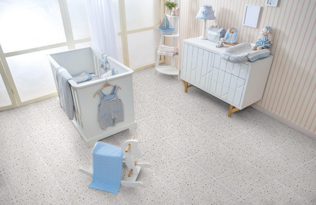
When it comes to the room’s materials, consider using tile. As children often drop and spill things, flooring that can withstand that is important. Tile is a durable option for your kid’s room and can withstand dropped objects without wear or dents. As a plus, they’re more water-resistant than other materials — that means things like spilled juice won’t seep in and create bacteria and mold. This also makes it easier to clean — water-resistant means that it naturally resists odors and dirt. Tile is the perfect material when dealing with a growing kid!


Key Takeaway

Designing your kid’s room is a unique challenge, and it can be hard to find the balance between aesthetics and functionality. However, using these tips for designing a kids’ room may be the trick to striking this balance for your home.

Need more design ideas? We have a blog just for you! Floor Center’s posts are made to help you find the most stylish design for your home! Click here to check out our latest design tips and tile tricks.

Have some of your own decorating tips for kids’ rooms? Join our FC Tile Community on Viber to share them with others! You can also contact us to learn more about our tiles and how they can fit into your design.

6 Style Ideas for a Modern Farmhouse Look

6 Style Ideas for a Modern Farmhouse Look

What are modern farmhouse-style ideas for your home?

  1. Think Neutrals
  2. Use Wood Accents
  3. Add Raw Textures
  4. Unite Styles and Eras
  5. Mix in Metals
  6. Keep it Family-Styled


Uniting a modern look with rustic touches — a modern farmhouse design combines the best of the old and the new. It harnesses a cozy, country look and marries it with contemporary elements to create a design style full of neutral tones, clean lines, and layered textures.

Whether you’re someone wanting an updated take on the farmhouse look or someone who’s in love with rustic chic, this design is perfect for you. For those looking to use this timeless style for their home, try these modern farmhouse style ideas! These tricks will show you how to integrate your love for homely and cozy decor into your home.


Think Neutrals

Think Neutrals

[30×30] I-3460

Neutral colors are the mainstay in a modern farmhouse look. Using white tones helps to keep the design timeless and classy. However, you can still keep things unique and fresh by integrating pastels, warm browns, and even light blues and greens. This is perfect for those who want a calm, but warm look for their modern farmhouse design.

For those wanting more contrasting shades, you can do so — just remember to use them as accents, not as a main component to your palette. Try using charcoal greys, emerald greens, navy blues, and even pops of bright yellow and red around the home. With these deeper accents, it moves the overall feel of your home from simple contemporary to a chic modern style.

Whichever accent colors you choose, always remember the key ingredient to this design — the neutral colors. They should always be the base colors for your home, so make sure to add varying shades of whites and creams.


Use Wood Accents

Use Wood Accents

[30×90] Q83-003PG

Expansive, modern rooms can feel cold and inhospitable without the right features. Adding wood accents, such as furniture with different tones and finishes, are the perfect design elements to use. Using wood accents can help add some warmth to your room while still keeping in line with a neutral palette. You can also use some textured wood pieces, such as the wood-shutter paneled benches in the interior above.

While using wood isn’t a novel idea when it comes to farmhouse decor, using different tones in the material is something new to consider. Try adding a few different finishes ranging from light to dark in a single room. Wood grains are naturally complimentary to each other despite the broad tonal shifts, so you don’t have to worry that one piece will look too out of place.


Add Raw Textures

Add Raw Textures

[40×40] F53

Embrace the natural surfaces of unfinished wood, stone, and metals to enhance the rustic look in a space. Using weathered and rough materials adds a sense of history and charm to your home. However, for this to work, these pieces need to be paired with sleeker elements, such as smooth and glossy surfaces. This contrast helps to accentuate the beauty of both the finished and unfinished elements.

Try using un-waxed woods, unpolished or tarnished metals, and even concrete pieces around your home. You can use the same kinds of woods and metals in the space, just with polished surfaces. The outcome is a space with a refined, but rustic feel, which is the overall aim of a modern farmhouse design.


Unite Rustic with Refined

Unite Rustic with Refined

[30×60] NHC63016 + [18×122] LD6187-5A

Adding modern and vintage design pieces creates a character-rich look for your space. Using old ceramics and metal containers as vases can create a contrast with the wooden textures around the home. Having worn pieces like an old coffee table or drawer in your living space can be a visual foil for the other white and polished furniture pieces.

Having this juxtaposition by including vintage and “worn-down” decor along with your more refined and natural pieces is a great way to achieve a modern farmhouse design while adding your touch to the style. Don’t be afraid to reuse and recycle, and even work on the decor yourself. Shop around and bring in vintage items that can add history and depth to your home.


Mix in Metals

Mix in Metals

[60×60] CL20

Don’t just stick with wood; you can mix in metals too! When thinking of metal pieces, industrial design comes to mind. This style is rooted in hard finishes and raw textures — also common in farmhouse styles. To marry metals into your space without deviating too far from a modern farmhouse look, add in elegant ceramic and glass decor, and throw in some delicate textiles.

If you’re adding metals, consider using unfinished surfaces, and using mainly iron, copper, and brass items. You can mix polished and rough pieces of the same metal to create some contrast. Like in the interior above, you can use reclaimed iron sliding doors to open up your living room and decorate with dining chairs with polished iron legs.


Keep it Family-Styled

Keep it Family-Styled

[40×40] S4040A + [15×15] 15AW1

Whether you decide to stick with light accents, unfinished pieces, or forgo the vintage touches, there is one key thing you have to always include in your design. At the heart of the modern farmhouse look is a warm and welcoming space for family (and friends!). So, make sure that your home is designed to embrace your loved ones, and provide cozy spaces for everyone to sit back and relax together.

Try using islands and bar stools in your kitchen. This subconsciously invites people to come up and chat with you while you’re cooking or fixing up a snack. You can also add plenty of seating options around your home to create a comfy environment. This also encourages people to relax, while providing many spaces for people to hang out in. Overall, making these design choices creates a welcoming and comfortable atmosphere for your family and guests.


Key Takeaway

Modern farmhouses are the perfect mix of warmth and refinement. Adding rural styling and natural elements into modern interiors creates a sophisticated yet cozy feel. If you’re considering this look for your renovation or new home, try out these modern farmhouse style ideas. These tricks can help you create this wonderful design for your home while helping you add your personality to the process.

Bring your ideas to life with Floor Center’s wide range of modern design-inspired flooring. Whether you’re going for more contemporary or more rustic looks, we have just the option for you!

Feeling inspired? Check out our Styles & Ideas Guide to find ways to incorporate your aesthetic and dream styles into your home. You can also share ideas and inspiration with our FC TIle Viber Community Group! Share your thoughts and hear from fellow tile experts about new tips and tricks to using our tiles.

5 Design Tips for A Modern Home Office

What are design tips for my modern home office?

  1. Go for Dark and Elegant
  2. Opt for Light and Bright
  3. Create Some Contrast
  4. Try Warm Neutrals
  5. Use Sophisticated Marble and Ceramic


Home offices are needed now more than ever in the new reality of the pandemic. With many of us working from home nowadays, creating our workspaces helps us to focus on our professional responsibilities.

For those who haven’t done so yet, knowing how to design your space can help with productivity. So here are some design tips for a modern home office to create your own space that is functional yet aesthetically pleasing.

When it comes to modern home spaces, we recommend going for simple and clean elements. With this design style, we let go of loud, fussy, and dramatic decor. Instead, we keep an emphasis on using neutral color palettes and natural materials. This creates a professional and classy look for the room — perfect for the worker at home!


Go for Dark and Elegant

Go for Dark and Elegant

[60×60] 6186P

You can give your home office a striking look by choosing darker hues with a moody finish. This interior design style draws inspiration from an industrial style and natural elements mixed with a dark color palette. You can use flooring with brown, black, and gray hues — like walnut flooring or stone-look tiles. You can even choose flooring options that use a mix of the three colors.

Your furniture and decor can also help set the tone for your space. Using wood and leather accessories works best with this palette. For example, choosing your seating in brown — such as a leather office chair or couch — can help tie the theme together. You can also fill your shelves with darker colored books, and incorporate an art piece or two with subtle colors.

You can also deviate from a fully dark palette. Shades like black and grey can be complemented by lighter shades, such as soft browns and greens. If you choose to accentuate your design in this way, make sure to use other colors in moderation. This way, you can still keep the character of the elegant design while still giving it some unique charm.


Opt for Light and Bright

Opt for Light and Bright

[40×40] S4040B

If you’re not interested in using darker colors for your office, that’s okay. Light and bright color palettes also work great. Using these colors can bring a fresh and vibrant mood into your space, which can help with your mood and productivity during work hours.

To achieve this design idea, use light color palettes that heavily feature shades of white. You can use light natural tones (such as beige) or pastels (like a light blue) for accents. For decor, you can brighten up your space with shiny materials — such as floor tiles — or by adding some light fixtures around your desk.

This kind of design works best with rooms that have open spaces and lots of natural light. The flooring, walls, and decor that you choose can also help your office feel more spacious and airy.

When choosing the decor, modern Scandinavian furniture can be an absolute hit with light colors. If you’re looking to add some style, choosing simple wood furniture and ceramic knick-knacks also works well in this design. Adding some potted plants can also give the room some bright spots of color. These design elements can create a delicate, yet elegant feel for your home office.


Create Some Contrast

Create Some Contrast

[30×60] P-3610 + [40×40] 432

Using a contrast of colors can also be a great design choice for your home office. Dark colors can look sleek and formal, while light colors can add a touch of simplicity and elegance. Together, they create a stylish palette. This idea is great for those who want their office to have such an aesthetic.

There are many ways to bring this design scheme to life. You can pair white furniture with some white brick walls and dark grey flooring. You can also opt to use darker-colored furniture, and this would not affect the overall feel of the office. When using a mostly white color palette, consider adding a black accent wall to add more contrast to the room.

There is a vast variety of ways to incorporate this theme into your modern office. This versatility when choosing your floors, walls, and furniture can be fun for many homeowners. If you want to create a more detailed look, you can also add decor featuring small designs in black and white. You can also add pops of lively colors — like blue or yellow — to add some bright features to the room.


Try Warm Neutrals

Try Warm Neutrals

[40×40] F53

Having a calm atmosphere can be very conducive to your work at home. Using warm neutrals can create that calming effect, and promote your feelings of comfort even when facing stressful work situations. This color palette is perfect for those who want a quiet and serene working environment.

This design scheme is also ideal for a modern and minimalist look for your office. We recommend that you use neutral flooring options — such as light-colored wood or wood-look tile. For walls, you could use plain white to keep the design simple, but you can also use any warm colors with a paler gradient, like a pastel yellow.

With this palette, avoid using any design elements that can create a harsh contrast — such as neon colors — and use as much natural light as possible. Natural light can accentuate the warm hues of your room and highlight any wood and metal elements you decide to include. Using all of these design tips, you can create a soft and warm space for your home office.


Use Sophisticated Marble and Ceramic

Use Sophisticated Marble and Ceramic

[60×60] A06GZGMA-GY0.G0P

Using marble touches in your design will work for those who want a more sophisticated look for their modern home office. An easy way to integrate these elements is by using marble-look tiles for your flooring. This can then be surrounded with furniture and decor following a brown palette. Using brown — the color of simple elegance and earthiness — is a great way to make an elegant yet cozy space to work.

Marble-look tiles are gorgeous pieces that give a room a lot of character and depth. Each tile would have a unique look to it, with varied designs and colors. With grey and white tiles, they often have cream and brown streaks that complete a luxurious look. These tiles also have a natural luster to them, especially if they’re polished. It provides some distinction and clarity to the design of the modern home office.


Key Takeaway

If you’re looking up some design tips for a modern home office, then this guide is the perfect tool for you. Using these tips, you can experiment with new design ideas and tricks to nail the modern look. With inspirations from natural and industrial elements, these tips can help you design a gorgeous and functional home office.

If you’re planning to start your project, finding the right supplies to redesign your room is an important part of the process. With Floor Center, you will have a variety of tiles to choose from — perfect for any dream design you’re aiming for. Check out our catalog today!

Curious to learn more? Check out our Styles & Ideas Guide here! You’re also invited to join our FC Tile Viber Community Group!

4 Zen Living Room Decor Ideas

4 Zen Living Room Decor Ideas [40x40] F46

What are some Zen living room decor ideas?

  1. Neutral tones
  2. White spaces
  3. Minimalist
  4. Natural stone-look


Originating from Japanese concepts of tranquility, meditation, and relaxation, Zen living room decor ideas have all been about bringing these elements into your home. What started out as a way of life eventually branched out into interior decoration, redefining the way people designed and used each of their spaces. What better way to liven up your home and create a fresh new look than with Zen-inspired looks that explore the roots of introspective architecture?

Any Zen living room focuses on making the entire area as relaxing as possible. It’s getting rid of the zany centerpiece that sticks out like a sore thumb, or the mismatched furniture making everything look outdated. Instead, Zen promotes creativity through a Japanese-inspired way of life — simple, yet alluring; minimal, yet stunning.

If you’ve always wanted to create an elegant living room space with these nuances in mind, then this guide is here to help you out. From versatile tones to outdoor vibes that freshen up your indoors, these ideas below can help you recreate the look into your own space. Check them out!


Neutral Tones

Neutral Tones [30x30] 03P

[30×30] 03P

Many contemporary Zen styles to date tend to veer towards the classic white or black — and for good reason. These two shades are extremely easy to work with. Not only that, but they build the foundation of any Zen interior design — neutral tones bring about a calming and soothing effect to any room, provided that they’re executed well.

Aside from these familiar shades, you’re also welcome to invite other colors like beige, dark blue, dark gray, or even earth tones. Your floral upholstered furniture may be swapped out for modular couches in grey tones, complete with matching accent pillows.

If not your furniture, then you may also apply Zen concepts to your walls, floors, hanging installations, or even passageways. Wooden doors or custom-built nooks, shelves, or any wood-designed storage space add a fitting contrast to the rest of the neutrality.


White Spaces

White Spaces [60x60] ME6010

[60×60] ME6010

In any Zen-to-be living room, you simply can’t go wrong with using white shades. There’s just something about this tone that’s distinctly Zen — it creates a tidy and clean-cut look that makes your interiors feel cohesive, seamless, and well-organized.

You don’t necessarily have to work from the ground up just to incorporate white into your living room. It can be a simple choice of changing the furniture, choosing the right additions, or bringing in more natural lighting into the space.

The idea is to add any shade of white in locations that you see fit. Whether it’s with your varied combination of coffee table decor or what have you, white shades offer a calming effect that’s unmistakably Zen.


Minimalist

Minimalist [60x120] L12601

[60×120] L12601

Marie Kondo made waves in 2019 for her “KonMari” method of decluttering spaces, tidying up, and getting rid of anything that does not “spark joy”. Many have likened her interior design philosophy to be a subdued version of the minimalist style — subtle, yet completely nails what Zen decors attempt to achieve.

You too could adapt this technique into your living rooms by following a few design conventions. Zen minimalism is the perfect opportunity for you to get organized, starting with this part of your home. Take a look into each piece currently taking up space — any piles of books or papers on flat surfaces simply have to go. Take away anything that doesn’t belong and place them back inside appropriate storage spaces like magazine racks, drawers, mounted shelves, and the like.

Once you’ve taken care of all the mess, try focusing on what you can do to populate the space without being too overwhelming. A small, Japanese-inspired decorative bowl may be a good centerpiece, combined with a small stack of coffee table books to while you or your guests’ time away.


Natural Stone-Look

Natural Stone-Look

[30×90] G2C-25NPEA

Finally, no modern Zen architecture would be complete without natural stone. Since time immemorial, decorative rock or stone structures have been foundational pieces in Japanese gardens. They have always been the Japanese’s representations of colossal architecture like mountains, Shinto Shrines, or Buddhist statues revered in ancient and modern history.

Now, you can also bring a piece of this tradition to any Zen living room inspiration by choosing natural stone look flooring. Floor Center’s tiles are perfect for this, as they create a sleek surface by which to base other matching Zen pieces. Add fresh pops of color with indoor plants or landscape artwork that ultimately match the vibe you’re going for. Find wooden finishes to complement the stone-inspired flooring and complete the entire look.


Key Takeaway

Zen living room decor ideas may be elusive to the beginner interior decorator, but the key is to understand what this design movement seeks to convey — that is, relaxation, calmness, and introspective spaces.

Try out a combination of these techniques on the list above. Neutral colors make for a perfect backdrop, complete with wood furniture and matching tones. Then, transform the entire space into a fully functional room by taking concepts from minimalist styles for clutter-free and truly Zen living quarters.

Interested in more stylish design tips? Check out our Styles & Ideas Guide to learn more! We’re also welcoming you to our FC Tile Viber Community Group! Be up to date with the latest tile tips, tricks, and trends, wherever and whenever.

4 Interior Design Tips for First-Time Home Buyers

4 Interior Design Tips for First-Time Home Buyers [30x60] Milan13 + [60x60] P147 4

What are some interior design tips for first-time homebuyers?

  1. Plan it out
  2. Invest in good lighting
  3. Personalize the style
  4. Begin with a relaxing color palette


Interior design tips for first time-homebuyers may seem daunting at first, but they’re quite easy to master once the ball gets rolling. If you’re reading this, you’re probably coming up with a number of ways to style your interiors, be it your bedroom, dining room, living room, kitchen, or what have you. Nothing is set in stone yet, but you already have a vague idea of where to place each piece of furniture, what type of lighting to use, and which decorations you may want to put up. The most important thing, after all, is getting everything in the right place.

For new homeowners, the prospect of designing your interiors from the ground up is both challenging and exciting. It’s easy to get swept up in all the newness of the experience. However, you have to keep a few basics in mind. One of which is focusing on both the function and design of your space, so as to make it as conducive to living as possible. Try not to rush into things — instead, take your time and savor the moment of carefully designing your brand new abode. Check out these tips below!


Plan It Out

Plan It Out [30x90] G2C-25NPEA

[30×90] G2C-25NPEA

Having a plan allows you to figure out what kind of work needs to be done in your house if there are any. When moving into a new location, most people have this tendency of changing everything about the place, even when unnecessary. Doing this will only take up too much of your time and expenses on unneeded repairs. Keep it simple and focus your attention on only the areas that need TLC.

Ask for an existing floor plan of your house — this already includes all the measurements, layouts, and overall structure of the area. From there, you’ll be able to picture where the furniture will be located, where the lampshade will stand, or which areas need a fresh new addition of windows. You can also consider working with an experienced design professional to help you make architecturally sound choices that simply work.


Invest in Good Lighting

Invest in Good Lighting [30x60] Milan13 + [60x60] P147 4

[30×60] Milan13 + [60×60] P147 4

One mistake that new homeowners make is that they don’t take lighting into consideration early on in the design process. More often than not, this aspect becomes more of an afterthought, with many owners eventually discovering just how inefficiently lit their spaces are.

That being said, the lighting should also be a key factor when designing a new home. In particular, the bathroom and the kitchen should be well lit because this is where the bulk of household activities are done. Aside from buying typical ceiling fixtures, you should also try out accent, ambient, zone, mood, and natural lighting to brighten up the rest of the space.

Kitchens, for example, might do well with an addition of modern pendant lights. Some owners may want to keep it straightforward by using recessed lighting or adding window treatments instead. You can also choose a combination of different lighting techniques to come up with a well-lit and coherent space for the entire property.


Personalize The Style

Personalize The Style [20x23] A23SZCBR-DGY.M2U

[20×23] A23SZCBR-DGY.M2U

While you have all of these style conventions to pick and work on, you should always incorporate a few of your own personal tastes and style in your interior design. You’ve put all your blood, sweat, and tears just to purchase your very own home — it makes sense to make it an extension of your personality.

Design each area in the house according to how you or your family members would use them. Are you a fan of open-plan spaces? Then a multipurpose living room might be to your liking. Want to showcase you or your kids’ artwork? Peppering living room walls with framed pieces make for a quirky and colorful space.

Don’t be afraid to put on a display of your personal collections or transform your bedroom walls into an interactive map canvas that tells the story of all the places you’ve been to. Make your home distinctively you.


Begin with A Relaxing Color Palette

Begin with A Relaxing Color Palette [40x40] F46

[40×40] F46

Personalizing your new home is much easier when you have a color palette to work with. For this, try starting off with relaxing color schemes that offer you design flexibility and versatility.

Choose from an array of relaxing color options, such as ivory, white, sage grey, navy blue, sky blue, cream, blush, pale yellow — the list is endless. Each color can create the desired look that you can work around to choose furniture, decor, floor tiles, wall tiles, and other elements.

More than just the design aspect, relaxing tones also have a positive impact on your mood. Interior design is as stressful as can be, but the right colors and pieces can offer relief from all the welcome madness.


Key Takeaway

There you have it — four interior design tips that first-time homebuyers will definitely appreciate when moving into a new home. Remember that you don’t have to limit yourself to these tricks. Focus on finding your own groove and working with a style that not just works from a design standpoint, but also as a place you can call your own.

Whether you’re buying a home for the first time or remodeling your space, make Floor Center’s tiles a part of it! Check out our Styles & Ideas Guide to find more design inspirations you’ll definitely love. You’re also invited to be a part of our FC Tile Viber Community Group! Exchange ideas with fellow homeowners and interior design experts on the latest tile tips, tricks, and trends.

4 Modern Rustic Design Ideas

4 Modern Rustic Design Ideas

What are some modern rustic design ideas?

  1. Gray textile look
  2. Carved white
  3. Natural stone
  4. Brown + white duo


The modern rustic style is a marriage of natural and modern elements. Modern rustic design ideas continue to highlight this uncanny charm in various ways. Designs have always highlighted open-plan spaces, incorporated contemporary furniture while featuring exposed natural elements wherever architecturally appropriate. Perfecting a modern rustic vibe may be elusive, but the key is to focus on simple color schemes and using pieces that bring a little bit of the outdoors inside.

Many people make the mistake of overthinking it when designing a modern rustic room of any kind, but it shouldn’t be the case. It all starts with choosing pieces that will work together from a visual standpoint just as they would on their own. For example, a piece of stainless steel chair is stylish on its own, but pairing it with reclaimed wood or wood-look finishes just takes the aesthetic to a whole new level. Try it out for yourself with these unique ideas below!


Gray Textile Look

Gray Textile Look [30x90] G2C-01NPEA 1

[30×90] G2C-01NPEA

Starting off this list is a gray textile look for your flooring. It’s chic, clean, and simple — all the makings of a modern style that’s surprisingly easy to complement. With neutral tones, you can pretty much choose anything under the sun to balance out contrast and complementary.

Add a splash of color to these unique neutral tiles by using light wooden furniture. If you’re thinking of making them a part of your dining room or kitchen. Take it up a notch with furniture selections, like backless wooden bar stools, a long island table, wooden cabinets, or modular storage shelving, or wood slat cabinets with fresh new hardware.


Carved White

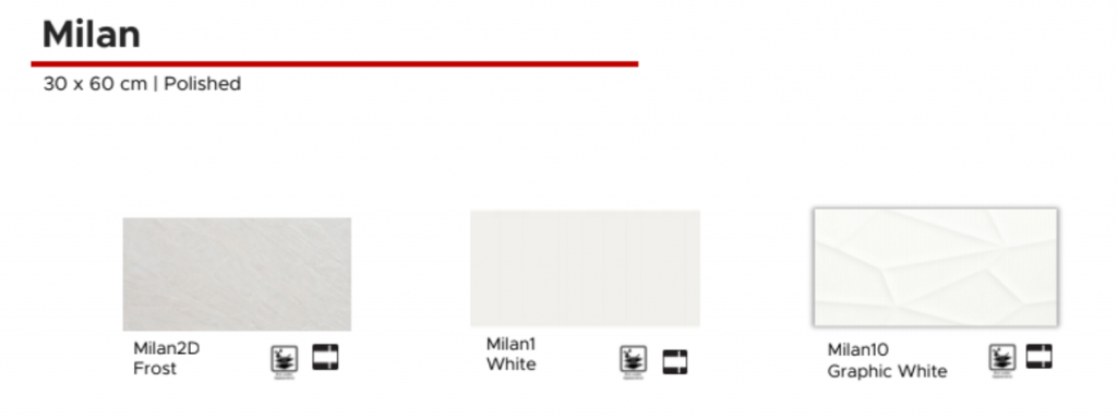
Carved White Milan

Many may be daunted with designing a white modern rustic bathroom, but there’s definitely nothing wrong with going back to basics, as long as you use this shade in a creative way.

Floor Center’s embossed white tiling, in particular, is a classic standout for this kind of interior style. It also works well as a subtle backsplash because the alluring texture offered by these tiles is a breath of fresh air from the usual generic tile fixtures.

What’s more, is that this tile is modern rustic exemplified — add some flair to your space by inviting in a piece of nature through reclaimed wooden elements that can complete the look.


Natural Stone

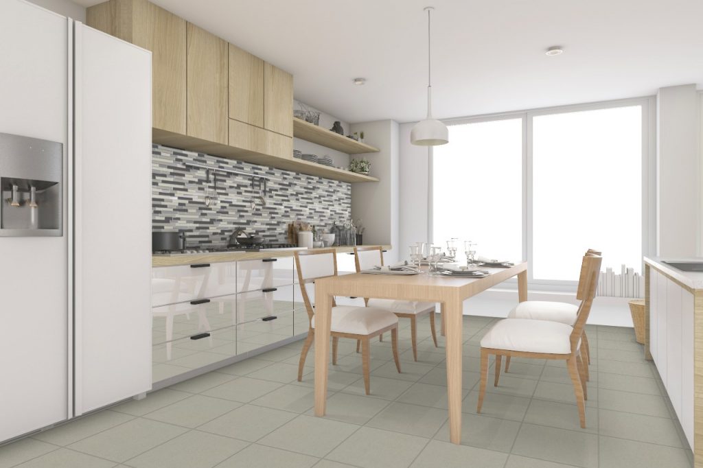
Natural Stone [60X60] P147 4

[60X60] P147 4

Working with natural stone tiles may be easier for outdoor spaces, but there’s no reason why they can’t be part of the indoors. Along with wooden styles, natural stone floors can elevate your spaces to the next level.

Check out the space above — the large format 60×60 gray tiles help to create a spacious kitchen effect, yet the kitchen doesn’t at all look barren. This is because while the gray color gives off a cohesive look, the modern furnishing and sleek accents create a stunning effect that fills the room. Add a touch of creativity by combining this large format tile with a classy and colorful kitchen backsplash that exude opulence.


Brown + White Duo

Brown + White Duo

[30×30] 3885P + W-04

The best thing about modern rustic is that you can mix and match a combination of high-modern and natural styles to come up with a look that simply works. You don’t have to limit yourself to totally modern or totally rustic — play around with various looks and incorporate classic touches here and there for a nice balance.

Instead of a completely whitewashed dining room, for example, you can take inspiration from the photo above by setting up a dining table complete with semi-tufted side chairs. Then, you can focus on other styles, such as pendant lamps or an industrial-style sink backsplash. Wooden elements and metal inserts, appliances, and cookware will provide the distinct modern rustic finish perfect for your project.


Key Takeaway

Are you looking for perfect modern rustic design ideas to revamp your interiors? This guide teaches you a few key tricks to nail this style. Take inspiration from these looks that will certainly make your home worthy of the modern rustic distinction. From industrial-fusion styles to simple gray looks, these ideas will have you designing gorgeous spaces in no time at all.

Make Floor Center’s tiles a partner to your every home decoration project. Learn more about various style ideas you can do by checking out our Styles & Ideas Guide. You can also be a part of our FC Tile Viber Community Group and exchange stunning tile ideas for your spaces.