CARPET VS. VINYL: CHOOSE THE BEST FLOORING FOR YOUR HOME

Choosing the right flooring for your space is crucial, setting the tone for the entire room. Two popular contenders often come into play among the many options available: carpet vs vinyl tiles. Both have their own set of advantages and considerations, making the decision a challenging one. In this blog post, we’ll delve into the showdown between carpet and vinyl tiles, exploring aspects such as durability, maintenance, aesthetics, cost, and installation to help you make an informed choice for your flooring needs. 
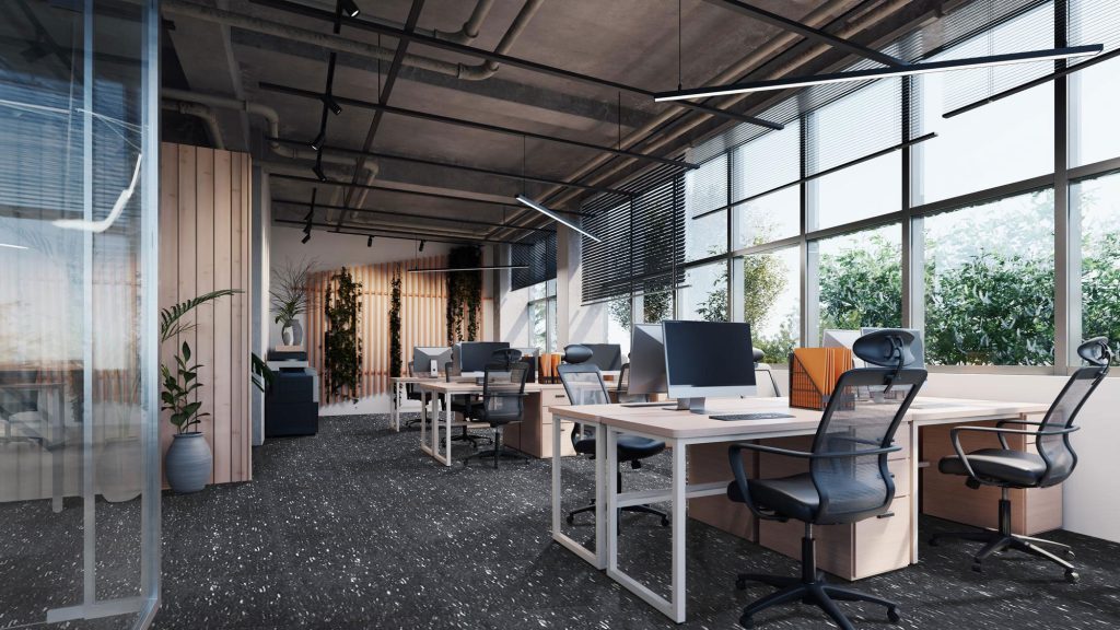
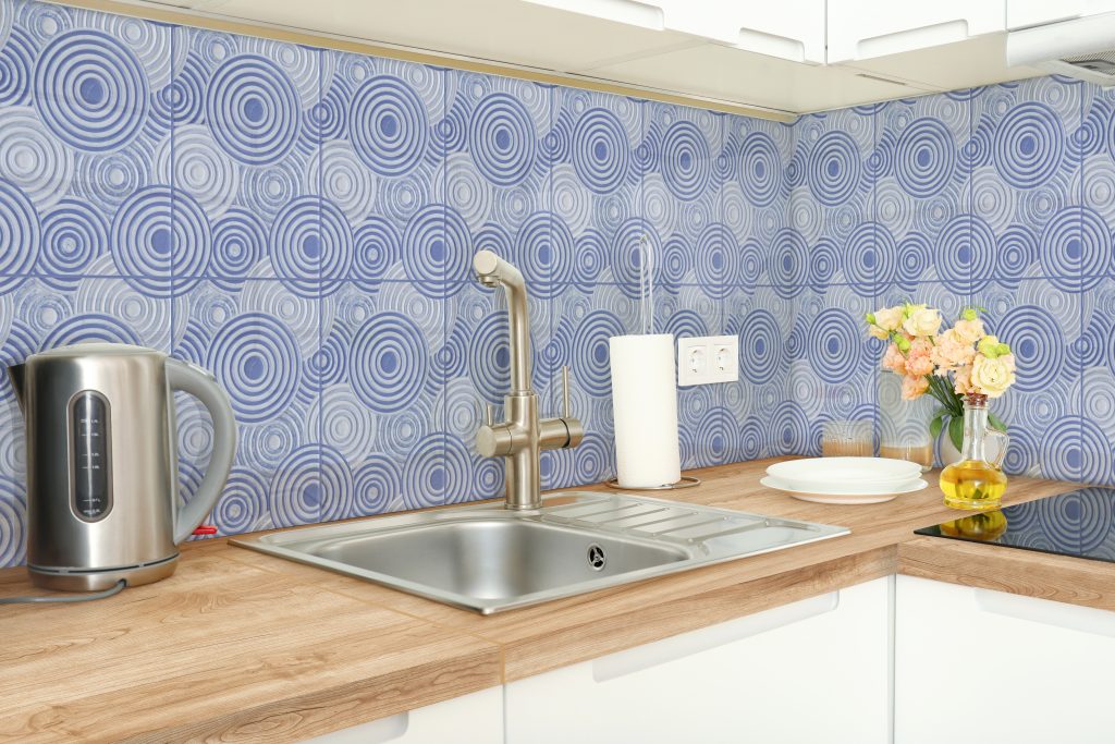
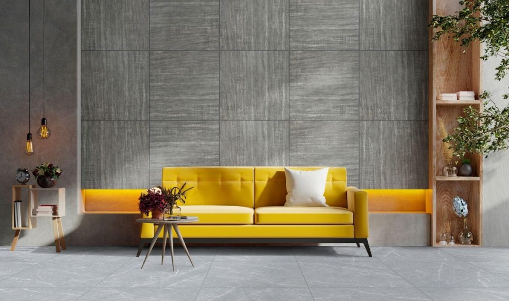
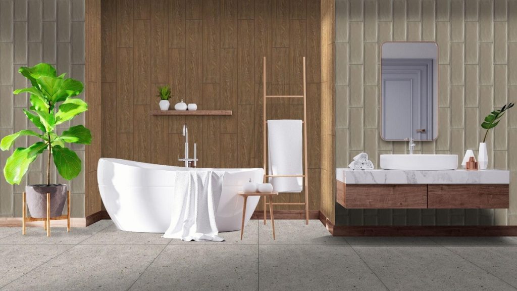
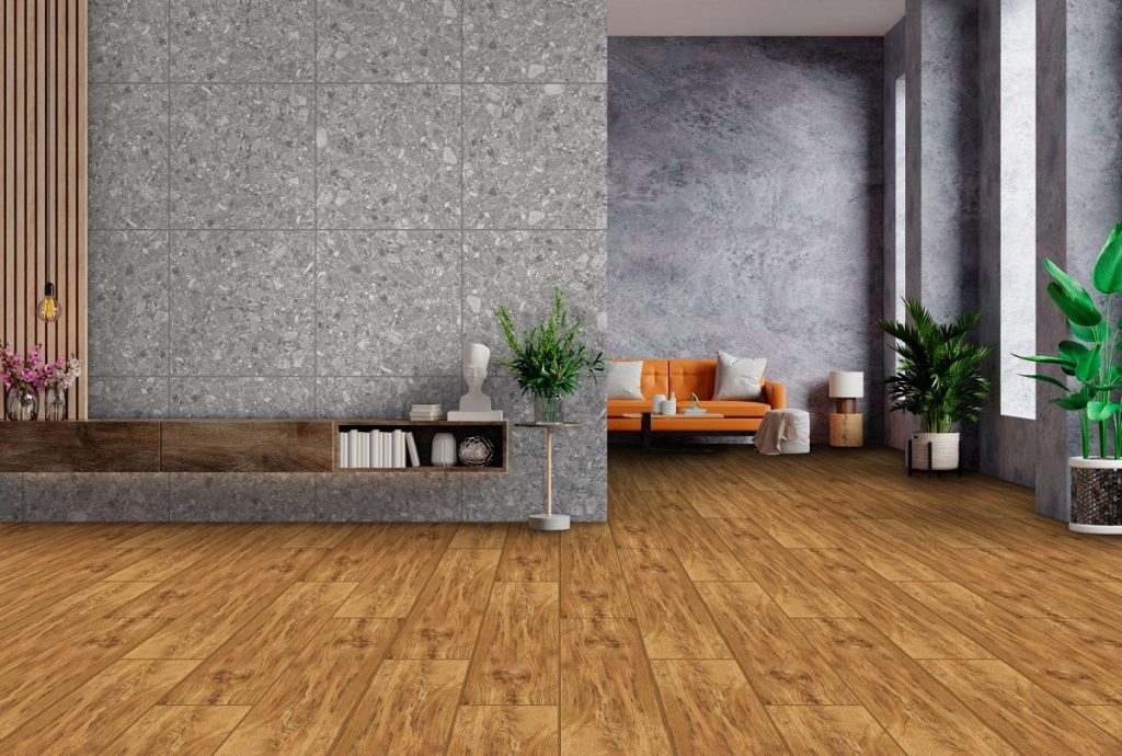
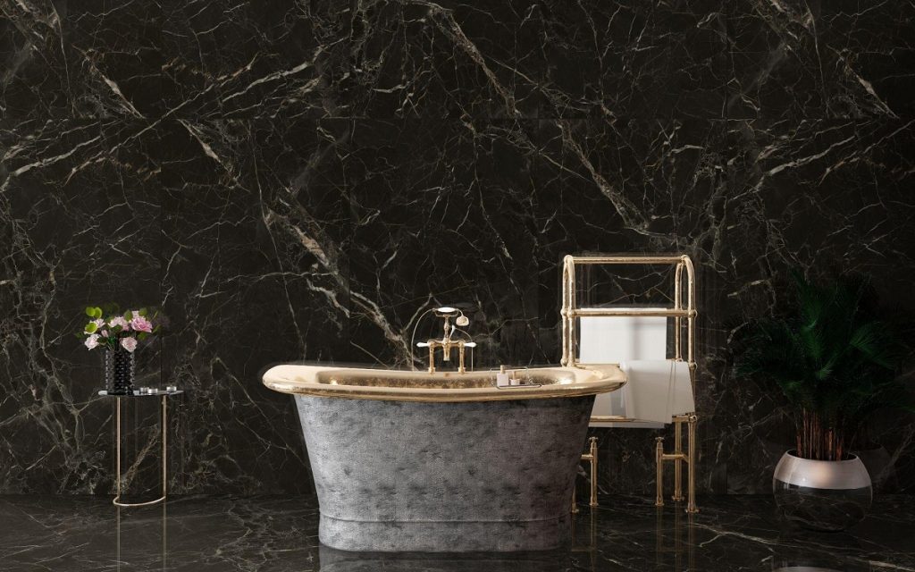
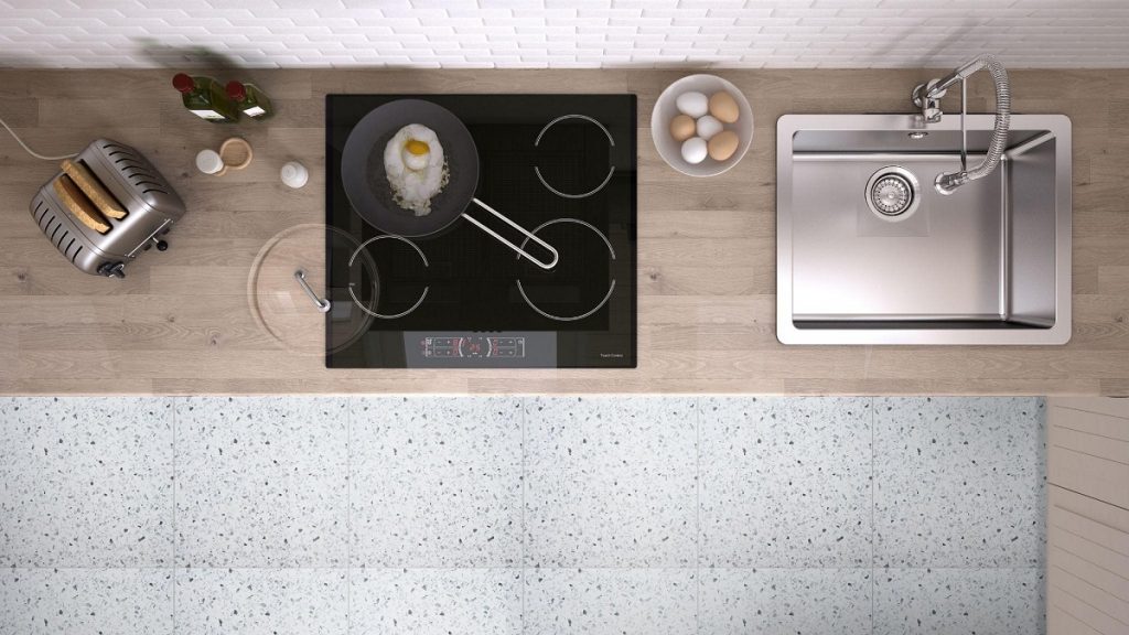
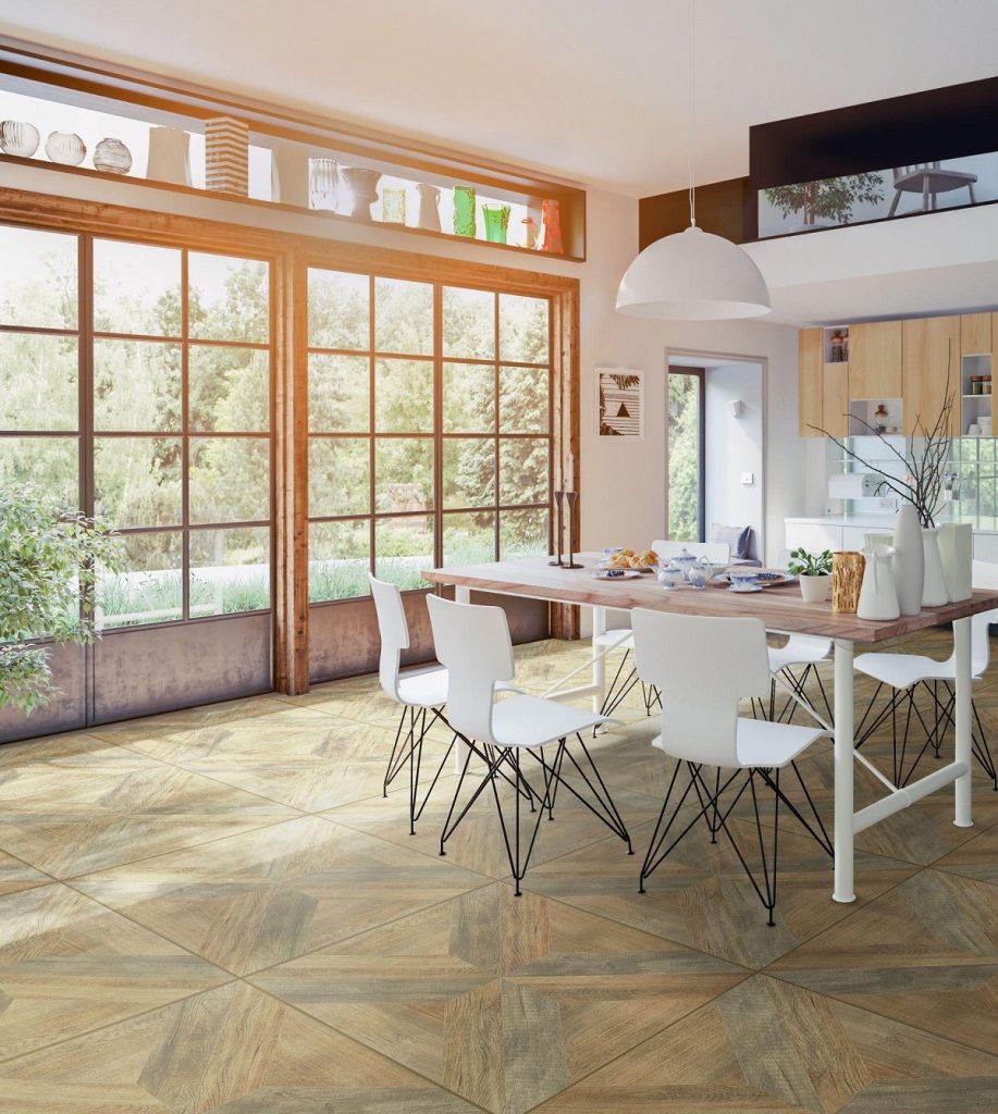
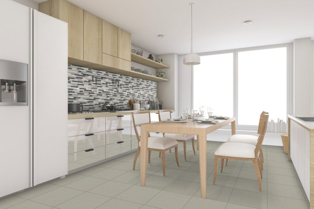
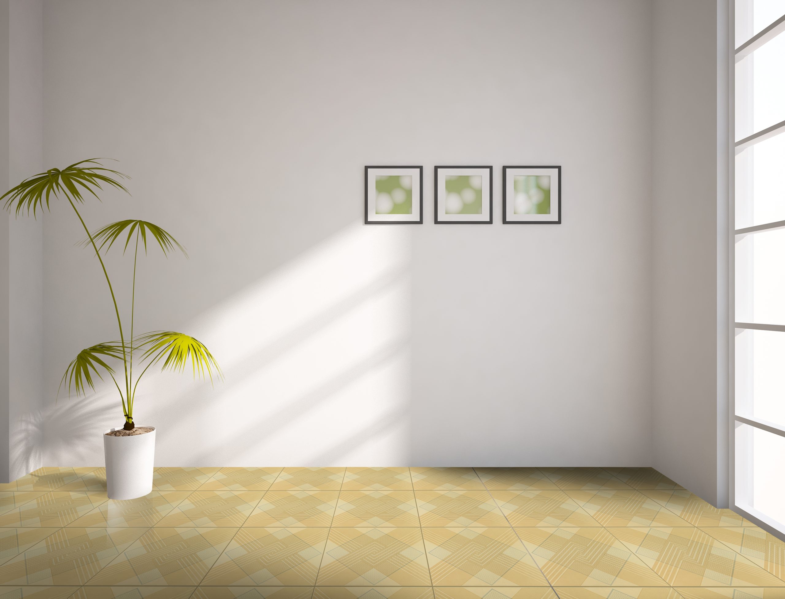
[Vinyl-30×30]-1197

Durability 

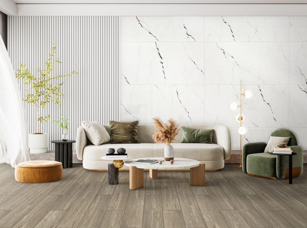
When it comes to durability, selecting a suitable flooring material is critical to ensuring longevity and enduring the rigors of daily life. Carpet and vinyl are two standard options, each with its durability advantages. Carpet, known for its softness and warmth, offering comfort underfoot and sound absorption, may be less durable than vinyl tiles. They can be prone to staining, wear, and tear, especially in high-traffic areas. Vinyl flooring, on the other hand, is well-known for its durability and resilience to scratches, stains, and moisture, making it an ideal choice for high-traffic areas like kitchens, bathrooms, and entryways. Vinyl flooring has been a popular choice for homeowners looking for durable and practical flooring options due to its ability to resist daily wear and tear and ease of maintenance.  
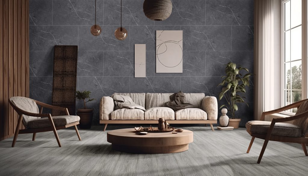
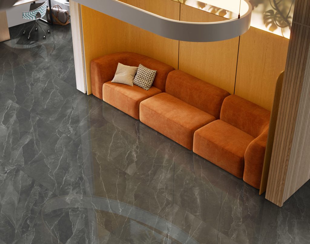
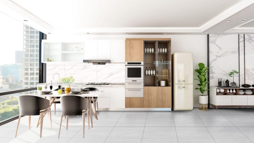
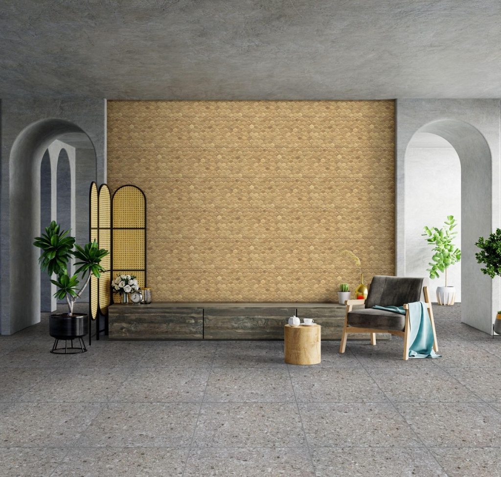
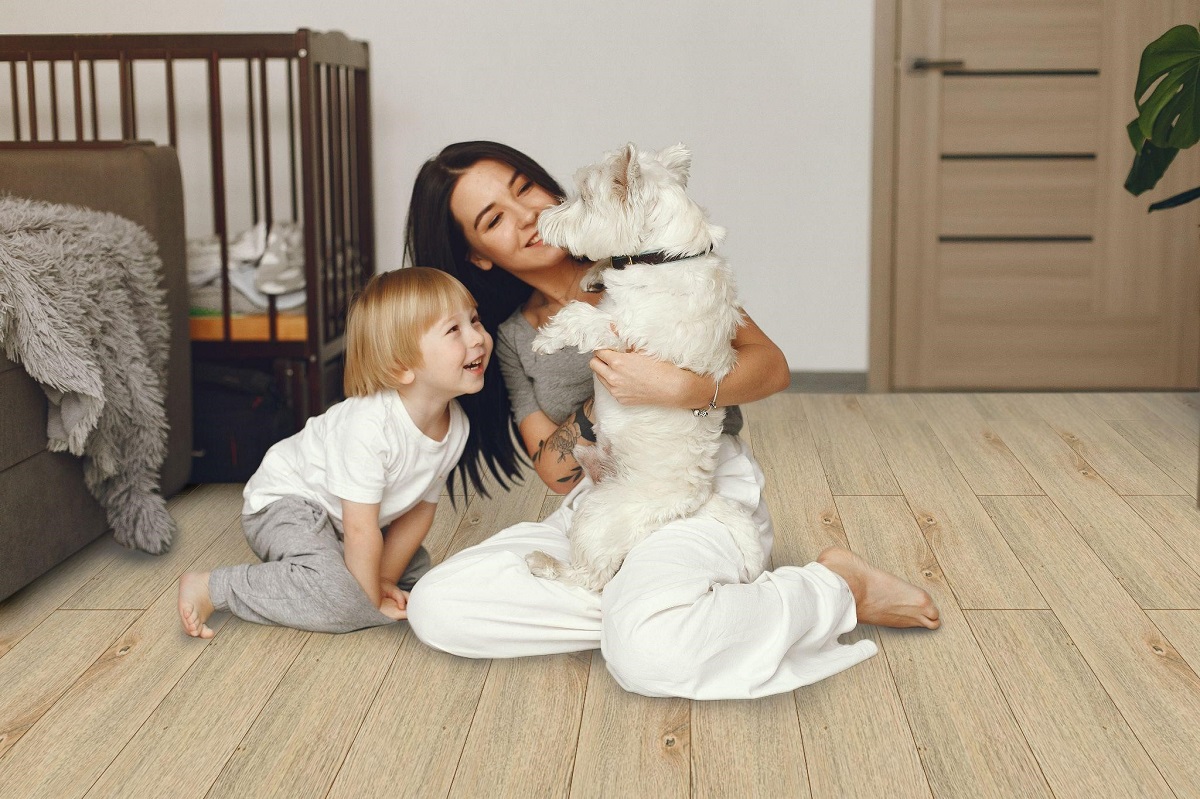
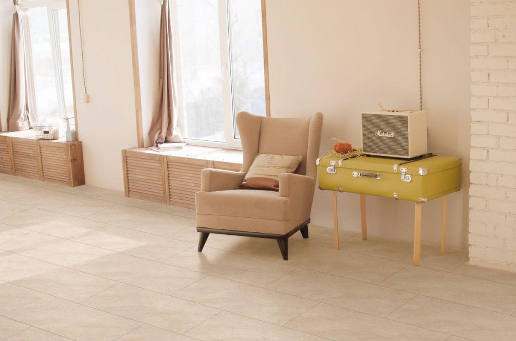
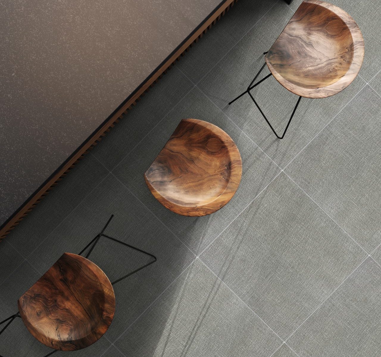
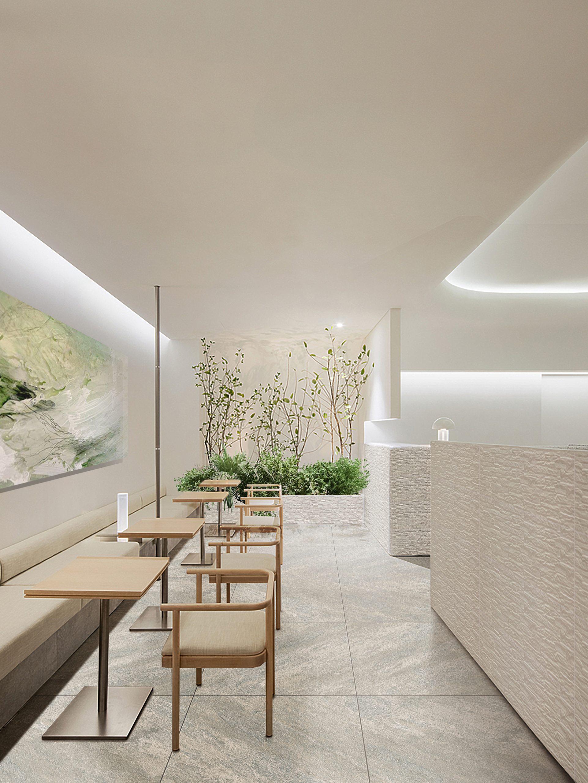
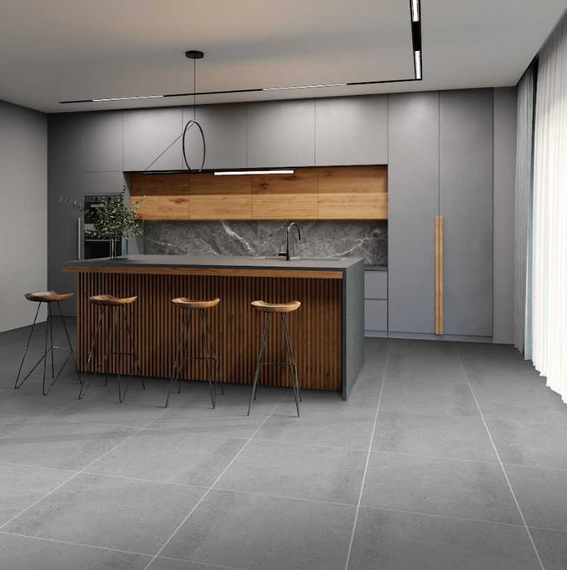
[Vinyl-30×60]-LD1803K-1 + [Vinyl-18×122]-LD6265-4

Maintenance

Maintenance is an important consideration when choosing between carpet and vinyl flooring because it directly affects the longevity and appearance of your floors. Carpet tiles require regular vacuuming to remove dirt and debris and occasional spot cleaning or steam cleaning to maintain freshness and remove stains. They may not be suitable for households with pets or allergy sufferers. Vinyl flooring, on the other hand, requires less maintenance, with regular sweeping and mopping usually enough to keep it clean and looking good. Vinyl’s resistance to moisture and stains allows for simply removing spills and messes, avoiding extensive cleaning. It is an appealing alternative for busy homes looking for flooring that can endure the demands of everyday life because it requires little care and is long-lasting.  
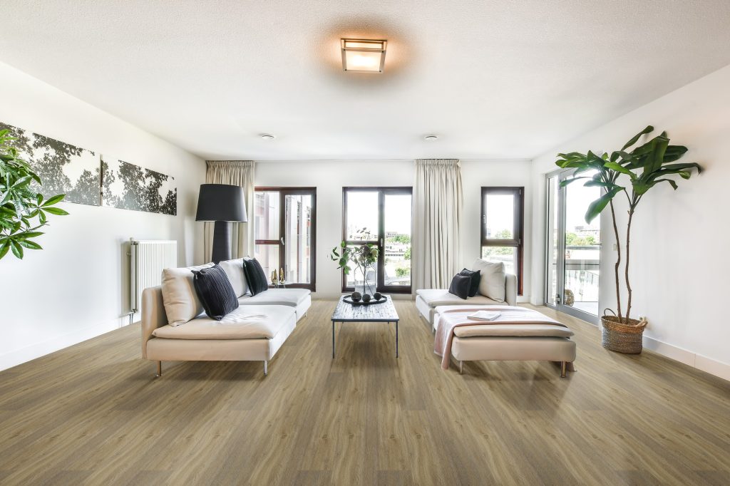
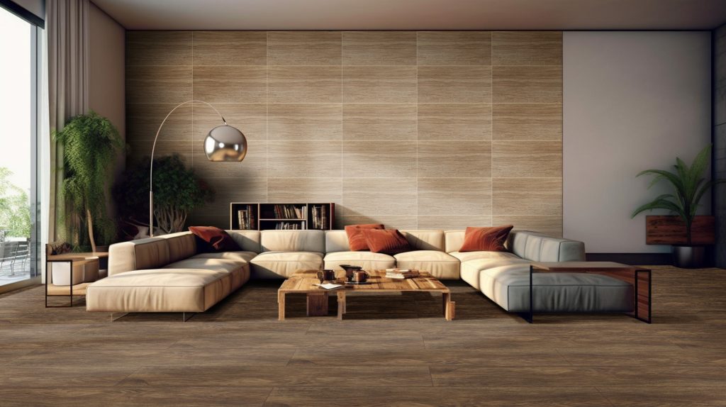
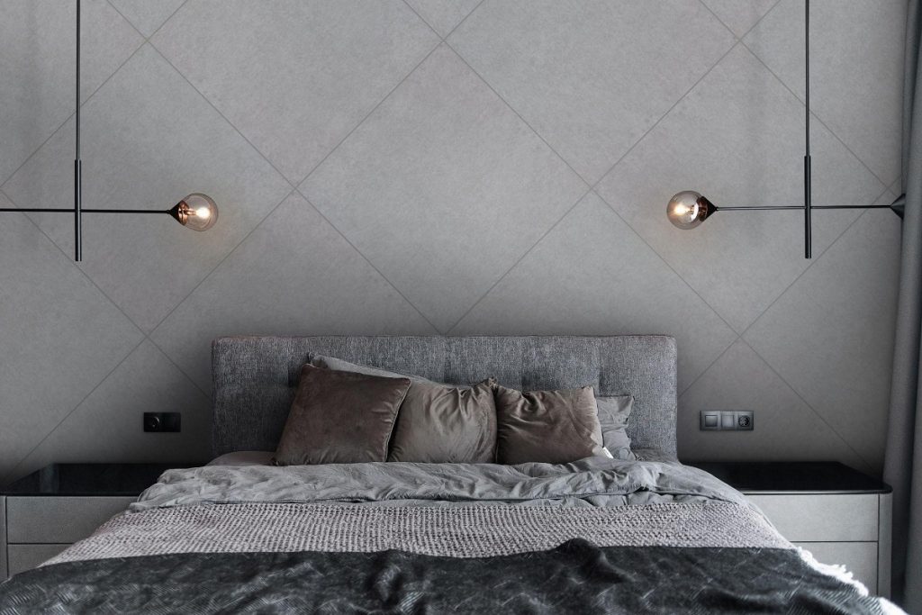
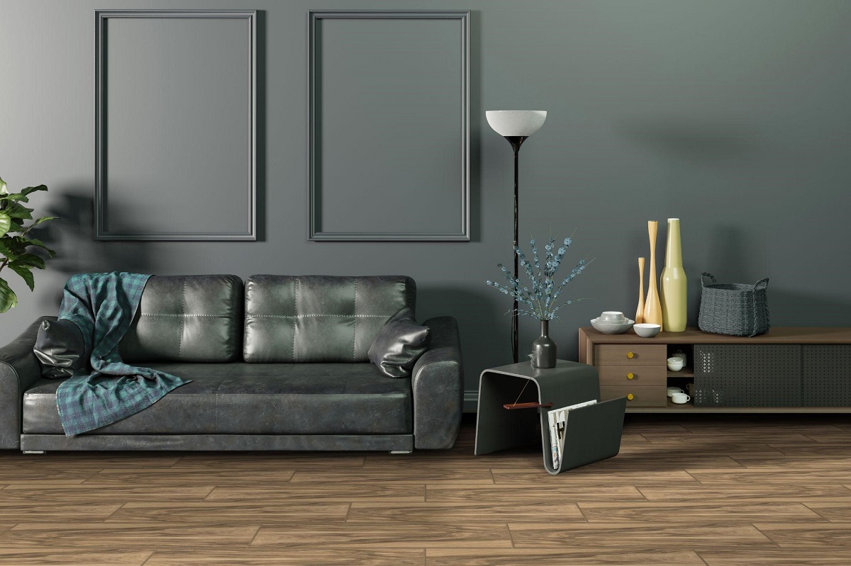
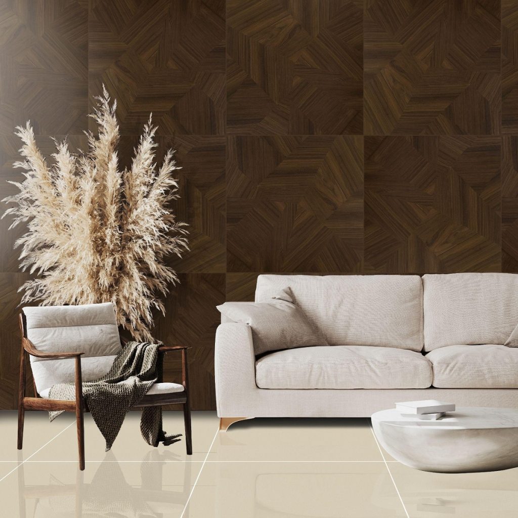
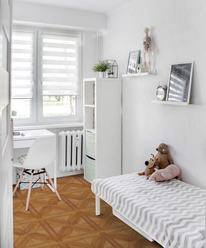
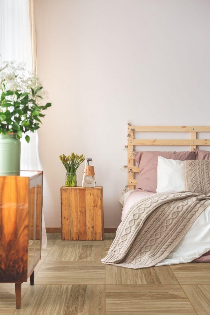
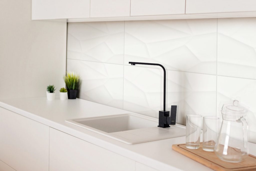
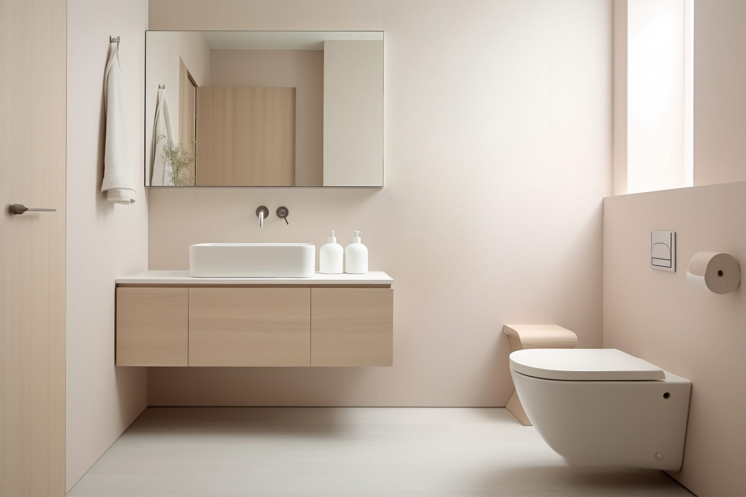
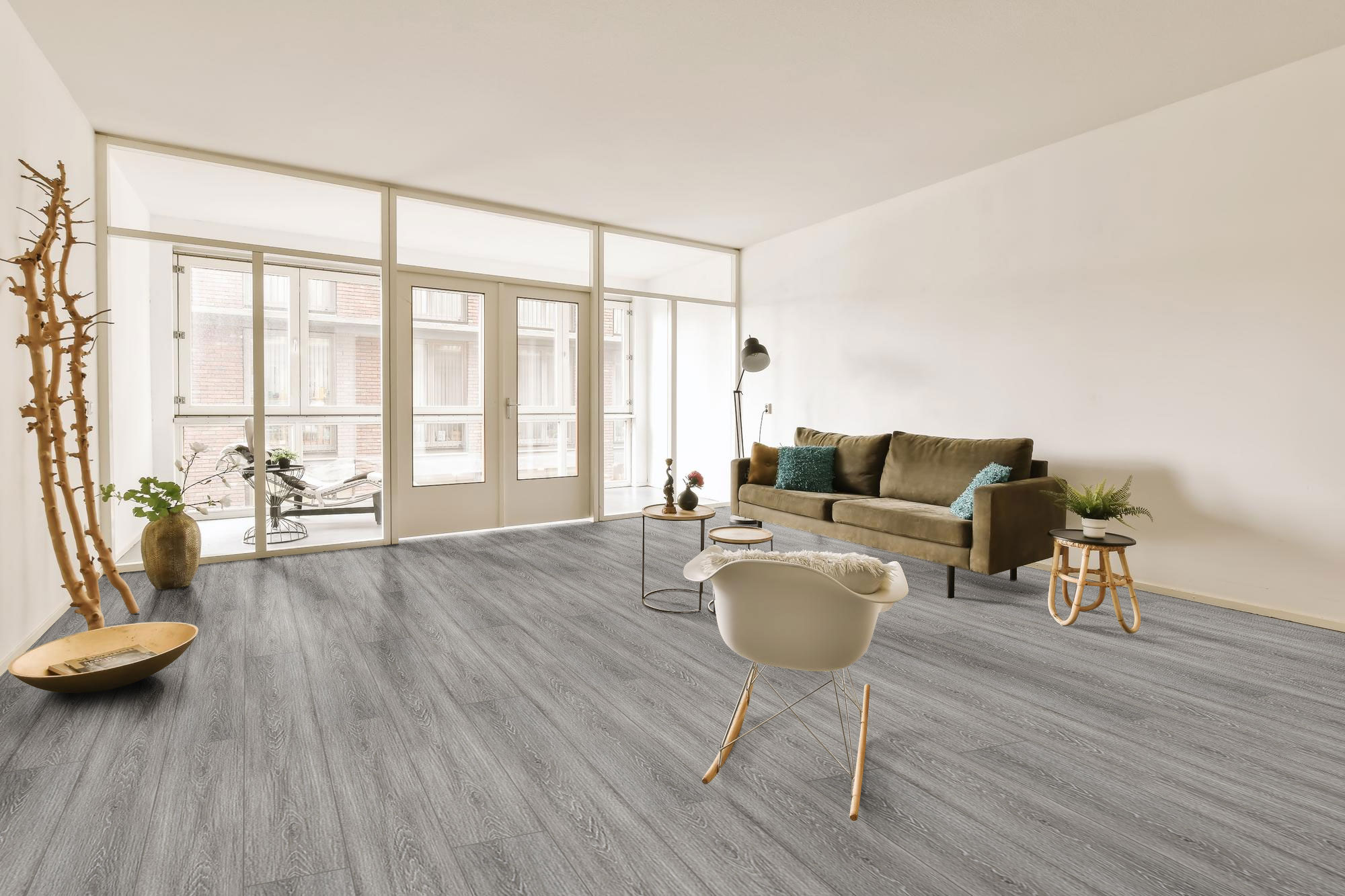
[Vinyl-18×122]-LD6605-3

Aesthetics 

The aesthetics of flooring significantly impact a room’s mood and visual attractiveness. When comparing carpet with vinyl, aesthetics become essential because each has unique visual qualities. The rug creates a soft, cozy, inviting ambiance with various colors, textures, and patterns to fit different design styles. Whether you like smooth, luxurious carpeting for a formal living room or durable, stain-resistant carpet for a busy family room, carpet allows you to create the style and feel you want. 

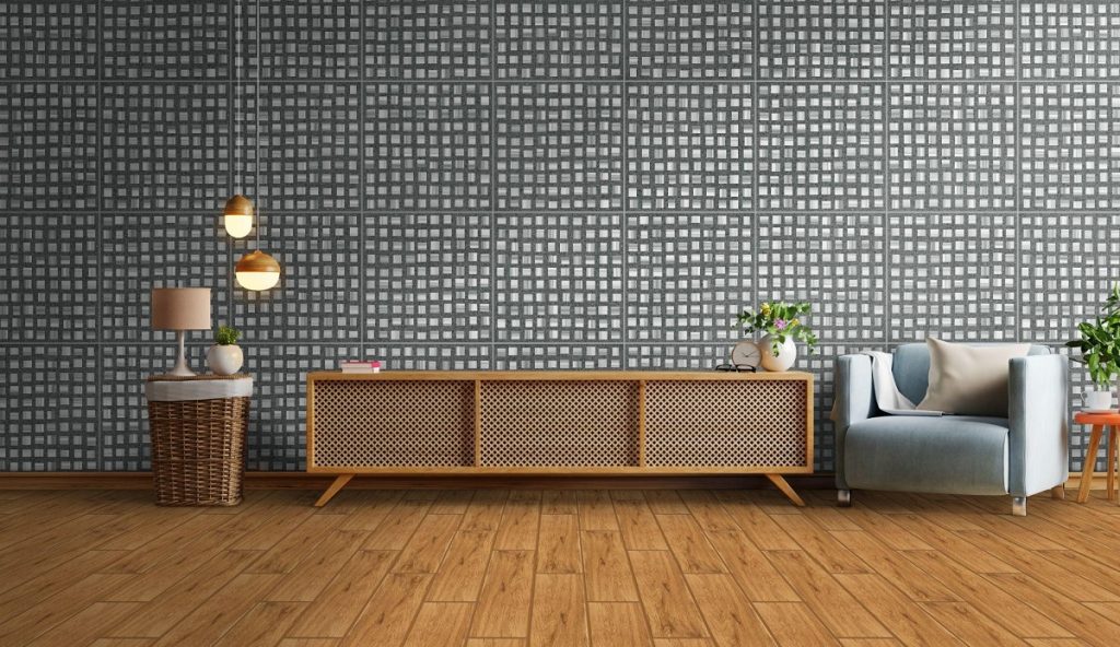
Vinyl flooring, on the other hand, comes in a variety of styles, such as wood, stone, and tile. With advances in printing technology, vinyl can nearly resemble the natural appearance of these materials while also offering durability and water resistance. Whether you prefer the warmth of mahogany, the elegance of marble, or the industrial chic of concrete, vinyl flooring has various options to suit any décor style. Furthermore, vinyl’s ability to mimic natural materials makes it a popular choice for homeowners seeking a high-end appearance without the related maintenance and cost. 
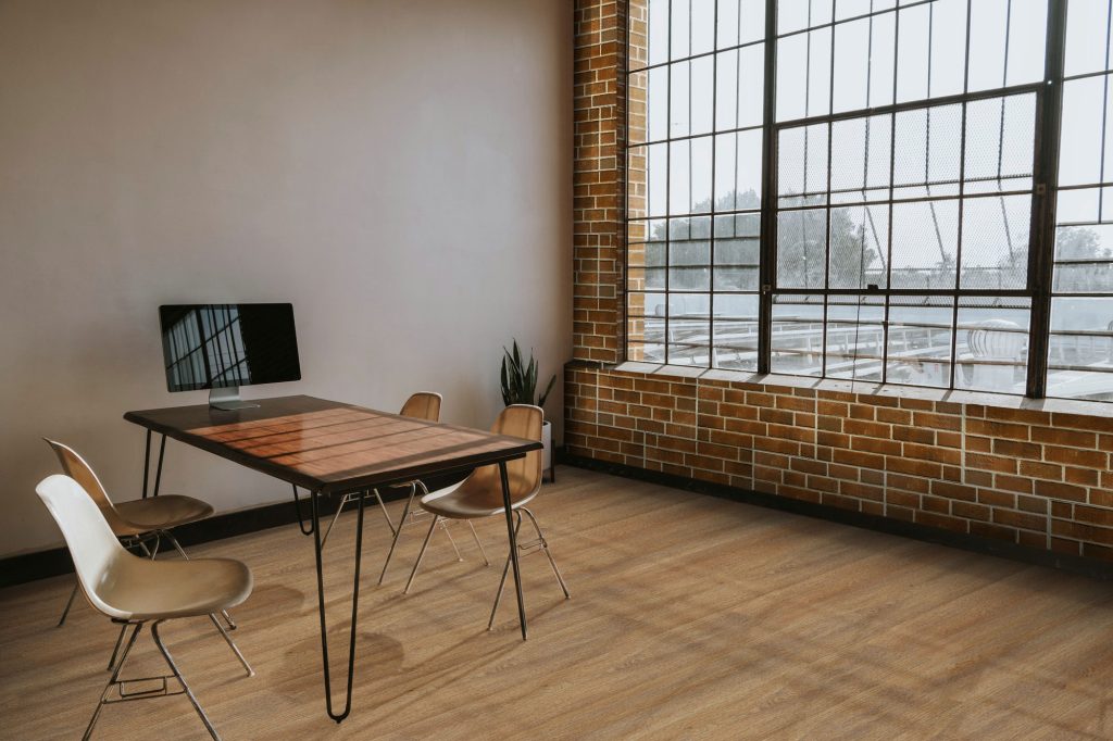
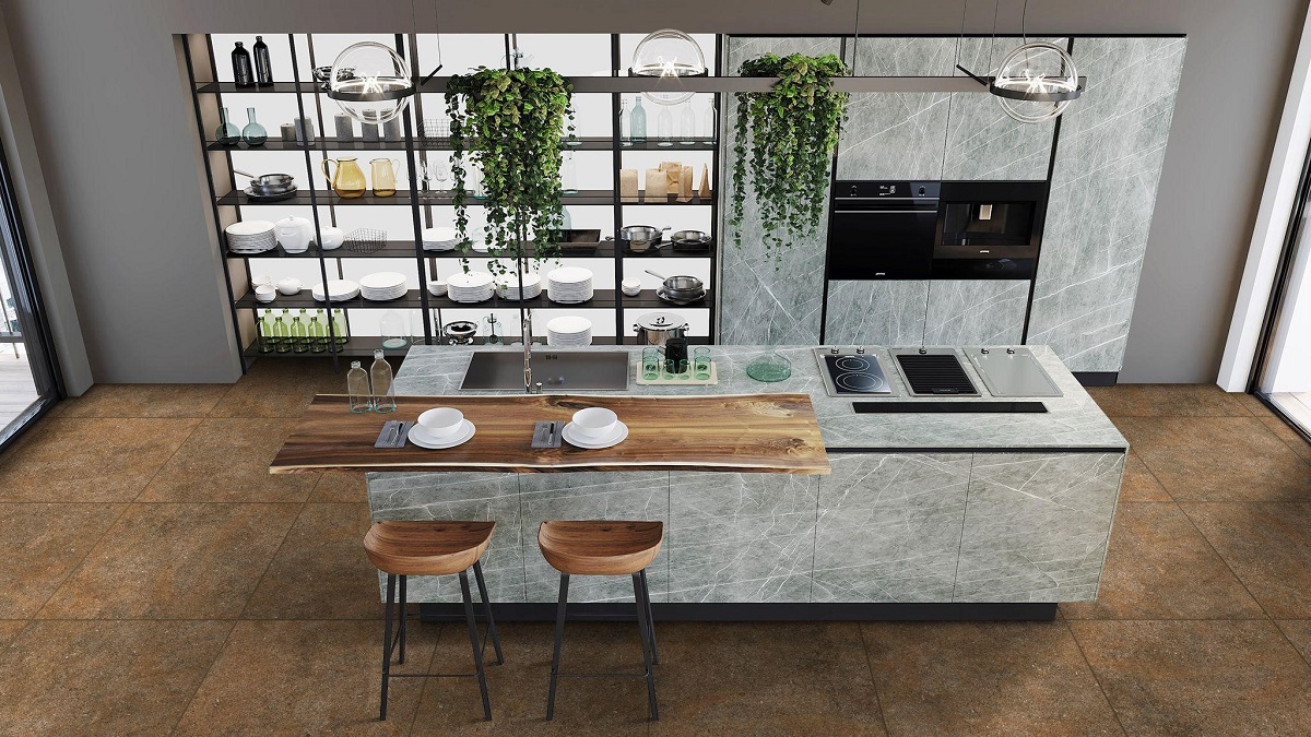
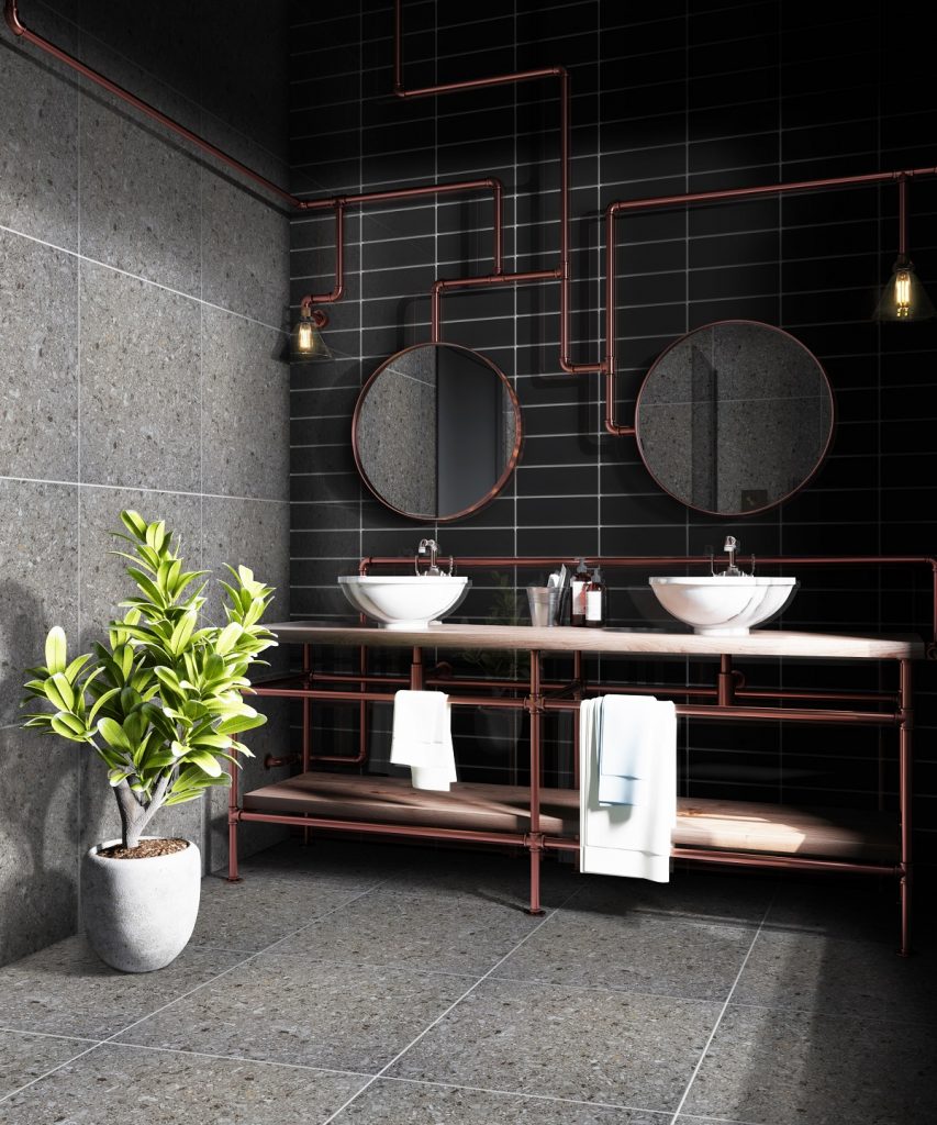
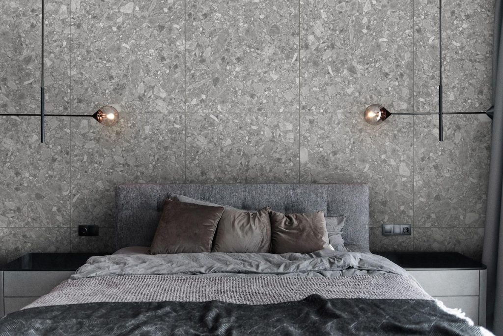
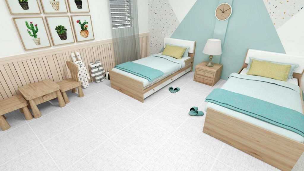
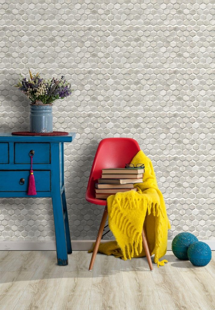
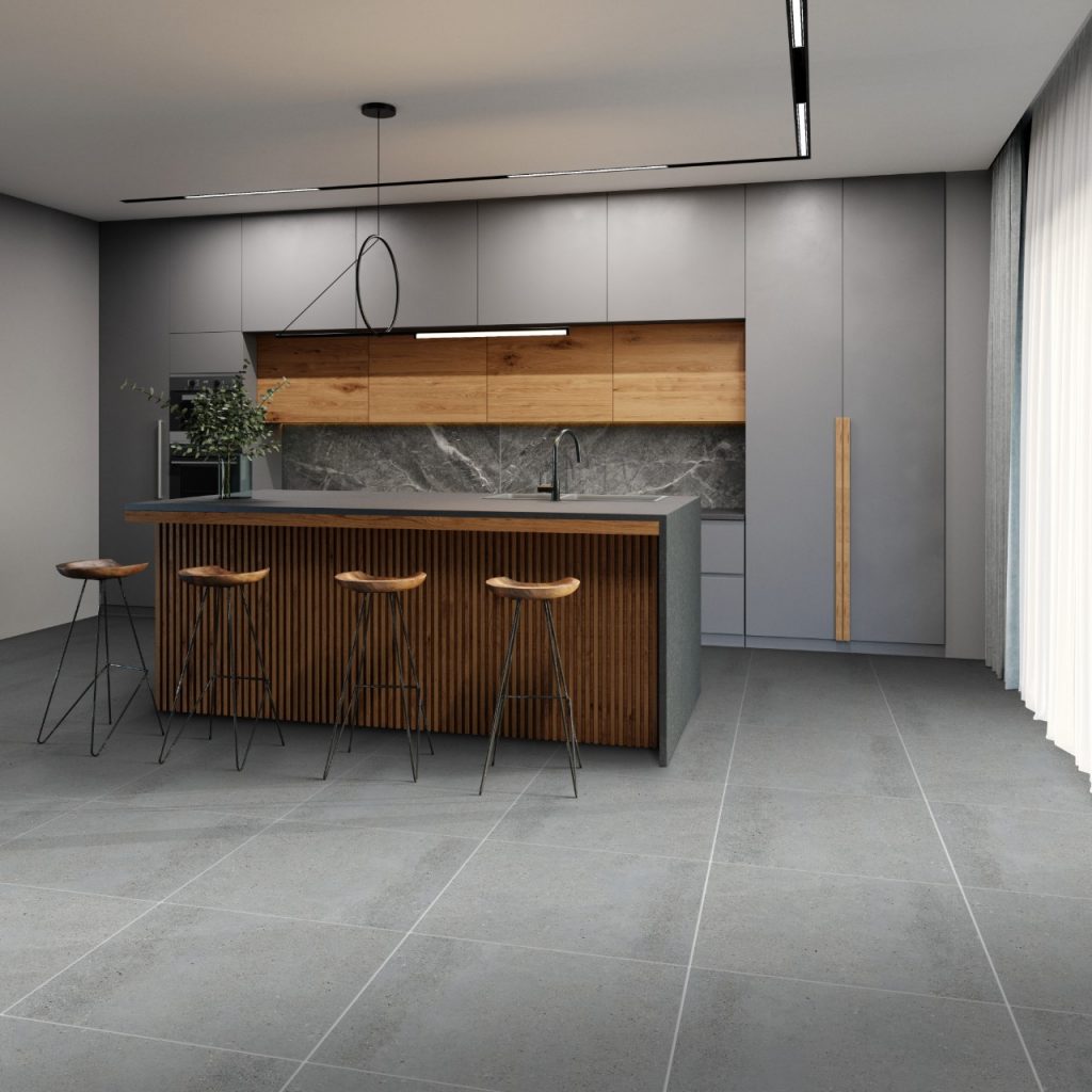
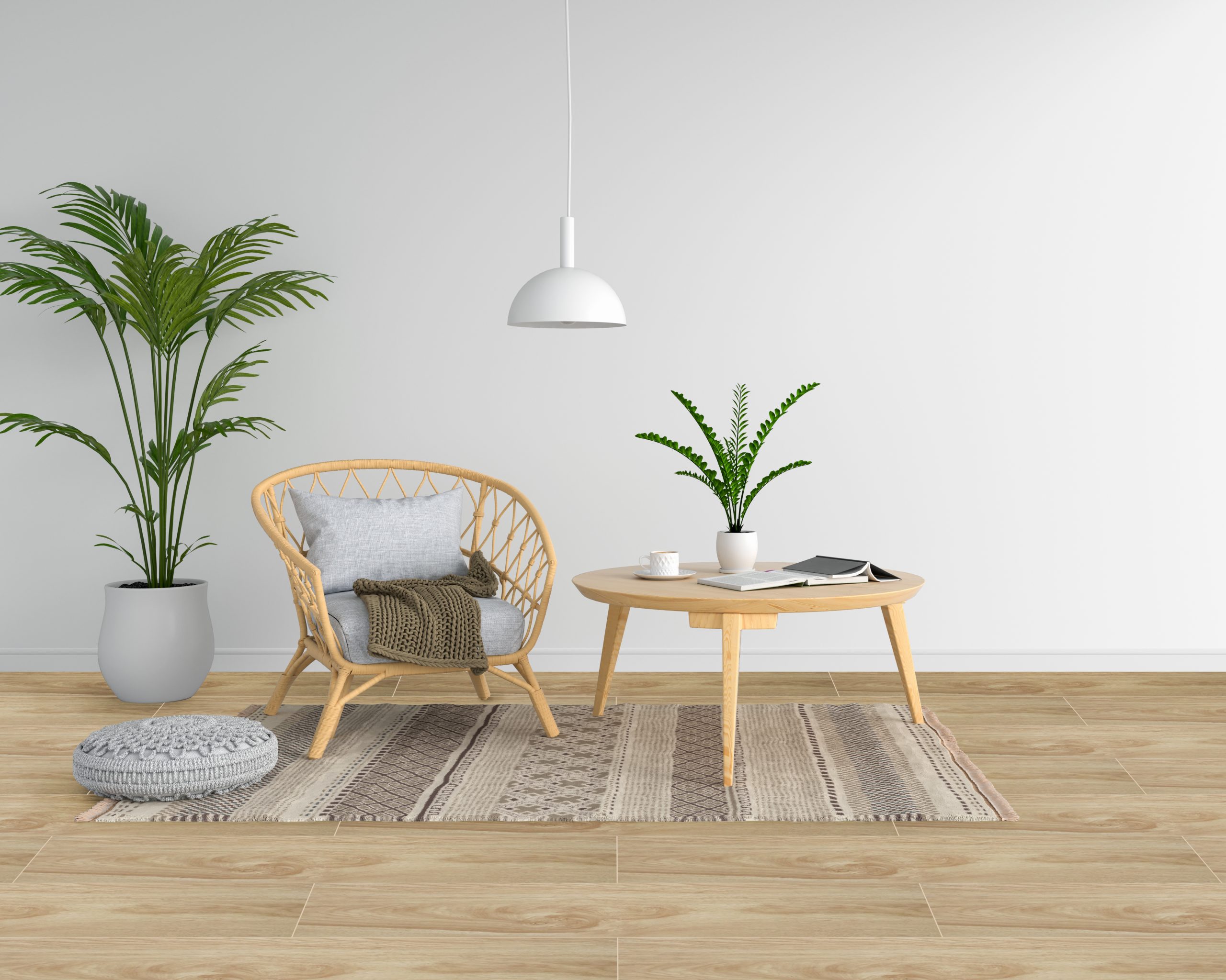
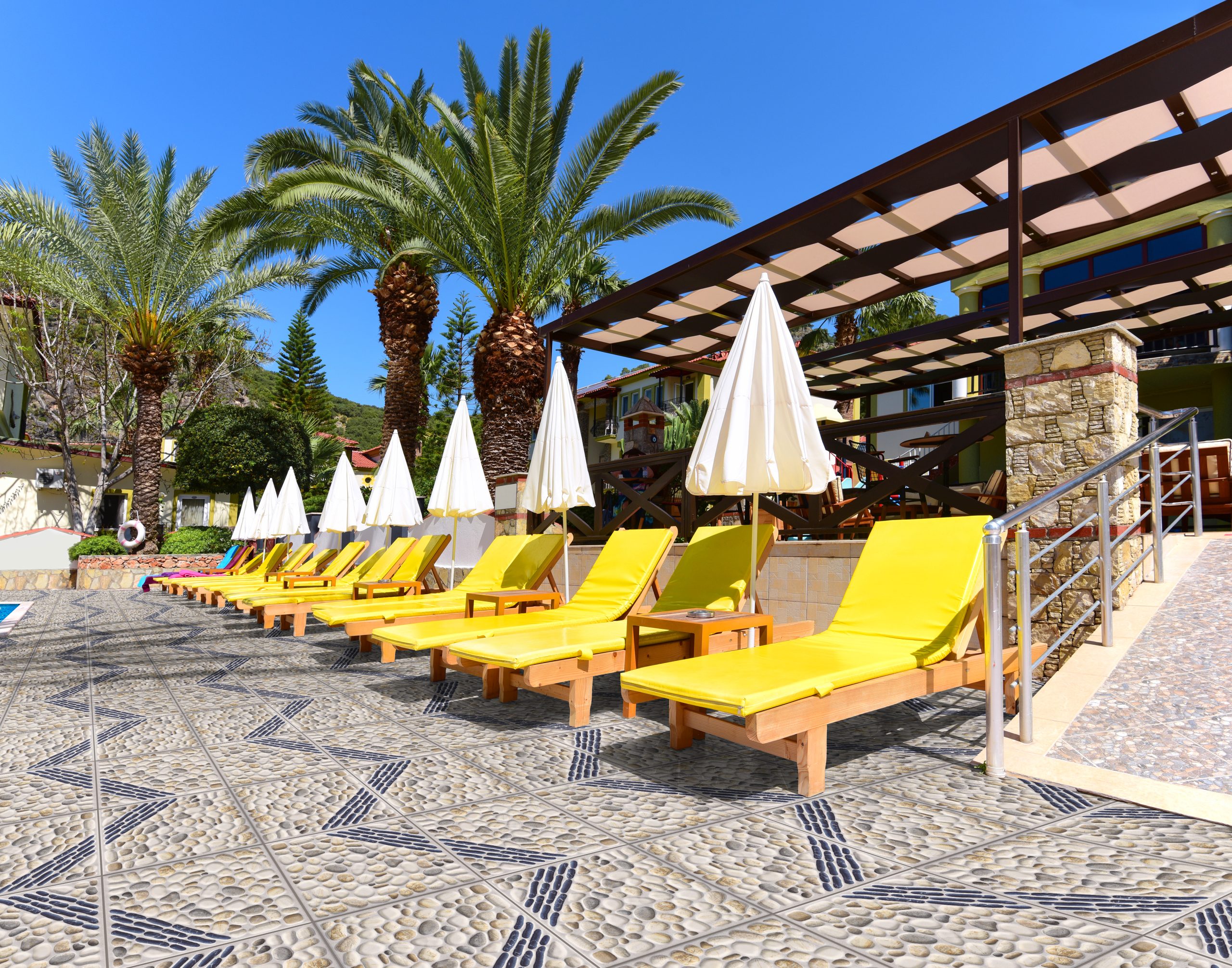
[Vinyl-18×124]-LD83019-4 + [30×60]-Q362

Cost 

Vinyl tiles are generally more cost-effective than carpet tiles in terms of material cost and installation. They are often budget-friendly for homeowners looking for durable and versatile flooring. Vinyl can save homeowners money by avoiding regular replacements and costly maintenance, making it a cost-effective option in the long run. Moreover, the cost of carpet tiles can vary depending on material, quality, and design factors. Generally, carpet tiles have higher installation costs than vinyl tiles.
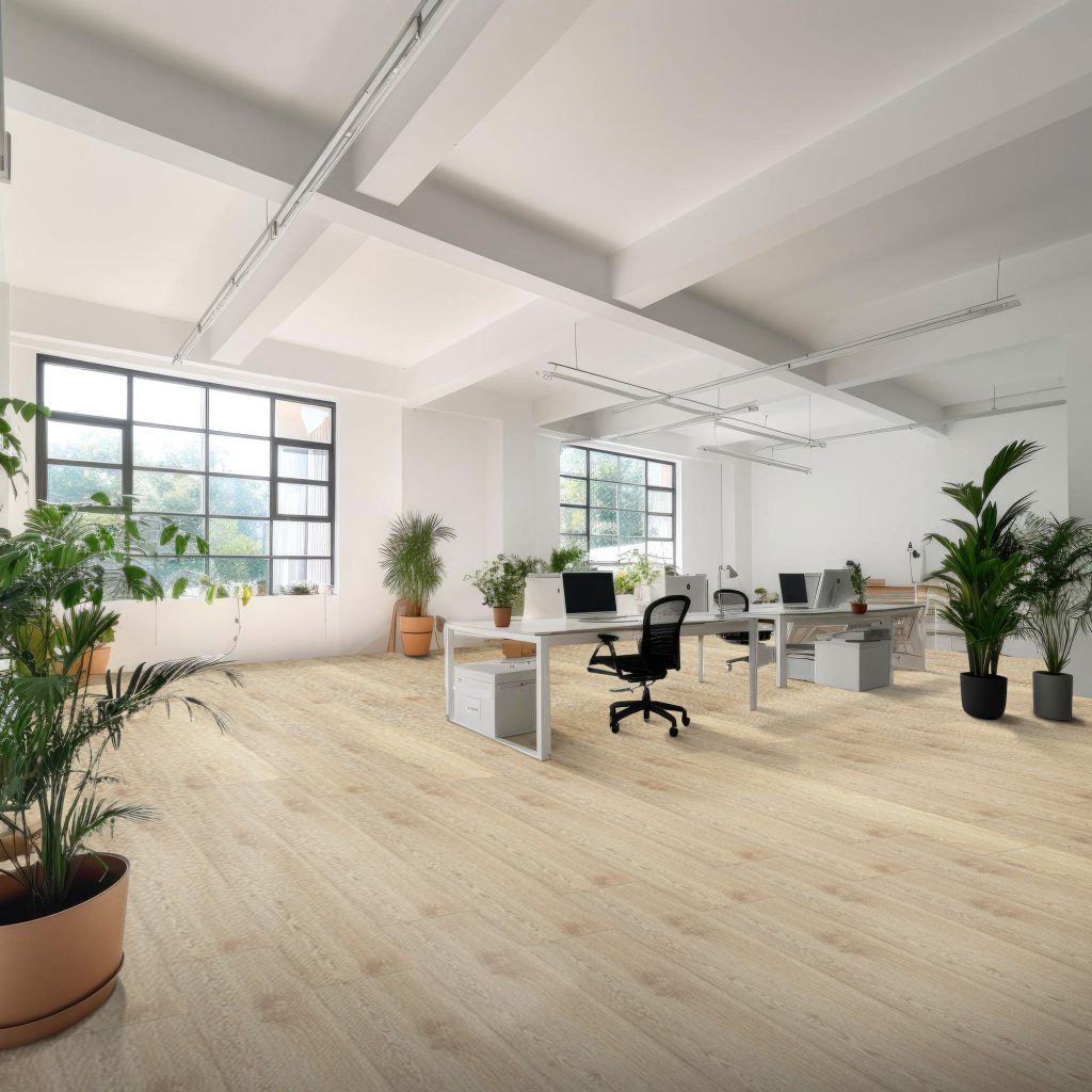
[Vinyl-18×124]-LD203087

Installation 

Carpet tiles are relatively easy to install, as they come in individual squares that can be laid down and replaced individually if damaged. They may require adhesive or tackifier for installation. Vinyl flooring, on the other hand, has a more straightforward installation method, with self-adhesive or click-lock systems available, making it suited for both professional installers and DIY enthusiasts. Vinyl tiles or planks can be installed directly over most existing flooring, eliminating the need for substantial subfloor preparation and potentially cutting installation costs. Vinyl is a popular choice among homeowners looking for its versatility and ease of installation.

Furthermore, the complexity of installation may impact the project’s completion timeline. Carpet installation often takes longer due to the meticulous stretching, cutting, and seam-sealing necessary. In contrast, vinyl flooring may typically be laid more rapidly, especially with click-lock or peel-and-stick choices that require minimal preparation and no drying time. 


Key Takeaway 

There is no clear winner in the battle between carpet and vinyl tiles, as each option has its strengths and considerations. Ultimately, the best choice depends on your needs, preferences, and lifestyle factors. If you prioritize durability, low maintenance, and modern aesthetics, vinyl tiles may be the way to go. However, if comfort, warmth, and a wide range of design options are more important to you, carpets could be the ideal choice. By weighing the factors of durability, maintenance, aesthetics, cost, and installation, you can make an informed decision that enhances the beauty and functionality of your spaces for years to come.

Now that you’re armed with the knowledge and tips to pick the right tiles for your home, it’s time to turn your vision into reality. Take the first step and embark on your tile transformation journey today!
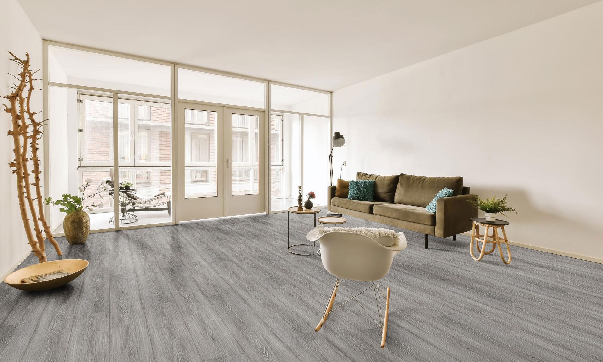
BEST TILES FOR KITCHEN THIS 2024: Where Style Meets Function

In 2024, the kitchen is a focal point for family get-togethers and a canvas for artistic design, where culinary magic unfolds. Here, the functionalities of meal preparation combine with the requirement for a room that expresses your style and character. As we examine the best tiles for kitchen this 2024: Where style meets function, you’ll see that they’re practical options and chances to add personality and charm to your kitchen. Your kitchen becomes a place where beauty and function come together naturally, thanks to the classic appeal of subway tiles, the modern elegance of big format tiles, the rustic charm of wood-look tiles, and the expressive inventiveness of mosaic tiles. So, let’s search to discover the perfect tiles that will turn your kitchen into a gourmet paradise where cooking and decor come together in perfect harmony.  


Large Format Tiles 

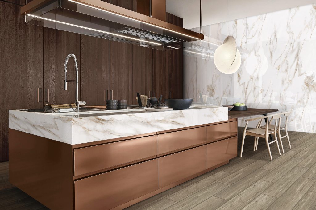
In 2024, large-format tiles will be a prominent feature in kitchen design, symbolizing contemporary refinement and elegance. These enormous tiles, often 24 inches or bigger, have completely changed the visual atmosphere of modern kitchens. They are perfect for creating the impression of space since there are fewer grout lines, which makes the surface look smoother and less crowded. 

In addition to being aesthetically pleasing, large format tiles are adaptable and available in various textures, patterns, and colors, enabling homeowners to incorporate their unique style into the kitchen design. Whether you want a sleek, minimalist space or a more classic, timeless style, these tiles are a popular choice for open-concept kitchen spaces because they provide an excellent canvas to achieve a harmonic balance of design and function. These tiles’ durability and ease of maintenance make them great for kitchen countertops, backsplashes, and floors. They are a design evolution that will completely change kitchen aesthetics in 2024, not simply a trend. Large format tiles are the pinnacle of modern elegance; they turn your kitchen into a culinary haven where functionality and style coexist.  

602E [90×180] + 1590P1 [15×90]

Classic Subway Tiles 

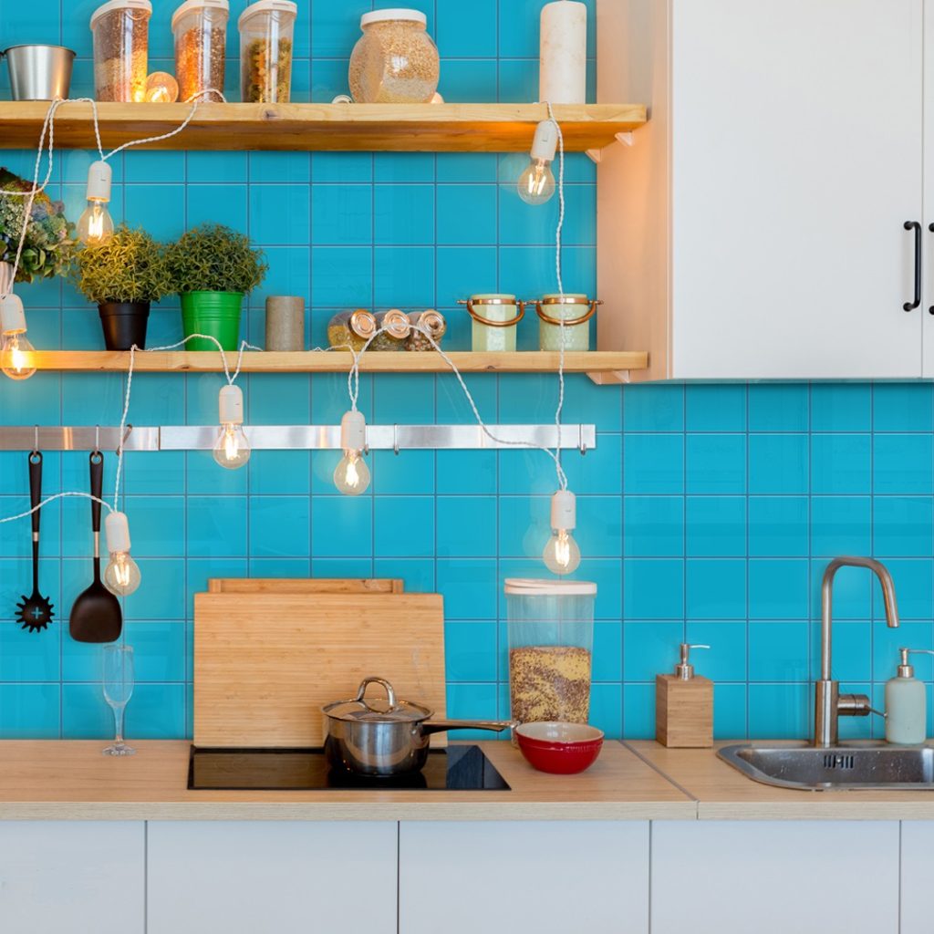
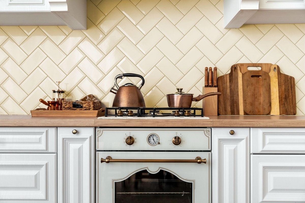
In 2024, subway tiles are still popular among homeowners and designers, demonstrating that their timeless appeal endures beyond trends. Any kitchen would benefit from subway tiles’ timeless elegance and simplicity, whether you prefer the conventional white style or experiment with more vibrant and textured options. Their affordability only serves to increase their attractiveness. Their simple forms and adaptability make them an excellent choice for traditional and modern kitchen designs.

Subway tiles provide your artistic talent an empty canvas due to their uniform rectangular shape. They may be arranged in various ways and give a unique touch, making them perfect for kitchen backsplashes. Any style, from a sleek, modern look to a retro-inspired layout or anything in between, may use subway tiles. These tiles provide the kitchen with visual depth and are a versatile choice that transforms your cooking area into a warm and inviting space where form and function come together. 

11CM3 [10×10]

Wood-Look Tiles

The durability and rustic beauty of wood-look tiles in kitchen design will make a welcome comeback in 2024. These tiles showcase the creativity of modern design by offering the enticing warmth and beauty of natural wood without the hassles of upkeep. Wood-look tiles are offered in various colors and designs that mimic the natural appearance of wood, from withered pine to deep oak. Homeowners may benefit from the practicality of tiles while achieving a cozy and inviting atmosphere in their kitchens, thanks to this variant. 

These tiles effectively withstand moisture, stains, and scratches, which makes them perform exceptionally well in an area with spills and high foot traffic. They are the ideal choice for kitchen flooring since they go well with various design aesthetics, from the sleek modernism of a contemporary cooking area to the timeless beauty of a country kitchen. Wood-look tiles transform your kitchen into a fascinating and valuable haven by balancing modern durability and rustic charm. For those wishing to build a kitchen that achieves the perfect mix of beauty and utility, they are a great alternative because of their durability and ability to hold onto the warm, inviting charm of wood. These tiles in 2024 represent a subtle fusion of the classic and the modern by embracing the eternal joy of rustic aesthetics and satisfying current demands. 

L6833 [60×60]  + J212 [20×100]

Mosaic Tiles

Homeowners can give their kitchens a distinctive appearance and feel by choosing from various colors, patterns, and textures available in these tiles, often manufactured from glass or ceramic. Mosaic tiles may be used to create eye-catching backdrops or focal points; they are an excellent medium for artistic expression. Thanks to mosaics’ versatility, you can now incorporate your idea into any kitchen design, whether eclectic, retro-inspired, or modern. 

To create a kitchen masterpiece, you may experiment with arrangement, color palettes, and even unique patterns when working with mosaic tiles. Whether you build a dramatic backsplash over your stove or sink or choose a more elaborate way to cover your entire kitchen, mosaic tiles allow you to upgrade your culinary haven. With the help of these 2024 tiles, you can bring creativity into the layout of your kitchen and make it a place where style, uniqueness, and creative expression seamlessly come together to create a genuinely charming and one-of-a-kind ambiance.  


Key Takeaway

The tile possibilities for kitchen design in 2024 are as gorgeous and varied as they are. Your kitchen can be made into a functional and fashionable culinary haven, regardless of your preference for the modern elegance of large format tiles, the classic charm of subway tiles, the rustic appeal of wood-look tiles, or the creative expression of mosaic tiles. It is crucial to use suitable tiles that meet both your practical needs and the most recent design trends. So, in 2024, when you start to build your kitchen, picking the appropriate tiles will complete your dream kitchen. Let style and function come together delightfully and harmoniously. 


UNVEILING THE INTERIOR COLOR PALETTE OF 2024

Embark on unveiling the interior color palette of 2024 with style and sophistication.  Discover the hues that will redefine your spaces and elevate your surroundings. Embrace the essence of design evolution with our curated collection. Explore now for a vibrant and inspired living experience. Colors have the unique power to inspire mood, set tone, and tell a story of the times. In this exploration, we take back the curtain of design, inviting you to explore the captivating colors that will shape how we perceive and experience our living spaces in the upcoming year. The trendy color palette for 2024 captures a range of inspirations beyond simple design decisions, from bold and vivid accents signifying a desire for innovation to nature-inspired tones mirroring a dedication to sustainability. 

Prepare to enter a world where colors are more than pigments; they reflect cultural trends, societal changes, and individual expressions. Get ready to be enthralled, captivated, and maybe even taken aback by the stories these colors tell and the feelings they evoke as we unveil the palette that 2024 holds. Join us on this illuminating trip as each hue reveals a piece of the intricate mosaic that will be used to decorate homes, workplaces, and creative spaces in the year ahead. 


Greens

Eco-friendly greens are a prominent trend in 2024’s color palette because they represent a peaceful coexistence with the environment and a commitment to sustainability. These hues, which range from vibrant emeralds to earthy moss tones, bring the spirit of nature into our homes. Eco-friendly greens remind us of the importance of preserving our planet, spurred by a collective awareness of environmental issues. People may give their homes a sense of tranquility, freshness, and a connection to the outside by using these colors in their interior design.

As we approach 2024, Eco-friendly greens are a sign of sustainable living rather than just a trend, but a symbolic nod towards sustainable living. Whether adorning walls, furniture, or decor elements, these hues create spaces that resonate with the values of environmental mindfulness. By choosing environmentally friendly greens, individuals contribute to a broader movement that aims to incorporate sustainability into every aspect of daily life, fostering a sense of responsibility and appreciation for the natural world within the comfort of one’s home. 

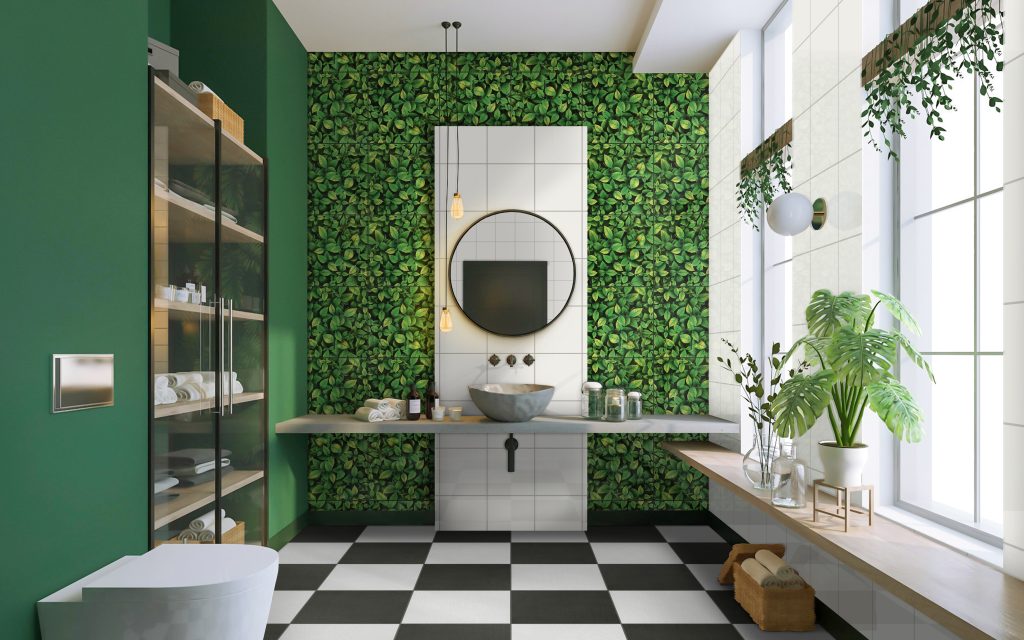
22AW1 [20×20] + WP3134 [30×30] + 3271 [30×30] 

Pastels 

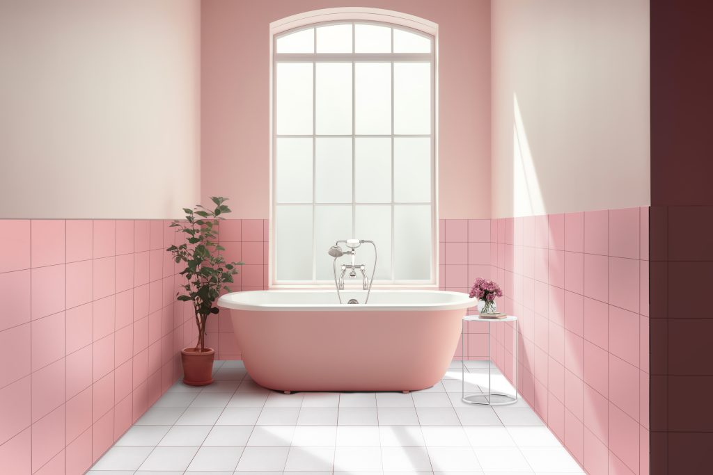
Muted Pastels come to light in the 2024 color palette as a classic and soothing option that brings interior design with a sense of tranquility and simplicity. Gentle colors like blush pink, powder blue and muted lavender create a quiet and peaceful environment, which makes them perfect for designing areas that promote relaxation and calmness. These muted pastels signify more than a color change; they also represent a conscious effort to create spaces that provide a break from the fast-paced world and promote balance and well-being. Whether used on walls, furniture, or décor accents, muted Pastels turn living spaces into serene sanctuaries that serve as a subtle yet impactful backdrop for peaceful times of reflection and renewal. 

In 2024, Muted Pastels’ appeal went beyond aesthetics to reflect a broader understanding of self-care and mindfulness. These soft tones provide a visual haven from the stresses of everyday life in living rooms, workplaces, and bedrooms. In a society that frequently yearns for quiet moments of reflection and calm, muted pastels are a design choice that emphasizes the beauty of simplicity and acknowledges the significance of creating spaces that prioritize mental and emotional well-being. 

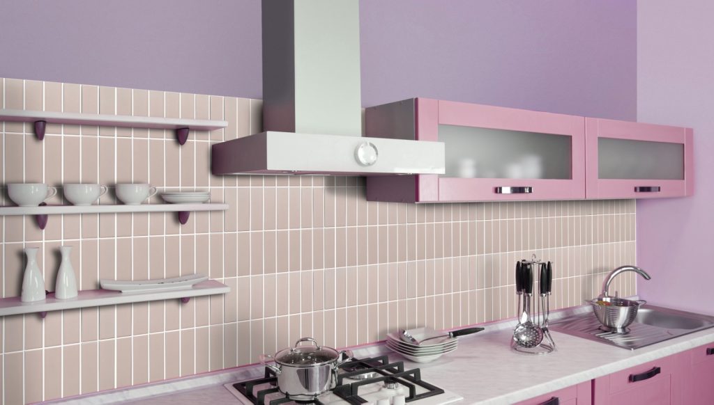
22DQ3 [20×20] + 2008 [20×20]

Blues and Purples

Tech-Inspired Blues and Purples are the cutting-edge pioneers in the 2024 color palette, evoking the sleek, futuristic designs influenced by the digital world. These deep, evocative hues evoke the technological age’s cosmic fascination, creativity, and refinement. These blues and purples, inspired by digital screens and interstellar landscapes, represent the speed at which our modern world is developing and its boundless possibilities. It creates a dynamic and cutting-edge atmosphere when incorporated into interior design through accent walls or furniture pieces. This turns living spaces into elegant havens that seamlessly blend the physical and digital realms. 

Their significance extends beyond color trends; they represent our shared interest in the digital era and our desire to integrate its aesthetics into our daily surroundings. These hues create an atmosphere that speaks to the dynamic spirit of the times by acting as a visual bridge between the real and the virtual. People are embracing not just a color trend but also a symbolic reference towards the continual advancement of technology and its integration into our daily lives by incorporating Tech-Inspired Blues and Purples into their living spaces. 

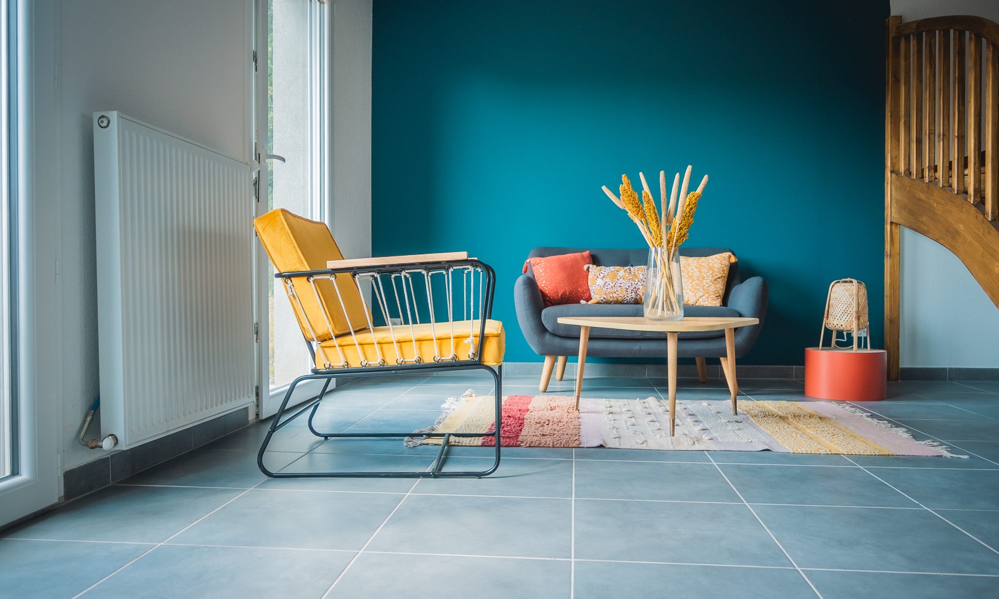
270D [20×30] + W6122 [60×120]

Oranges and Reds

Sunset oranges and reds become the blazing heroes of 2024’s intriguing color story, bringing warmth, vibrancy, and a touch of drama to living spaces. Inspired by the intense tones of a stunning sunset, these bold and passionate colors take center stage, resulting in rooms that exude vibrancy and invigoration. Sunset oranges and reds turn houses into dynamic havens where the warm glow of a sunset is perpetually recorded, bringing a sense of excitement and optimism to every area, whether used to decorate accent walls, furniture, or other décor elements. 

Sunset oranges and reds embody a spirit of lively expression and striking uniqueness that goes beyond their aesthetic appeal. These colors are more than just statements of color; they’re a statement of the intention to bring energy and optimism into living areas. By embracing these fire hues in interior design, people can create spaces that exude vitality and make a strong statement about living life to the fullest and welcoming optimism. This is similar to how the brilliant hues of sunset paint the sky in tones of orange and red.

7289 [75×150]

Browns and Terracotta

The anchoring elements of 2024’s color narrative are terracotta and earthy brown, which infuse interior design with coziness, warmth, and a connection to the natural world. These earthy colors, which draw inspiration from clay and landscapes, resonate with a desire for authenticity and a return to classic, cozy design. Whether used on walls, floors, or furniture, earthy tones like terracotta and brown produce rooms with a homey, rustic feel that serves as a visual diversion from the hustle and bustle of modern life. 

Beyond just being aesthetically pleasing, terracotta and earthy brown represent a more significant trend towards appreciating simplicity and the beauty found in the natural elements. These hues are calming and balanced, making them excellent options for various living spaces. By combining earthy browns and terracotta into their houses, people may build spaces that honor the essence of the earth, developing a connection to nature and creating a warm sanctuary that stands the test of time. 

LD6159-1 [18×122] + LD8134-3 [30×60]


Key Takeaway

As we reach the end of our journey over the rainbow to reveal the popular color palette for 2024, it is clear that the following year has a complex tapestry of colors beyond simple aesthetic choices. These hues represent our shifting tastes and collective aspirations, encapsulating the spirit of a dynamic period. Every shade, from the tech-inspired blues and purples that reflect our obsession with innovation to the eco-friendly greens that stand for dedication to sustainability, adds to a story that transcends the surface and intertwines with our values and desires. 

Let these popular hues serve as more than just a guide for design choices as we await the coming of 2024. Let them catalyze positive change and be a source of inspiration. Remember that the colors we surround ourselves with can affect our experiences and evoke emotions, regardless of whether you add the warmth of sunset oranges or the serenity of subdued pastels to your living environment. These trending hues become strokes for self-expression on the walls of our houses, enabling us to create spaces that speak to our innermost feelings and aspirations for the future. Cheers to a vivid and bright 2024! 
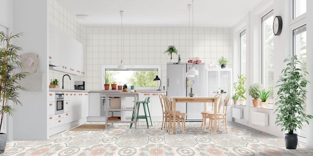
6 Tiles to Make Your First Home Look Grown Up

6 Tiles to Make Your First Home Look Grown Up

What are tips for elevating your home?

  1. Make a statement wall with textured tiles
  2. Elevate with marble-look tiles
  3. Use dark gray tiles in the bedroom
  4. Decorate your living room with wood-look tiles
  5. Design your bathroom with earth-colored tiles
  6. Brighten up your kitchen with neutral tiles


If you’ve just bought your first home, you might be planning to redecorate. But, where to start? Furthermore, you might be wondering how to make your home look like the grown-up, sophisticated home of your dreams. If so, you’re not alone! Many first-time homeowners can get confused and overwhelmed with the prospect of designing a space all on their own. But don’t worry, we compiled a few tips for elevating your home, using these elegant tiles from Floor Center.


Make a statement wall with textured tiles

Make a statement wall with textured tiles

[60×60] M71 + M1524

When it comes to ‘grown-up’ spaces, less is more. Small details can add a lot of character to any room without overwhelming the space. This can be in the form of knick-knacks artfully positioned throughout the room, or a painting on the wall. Or, our personal recommendation — a statement wall. Keep it clean and simple, with some negative space.

Making a statement wall with some textured tile is perfect for elevating a space without taking up too much room, or creating too much clutter. It adds some visual interest in the room without being too glaring. This effect is enhanced when you use raw-looking material, like these stone-textured tiles. It provides an elegant backdrop for your other pieces. This style pairs well with other raw elements, such as wood and iron furniture.


Elevate with marble-look tiles

Elevate with marble-style tiles

[60X120] Y1GL17GE + [15×90] 1590P1

Marble-look tiles are one of the most popular design elements for a home — and for good reason. If you’re looking to create a tasteful and grown-up room, then these kinds of tiles are your best friend. They look simple yet elegant, and despite their texture, it’s still a fairly neutral element. This means that you can easily pair the pieces you have with this kind of design.

When using marble-look tiles, we highly recommend decorating with wood, as well as earthy or pastel neutrals. This gives the room more layers of texture and pops of color, thus more visual appeal. Plus, wood and marble textures go great together! So simple, but it makes a huge difference. It creates a rich feeling and inviting atmosphere without being too loud.


Use dark gray tiles in the bedroom

Use dark gray tiles in the bedroom

[60×60] P6615

When designing your first home, the looks are important but don’t forget to account for how your spaces should feel. Spaces like the bedroom shouldn’t be overpowered by too many textures and colors — it should be a comfortable area for you to rest in. Remember — a beautiful space will do you no good if you don’t enjoy relaxing in it. So always choose elements that work with the purpose of the room.

For your bedroom, we suggest using dark grey tiles. This color lends a soft, tranquil feel to your room. Plus, there are many ways to work this color to create the ambiance you want. You could let in some natural light, and the color will transform into a soft, airy shade. If you want a darker style, you could shutter your windows and switch to ambient lighting to achieve this. Either way, your bedroom will look distinguished, yet comfortable.


Decorate your living room with wood-look tiles

Decorate your living room with wood-like tiles

[60×60] M92 + [15×60] AI030

Figuring out a design scheme for your living room? Keep in mind that this is one of the most-used rooms in the home. Because of this, it’s a good idea to add lots of warmth and personality to it. This creates a comfortable space to entertain visitors or just lounge around.

To achieve this, add a high-end and elegant touch to your living room, use wood-look tiles. This look can make an impact on the interior design of this space, and enhance the existing elements, such as the walls and furniture. The beauty of this tile is that it engages our senses, and exudes a rich warmth that other textures just can’t beat. It also offers a wide range of brown hues and a tactile grain that delights the viewer. These qualities are especially good for the living room.


Design your bathroom with earth-colored tiles

Design your bathroom with earth-colored tiles

[15X80] 1580P3 + [10×30] 13UBC3 + [60×60] M101-4

Your bathroom should be a sanctuary. It’s where you go after hours of work, and wash away the stress of the day. As such, choosing tiles that are perceived as calming, settling, and warm is key. Earth tones in particular are an excellent choice for this purpose.

So, design your bathroom earth-colored tiles. These tiles are incredibly relaxing and bring in a raw and organic feel into your space. This color scheme works well with wood elements like cedar, birch, and bamboo, as well as porcelain fixtures. Plants also look good with this style of tile and help to create a more tranquil environment reminiscent of nature.


Brighten up your kitchen with neutral tiles

Brighten up your kitchen with neutral tiles

[60X120] 1305 + [60×60] M1544

When it comes to the kitchen, using a neutral color palette is key to making the space look grown-up. They create a strong foundation into which you can add different elements and decor without making the space look unrefined or cluttered. Plus, using neutral tiles adds a timeless elegance to your kitchen, meaning it won’t look tacky or out of style anytime soon.

For new homes, your spaces are likely a bit on the smaller side. Using our neutral tiles will help the room feel a bit bigger. To enhance this look, we recommend letting in lots of natural light or adding ample light fixtures in the room. The result will be an open and breezy feeling, which is critical for making your home feel elevated.


Key Takeaway

When trying to create a grown-up feel for your first home, it’s important to use elements and design schemes that exude sophistication and elegance. To help you achieve this, follow our tips for elevating your home using Floor Center’s tile.

Need more ideas for your first home renovation? Check out our Styles & Ideas Guide for more guides and how-tos. If you need more tips, Our FC Tile Viber Community Group is here for you to learn the newest tile trends and design tricks.

6 Tips for Using Dark Colors in Interior Design

6 Tips for Using Dark Colors in Interior Design

What are design tips for using dark colors in my home?

  1. Bring in lots of light
  2. Feature your furniture
  3. Tie in eclectic elements
  4. Create contrast and balance
  5. Limit your patterns
  6. Use large materials


Nowadays, renovation materials like tile or paint come in more colors and styles than ever before, so why not experiment with darker colors? Though using these dark-colored, striking elements may be intimidating to some; they can add a lot of character to your home. When done right, these bold tones can elevate your chosen design style, but using dark colors requires some careful planning and creativity. To help you get started, here are some design tips for using dark colors in your interior design.


Bring in lots of light

Bring in lots of light

[10×30] 13UDH1 + [60X60] P127-7

When installing dark materials in your rooms, lighting should be one of the first things to consider. The darker the color is, the more it seems to absorb the brightness of the room. Without ample light, your room may end up feeling claustrophobic and dreary.

To avoid this, make sure that the room you’re designing has plenty of light sources. While using overhead and ambient lighting works well, natural light is preferred. Using dark tile in windowed rooms will allow enough sunlight to stream in, providing bright yet soft lighting. This feels more refreshing and does a better job of highlighting the dark surfaces of the room.


Feature your furniture

Feature your furniture

[60×60] M120-4 + [20×100] AI211

If you’re someone who wants to feature their furniture, using darker elements may be the best decision for you. With lighter-colored material, your furniture may be at risk of blending in, which makes your room seem drabber. Installing darker-colored tiles on your walls can play up the furniture, drawing the attention of the viewer.

Try using dark stone-like tile to add some contrast to your furniture. This will make the colors and designs of your furniture pop, and add more visual interest to the room. This scheme works well with brightly colored, intricate, and fun furniture pieces. Adding plants can also make the space feel more welcoming, and tie your design together.


Tie in eclectic elements

Tie in eclectic elements

[29.2×58] NHC63014 + [60×60] P127-7

Similar to furniture, using eclectic elements can be a bit tricky with lighter colors. Dark tile is great for tying in pieces from different eras and styles because it gives a neutral background. This is perfect for those who want to mix and match their decor. When adding pieces with differing aesthetics, try to use various materials (such as wood, metal, and even fabrics). Pairing these with dark walls and stone-like flooring will unite the disparate elements and create a stimulating yet cohesive look.​


Create contrast and balance

Create contrast and balance

[60×60] V-00+ [60×60] CL11

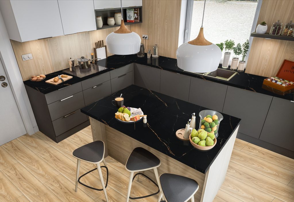
When using dark colors, make sure something is balancing out its boldness. Too many dark-colored elements can make your room feel monotonous. In previous tips, we showed that you can achieve this using your furniture and decor. And, this can also be done by using a mix of building materials. Using dissimilar and textured tiles can create contrast and break up the monotony of your design. Make use of the various shapes, materials, and colors that you can add to your space — just make sure that there is a balance between the elements you’re using.


Limit your patterns

Limit your patterns

[60×60] M120-4

It’s great to have patterns in your room. Like using contrasting materials, some texture can add balance to the room while enhancing visual interest. Textures such as wood, stone, and metal, and fabrics such as velvet, linen, and cotton can add depth to the space. However, it’s best to limit the patterns in your dark-themed rooms. As darker colors are inherently eye-catching and dramatic, adding too many patterns can be overkill —  making your rooms feel too cluttered. The number of patterns that best fit the space will vary from room to room, so trust your eye and your instincts.


Use large materials

Use large materials

[90X180] L0D8FF-33E

In smaller rooms, using dark tones can be difficult. With the wrong application, you can make them feel even more cramped. The best way to work around that is to use larger pieces of material. Using large tiles can make the room feel more spacious. Installing these with dark grout can enhance this visual effect, due to its seamless look.

Using the same tile on your floor and walls can even blur the line further, creating the feeling of a bigger space. Worried that this will make your room too dim? Adding reflective elements and tiles with a marble look can easily add some brightness to this style.


Key Takeaway

Decorating with dark colors doesn’t have to be intimidating. There are many ways to use bolder colors to create a sleek yet vibrant environment for your home. These six design tips for using dark colors will help you add depth and character to your decorating scheme.

Planning your home renovation? Let Floor Center’s tiles help you build your dream designs. Check out our Styles & Ideas Guide for more tips and tricks. If you’re feeling inspired, Our FC Tile Viber Community Group is here for you to share your ideas, and keep up to date with tile design trends.

5 Tips in Designing Your Kids’ Rooms

5 Tips in Designing Your Kids’ Rooms

What are tips for designing a kids’ room?

  1. Keep it simple
  2. Play with color
  3. Make space for play
  4. Use decorative storage
  5. Choose safe and easy-to-clean materials


Designing your home can be a fun experience for the whole family. However, it can also be quite a challenge — especially when it comes to your kids’ rooms. Figuring out how to create a functional yet beautiful room that they will still love when they’re older is a pretty tall order.

Need some advice? We have some for you right here. These tips for designing a kid’s room are here to help you strike a balance between practicality, aesthetics, and your kids’ tastes. Whether you’re renovating an existing space or starting from scratch, you’re sure to find some helpful inspiration here.


Keep it Simple

Keep it Simple

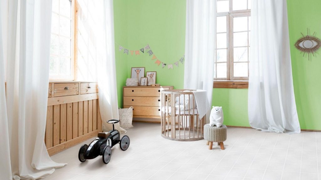
[30×30] KLD0708-2

When it comes to your kid’s room, keeping it simple can work wonders. Especially if your kid is on the older side, less can be more. While bright pinks and a themed bed might seem wonderful to a young girl, a teenager probably won’t feel the same way. Many older kids may also want to start decorating their space on their own. By keeping the colors, decor, and furniture on the simple side, you give your kid a neutral canvas that they can easily change as they grow up.

For example, you could choose a white and gray color palette for their furniture, which provides a sort of blank slate for them to work with. This will give plenty of flexibility when they decide on what aesthetic they want. Pair this palette with some vinyl or wood-look tiles, and the room won’t look sterile while you and your child work on their room design.


Play with Color

Play with Color

[60×60] M77

Keeping it simple doesn’t mean that you can’t use color at all. Colors are important — they can stimulate their imaginations and their mood. Kids love color, but their favorites may change over time. So, you should choose a design that won’t be displeasing for them in just a year or two.

Consider your kid’s favorite color and how you can use it to create a stimulating, but relaxing atmosphere in their room. One great way of doing so is to take the softer shades of their favorite color and pair them with complementary colors and simple textures. This is what was done in our example above — we made a colorful yet subtle accent wall. Paired with white textile tile design, it makes a calm yet cheerful look for your kid’s room. As a plus, this look is also pleasing even for older children, making it a long-lasting design choice.


Make Space for Play

Make Space for Play

[20×20] 2008

Making the most out of your child’s space is an absolute necessity — this also includes making enough space for them to play. To create a room your kid will love, make sure they have the room to do what they love the most. Houses with smaller rooms can use this trick to clearly define a play space for your kid. Use storage containers — such as shelves or cabinets — to create little zones in the room.

In these zones, give them the materials they need to work or play. For example, their play area should contain their toys, video games, and other play items. You can also use designs — such as a colorful wall or tile — in this area to stimulate their mood and imagination. Their school area could contain a small desk, a bookshelf, and storage for their school supplies to help them keep focused and organized. You can opt for neutral-colored tiles and walls in this area to help your child focus better.


Use Decorative Storage


Use Decorative Storage

[15X60] AI024

Kids come with a lot of stuff — they can collect a multitude of toys, games, books, and even clothes of all shapes and sizes. This means incorporating storage is of the utmost importance when designing your kid’s room. Having enough storage will help keep your kid’s room tidy, and their clutter out of sight.

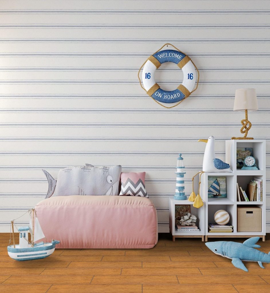
Get creative when adding storage into their room. Make sure that your storage choices are functional, but still blends in with the theme of your room. However, you don’t need to stick with plain storage options — try some decorative ones! You could use bookshelves with interesting shapes to add some style to their room.

Or, you could pair some plain-looking storage with interesting toys. Placing them into different storage nooks can look great when arranged well. For example, you could use white shelves, decorate them with colorful books and stuffed toys, and complete the look with wood-look flooring. This creates an appealing yet warm look for a nautical-themed room.


Choose Safe and Easy-to-Clean Materials

Choose Safe and Easy-to-Clean Materials

[30×30] I-3460

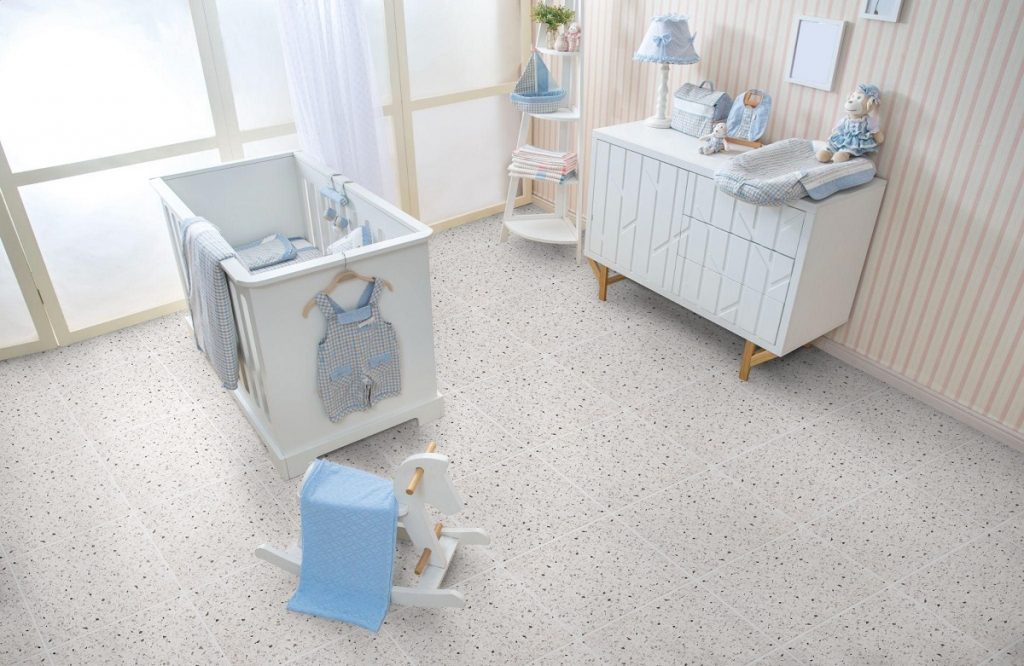
Lastly, when designing your kid’s room make sure that you’re choosing safe and easy-to-clean materials. Kids can be clumsy and cause messes and accidents — it’s inevitable when they’re still growing and learning. This is why you should choose furniture and room materials that create fewer risks for your kid.

When choosing your furniture, avoid ones with glass pieces or sharp corners. If you currently have these kinds of furniture, you can cover these hazards with protective caps. It would also be safer for you to choose furniture with safe sliding and hinging mechanisms. This means avoiding slow-closing mechanisms as it can accidentally pinch or hurt fingers.

When it comes to the room’s materials, consider using tile. As children often drop and spill things, flooring that can withstand that is important. Tile is a durable option for your kid’s room and can withstand dropped objects without wear or dents. As a plus, they’re more water-resistant than other materials — that means things like spilled juice won’t seep in and create bacteria and mold. This also makes it easier to clean — water-resistant means that it naturally resists odors and dirt. Tile is the perfect material when dealing with a growing kid!


Key Takeaway

Designing your kid’s room is a unique challenge, and it can be hard to find the balance between aesthetics and functionality. However, using these tips for designing a kids’ room may be the trick to striking this balance for your home.

Need more design ideas? We have a blog just for you! Floor Center’s posts are made to help you find the most stylish design for your home! Click here to check out our latest design tips and tile tricks.

Have some of your own decorating tips for kids’ rooms? Join our FC Tile Community on Viber to share them with others! You can also contact us to learn more about our tiles and how they can fit into your design.

6 Style Ideas for a Modern Farmhouse Look

6 Style Ideas for a Modern Farmhouse Look

What are modern farmhouse-style ideas for your home?

  1. Think Neutrals
  2. Use Wood Accents
  3. Add Raw Textures
  4. Unite Styles and Eras
  5. Mix in Metals
  6. Keep it Family-Styled


Uniting a modern look with rustic touches — a modern farmhouse design combines the best of the old and the new. It harnesses a cozy, country look and marries it with contemporary elements to create a design style full of neutral tones, clean lines, and layered textures.

Whether you’re someone wanting an updated take on the farmhouse look or someone who’s in love with rustic chic, this design is perfect for you. For those looking to use this timeless style for their home, try these modern farmhouse style ideas! These tricks will show you how to integrate your love for homely and cozy decor into your home.


Think Neutrals

Think Neutrals

[30×30] I-3460

Neutral colors are the mainstay in a modern farmhouse look. Using white tones helps to keep the design timeless and classy. However, you can still keep things unique and fresh by integrating pastels, warm browns, and even light blues and greens. This is perfect for those who want a calm, but warm look for their modern farmhouse design.

For those wanting more contrasting shades, you can do so — just remember to use them as accents, not as a main component to your palette. Try using charcoal greys, emerald greens, navy blues, and even pops of bright yellow and red around the home. With these deeper accents, it moves the overall feel of your home from simple contemporary to a chic modern style.

Whichever accent colors you choose, always remember the key ingredient to this design — the neutral colors. They should always be the base colors for your home, so make sure to add varying shades of whites and creams.


Use Wood Accents

Use Wood Accents

[30×90] Q83-003PG

Expansive, modern rooms can feel cold and inhospitable without the right features. Adding wood accents, such as furniture with different tones and finishes, are the perfect design elements to use. Using wood accents can help add some warmth to your room while still keeping in line with a neutral palette. You can also use some textured wood pieces, such as the wood-shutter paneled benches in the interior above.

While using wood isn’t a novel idea when it comes to farmhouse decor, using different tones in the material is something new to consider. Try adding a few different finishes ranging from light to dark in a single room. Wood grains are naturally complimentary to each other despite the broad tonal shifts, so you don’t have to worry that one piece will look too out of place.


Add Raw Textures

Add Raw Textures

[40×40] F53

Embrace the natural surfaces of unfinished wood, stone, and metals to enhance the rustic look in a space. Using weathered and rough materials adds a sense of history and charm to your home. However, for this to work, these pieces need to be paired with sleeker elements, such as smooth and glossy surfaces. This contrast helps to accentuate the beauty of both the finished and unfinished elements.

Try using un-waxed woods, unpolished or tarnished metals, and even concrete pieces around your home. You can use the same kinds of woods and metals in the space, just with polished surfaces. The outcome is a space with a refined, but rustic feel, which is the overall aim of a modern farmhouse design.


Unite Rustic with Refined

Unite Rustic with Refined

[30×60] NHC63016 + [18×122] LD6187-5A

Adding modern and vintage design pieces creates a character-rich look for your space. Using old ceramics and metal containers as vases can create a contrast with the wooden textures around the home. Having worn pieces like an old coffee table or drawer in your living space can be a visual foil for the other white and polished furniture pieces.

Having this juxtaposition by including vintage and “worn-down” decor along with your more refined and natural pieces is a great way to achieve a modern farmhouse design while adding your touch to the style. Don’t be afraid to reuse and recycle, and even work on the decor yourself. Shop around and bring in vintage items that can add history and depth to your home.


Mix in Metals

Mix in Metals

[60×60] CL20

Don’t just stick with wood; you can mix in metals too! When thinking of metal pieces, industrial design comes to mind. This style is rooted in hard finishes and raw textures — also common in farmhouse styles. To marry metals into your space without deviating too far from a modern farmhouse look, add in elegant ceramic and glass decor, and throw in some delicate textiles.

If you’re adding metals, consider using unfinished surfaces, and using mainly iron, copper, and brass items. You can mix polished and rough pieces of the same metal to create some contrast. Like in the interior above, you can use reclaimed iron sliding doors to open up your living room and decorate with dining chairs with polished iron legs.


Keep it Family-Styled

Keep it Family-Styled

[40×40] S4040A + [15×15] 15AW1

Whether you decide to stick with light accents, unfinished pieces, or forgo the vintage touches, there is one key thing you have to always include in your design. At the heart of the modern farmhouse look is a warm and welcoming space for family (and friends!). So, make sure that your home is designed to embrace your loved ones, and provide cozy spaces for everyone to sit back and relax together.

Try using islands and bar stools in your kitchen. This subconsciously invites people to come up and chat with you while you’re cooking or fixing up a snack. You can also add plenty of seating options around your home to create a comfy environment. This also encourages people to relax, while providing many spaces for people to hang out in. Overall, making these design choices creates a welcoming and comfortable atmosphere for your family and guests.


Key Takeaway

Modern farmhouses are the perfect mix of warmth and refinement. Adding rural styling and natural elements into modern interiors creates a sophisticated yet cozy feel. If you’re considering this look for your renovation or new home, try out these modern farmhouse style ideas. These tricks can help you create this wonderful design for your home while helping you add your personality to the process.

Bring your ideas to life with Floor Center’s wide range of modern design-inspired flooring. Whether you’re going for more contemporary or more rustic looks, we have just the option for you!

Feeling inspired? Check out our Styles & Ideas Guide to find ways to incorporate your aesthetic and dream styles into your home. You can also share ideas and inspiration with our FC TIle Viber Community Group! Share your thoughts and hear from fellow tile experts about new tips and tricks to using our tiles.

3 Kitchen Makeover Ideas for 2021

3 Kitchen Makeover Ideas for 2021

What are some kitchen makeover ideas for 2021?

  1. All-white
  2. Concealed style
  3. Mosaic backsplash


2020 has seen a majority of our time spent at home in unprecedented numbers. We devoted much of the year to rediscovering the four corners of our abode’s walls, which, suffice to say, has drastically transformed the way we cook, work, relax, and entertain.

Halfway into 2021, we’re beginning to realize that part of this change has affected how each part of our homes functions — with the kitchen, in particular, graduating from a typical household fixture to becoming essential in form, function, and design. Kitchen makeover ideas in 2021 will needless to say become one of the top priorities for homeowners as they continue to embrace versatility, design, and ergonomics.

In this simple list, we’ve rounded up a few design inspirations that you may want to try out for your kitchen. Don’t just settle for the current design — just because it isn’t broken, doesn’t mean that there’s nothing you can improve. Any kitchen will always do well with a much-needed remodeling. The trick is to explore a variety of subtle and equally obvious ways of giving your kitchen a whole new vibe. Check them out!


All-White

All-White

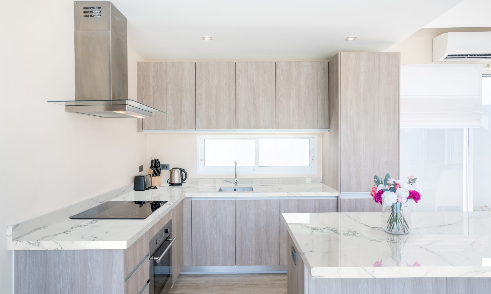
[30X60] Milan10

The all-white kitchen design will always reign supreme over other styles. There’s no other way around it — white offers cleanliness, simplicity, and uncanny modernity that even the boldest colors aren’t able to pull off. This is the perfect design for kitchens whose mismatched tones have unfortunately disappeared into obscurity. Or, it could also be homeowners who simply want to take it down a notch and stick to the basics.

There are various ways to perfectly execute the all-white kitchen, but arguably the easiest one would be to focus on your furniture. Yes, you may want to ditch the traditional wood-carved glass cabinet. It’s time to introduce a fresh new set of modular and handle-less shelves, cupboards, countertop, or what have you.

Add splashes of contrast here and there with your hardware — think stainless steel sinks, range hoods, or even modern pendant lights. Complete the look by bringing in a bit of nature indoors. Small potted plants and reclaimed wooden pieces, for example, complement each other for an overall cohesive style.


Concealed Style

Concealed Style

[60×60] P109-4 + [60×120] Y1GL24GE

Not all kitchens are built the same, that much is true. Some homeowners have the luxury of space, while some are challenged to come up with a standout design despite architectural restraints. This is where the concealed kitchen style might come in handy, especially for open-plan designs that tend to be multifunctional as well.

For chameleon-like kitchen designs, a number of elements work to bring each addition, piece, and fixture together. How well you execute a concealed kitchen depends on its paneling, choice of appliance, lighting, and even hues. This means choosing a fridge that seems to blend in with the rest of the furniture. Refrigerator-in-cabinets are extremely popular, but custom-made looks also work best.

Like the all-white design, you’ll want to minimize your use of hardware — knobs and pulls will only defeat the purpose of concealing kitchen storage or shelving builds. Go for handle-less designs, such as a rail function, push-to-open, or a J-pull.


Mosaic Backsplash

Mosaic Backsplash

[30×30] 3885P + W-04

Classic and familiar, the mosaic backsplash is also making a resurgence in 2021. Why settle for plain, paint-colored walls when you can add a nice artsy touch to highlight a part of your kitchen? You don’t have to go overboard by lining every portion of your walls or floors with mosaic pieces. A quaint and unassuming backsplash addition will make your kitchen worthy of an interior design spread.

The multi-toned backsplash tiling on the interior comes in shades of gray, white, and black, which makes for a perfect fit for any modern kitchen. Incorporate contrasts, such as wooden pieces, glossy furnishing, or even a new set of stainless steel appliances. Since these neutral tones tend to generally darken the backsplash area, you can also introduce lighting through sliding glass windows that can breathe in vibrancy and new life into the space.


Key Takeaway

It’s never too late to pick up on the best kitchen makeover ideas in 2021 that will make your space feel fresh and vibrant. We all know that the all-white never goes out of style, but unique ideas like mosaic backsplashes and concealed kitchens definitely add to the aesthetic appeal and functionality of the room. Let these design ideas inspire you to experiment on mix and match, and experiment with different combinations to come up with a kitchen that reflects all the good things that this year has in store.

In need of more design inspirations? Check out our Floor Center Styles & Ideas Guide and find the perfect look for your interiors and exteriors. We are also inviting you to become a part of our FC Tile Viber Community Group! Stay on top of all tile trends — past and present — to come up with timeless and unforgettable designs with our products.