4 Decorating Ideas for Children’s Rooms

Mother and little son fun at home with dog

How can you decorate children’s rooms?

  1. Mix and match contrasting colors
  2. Add unique accents
  3. Organize the space
  4. Pastel is the new neutral


At some point, you may have thought about decorating ideas for your children’s rooms. You just want to make your child’s living quarters more fun and stylish than your own. The best part is, you can play around with different designs. The sky’s the limit!

For your kids’ spaces, you’re not constrained with the colors and patterns that you use. You do want to think about how well they’ll fit with all the other elements of the bedroom. Ultimately, you want to build a livable space for your child. At their age, they’re very active and like to move around. With these tips, you can easily style a children’s room that your kids will surely love.


Mix and match contrasting colors

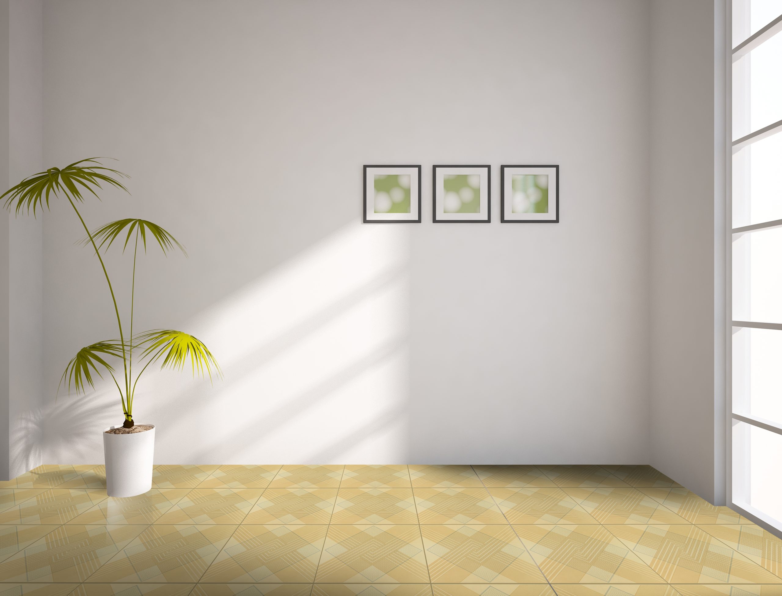
[15x60] A1024

[15×60] A1024

Mixing contrasting colors is a great way to bring out the vibrancy of your kids’ rooms. As much as possible you want to make this room a reflection of themselves. The brighter, bolder, and more outrageous the colors are, the better.

You can add a splash of color to any part of the room. For walls that come in a lighter shade choose contrasting colors that can separate each element in the room. You can add any contrast to different parts of the room — it’s all up to you, really. For floors, using a darker-shaded wood is a perfect contrast to a lighter shade wall. Ceramic wood-look flooring is a good option as this has better grip which allows your child to move around without worrying for accidents.


Add unique accents

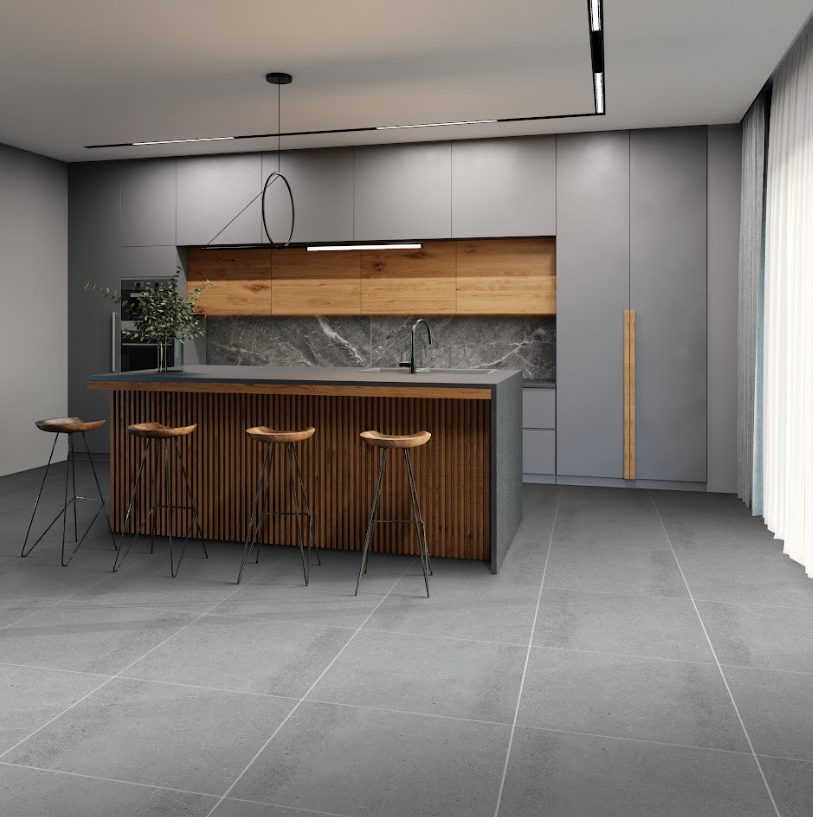
[60x60] M76-4

[60×60] M76-4

Adding accents is the key to imbibing a sense of texture in children’s rooms. Accents are found everywhere — from the bedding, linen, pillows, lighting, furniture, wall, floor, carpets. The list is endless, in fact, even your kids’ favorite toys could be considered as accents.

As much as possible, you’ll want to make the accents as playful as possible. Take this redecorating activity as a collaborative opportunity between you and your child. If they want to include their favorite cartoon character prints, then let them. Complement this by adding your own touch — add some kid-friendly patterned carpeting, bedside tables, study desks, or even miniature indoor plants.

It’s also essential to invest in timeless flooring because kids have a tendency to constantly run around and play in their rooms. Matte and rustic surfaces are proven to be the ideal option due to their slip-resistant qualities and hassle-free maintenance.

There’s no doubting that all of these elements will eventually come together to form a fun-loving room that your kids will love.


Organize the space

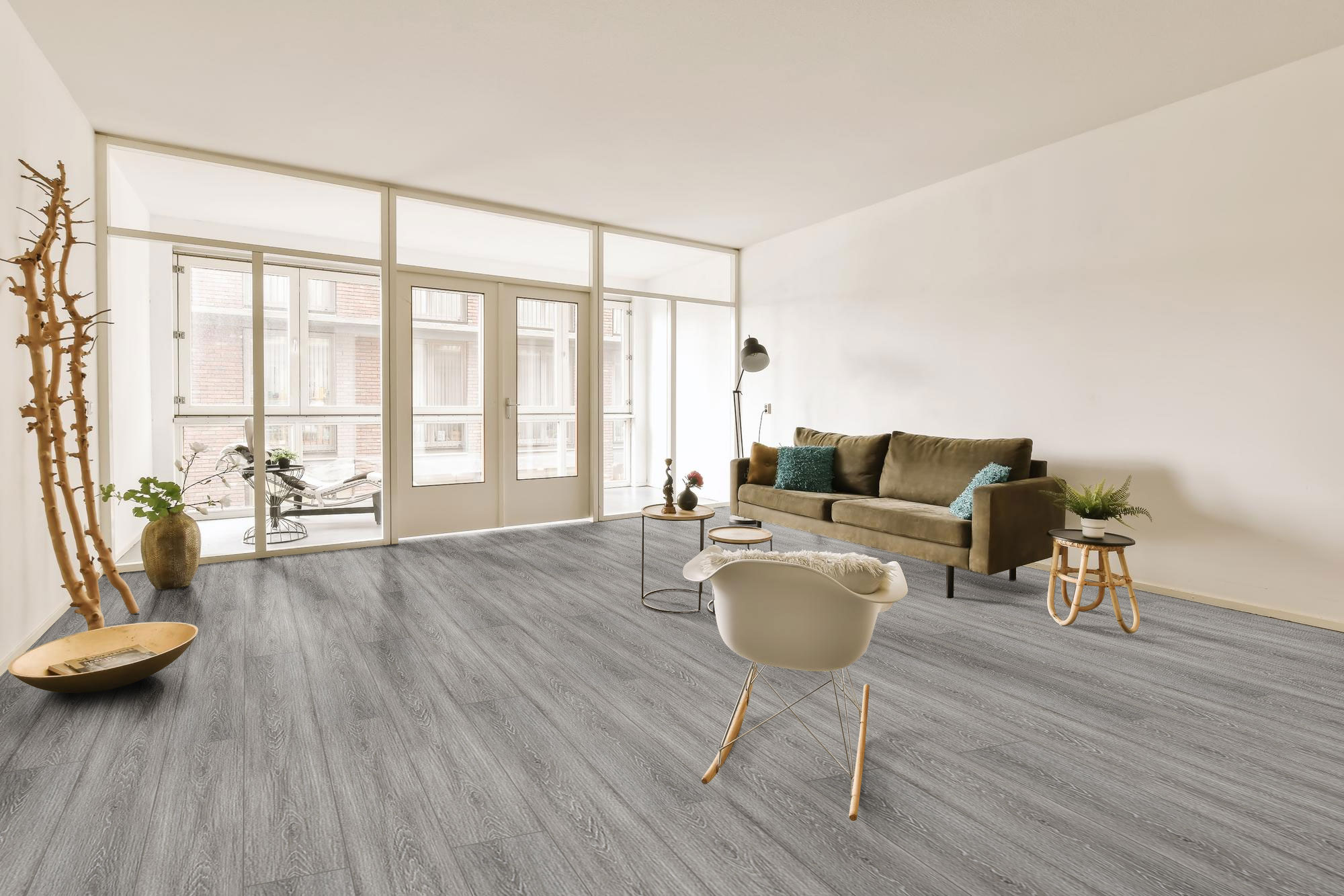
[30x30] KLD0708-2

[30×30] KLD0708-2

Children just love to play with their toys. The thing is, they may not always know how to keep them in place. In fact, you might find your children’s toys just strewn all over the floors of your house. While teaching them the importance of neatness and cleanliness is important, the best way to emphasize this is through their bedrooms or play spaces.

As much as you want your kids’ rooms to be playful, you also want to make sure that it’s organized. The best way of doing this is by adding neat and nifty storage drawers, cabinets, boxes, compartments, or slats that can go well with the overall design of the room.

During your redecorating make sure that you leave out enough room size for these storage accents. You can paint and customize them to add a splash of color. For something more minimal, go for cabinets or small drawers that come in basic tones, like white, gray, black, or pastel. You can also exercise your creativity by adding custom-built storage designs like built-in drawers, slats, or floating shelves.


Pastel is the new neutral

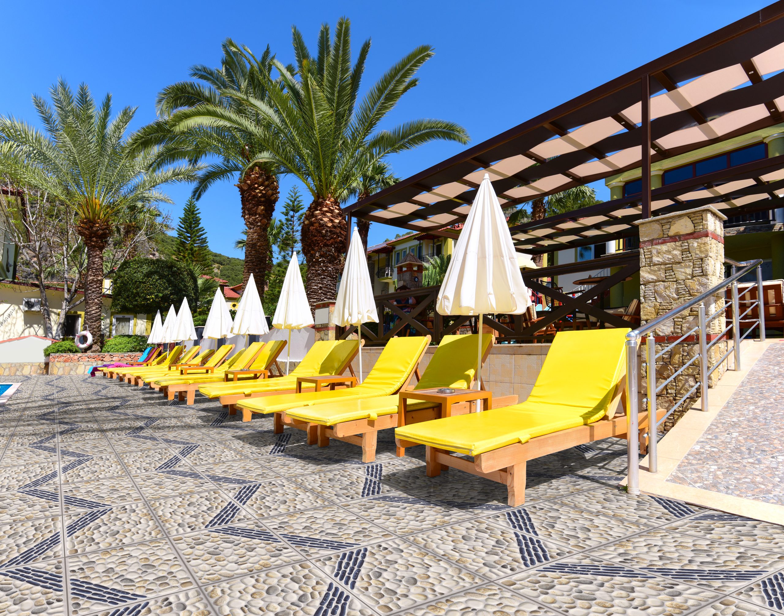
[60x60] M77_

[60×60] M77

Color is undeniably an important factor as to how the look of your children’s bedroom will come together. Pastel colors were originally a trend that came about some time during the 50’s and 60’s but is becoming more and more of a staple for contemporary interiors. Going with pastel can even serve as a stylish yet practical option for when your child transitions from the toddler to adolescence stage.

As previously mentioned, matte surfaces are the best flooring choice for children’s rooms – the M77 is another great example. This high-quality textile design provides slip-resistant qualities that will give you more peace of mind when your child plays and does physical activities.


Key Takeaway

With these decorating ideas for your children’s rooms, you’ll surely come up with a space that your child will enjoy staying in.

As mentioned before, a good tip when it comes to children’s rooms is to use up all your creativity. You’ll want to emphasize both the playfulness and livability of the space without sacrificing harmony. Once you find the right styles, you can now begin designing any of your kids’ rooms with ease.

Want to come up with more awe-inspiring children’s room designs for your kids? Check out Floor Center’s tile collections here!

Join our FC Tile Viber Community and stay updated on the latest tile trends, tips, and promos.

5 Perfect Tiles to Transform the Look of Your Outdoor Areas

[60x60] ZX-W6613AGA-HT

What are the perfect tiles for your outdoor areas?

  1. Gray stone-look
  2. Natural brick pattern
  3. Porcelain stone-look
  4. Wood-look
  5. Brown patterned


If you’ve been focusing on improving the interiors of your residential space, then you may find yourself devoting less time on improving the look of your outdoors — but this shouldn’t be the case. Why not add a touch of creativity by checking out beautiful tiles for your outdoor areas? Outdoor tiles are great because they’re the perfect opportunity for you to transform a once-bland space into something livelier and more vibrant. Coupled with the right accents, outdoor seating, and your choice of potted plants, these tiles may just be the missing piece that your outdoor areas need.


Gray stone-look L53

patio deck and chair

[30X30] L53

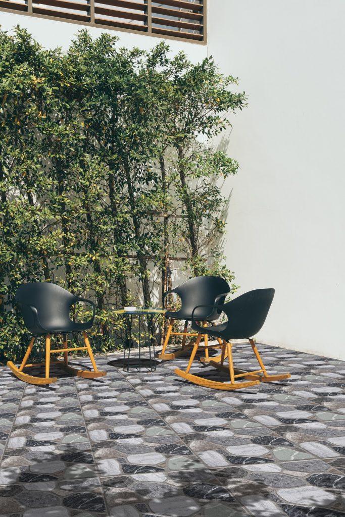
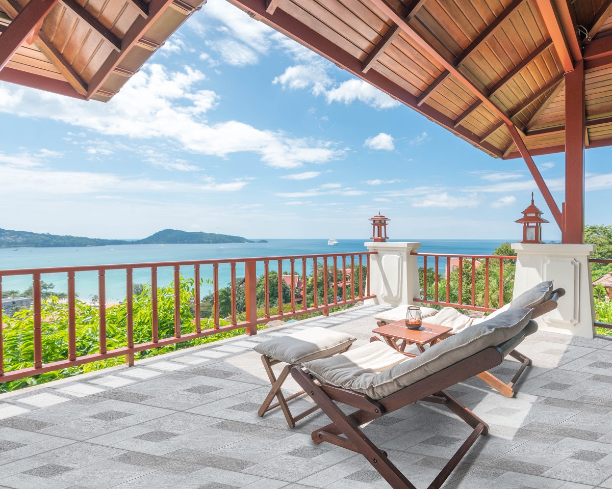
When you think of your outdoor areas, you want it to be a safe space that separates the mundaneness of your daily activities, from the beautiful nature that surrounds it. You may not always get the chance to experience this nature in its entirety — why not bring a piece of it with you in your patio, veranda, or porch? With the gray stone-look L53 tile, you certainly can.

This tile gives the all-natural appearance of stone flooring. Its textured design features different shades of gray, black, dark gray, and white for a more authentic feel. Whether you want to put this tile up as part of your backyard’s entryways, or as a beautiful stone walkway, you’ll never go wrong.


Natural brick pattern I-QF3606

[30x60] I-QF3606 Render FA

[30×30] I-QF3606

Natural brick patterned tiles are one of the simplest ways for you to bring natural, yet consistent looks for your outdoors. Since most of these tile designs come in shades of brown, white, gray, or black, they’re best complemented with other outdoor elements.

Floor Center’s I-QF3606 can make another beautiful addition to your outdoor walls because of the natural texture in its design. Have them installed in uniform or alternating segments of your choice to help the design blend in with other exterior fixtures.


Porcelain stone-look G0AE-51QEA

[60x60] G0AE-51QEA

[60×60] G0AE-51QEA

Porcelain stone tiles are much more affordable options, compared to natural stones. Make no mistake, however, — despite their affordability, they’re still able to enhance any setting they’re applied in. Featuring 3D print of textured stone, porcelain tiles with a rustic finish like the G0AE-51QEA might be your key to achieving that elusively natural, yet exquisite outdoor appeal.

This rustic tile design is an ideal choice for your outdoor areas because of its highly textured and rough finish. Aside from sporting stylish earth tones, its slip-resistant surface will serve as your go-to option for wet areas.


Wood-look 1580P3

Dinner table setting in modern villa terrace

[15×80] 1580P3

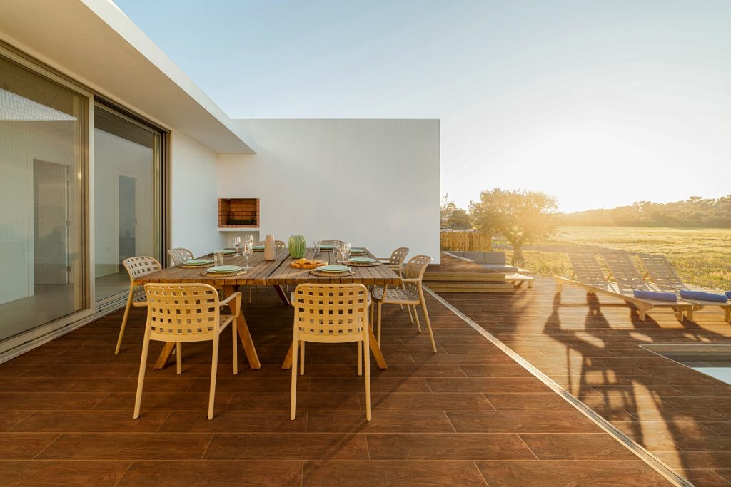
Ever wanted to achieve a natural countryside look for your outdoors? You can now bring to life your aspirations with this wood-look tile. Dark brown wood designs have long been embraced in both traditional and modern exteriors.

This simple yet heavy-duty tile can make the perfect addition to your porches, patios, balconies, or terraces. Its calm design can create a serene ambiance that will instantly transform your outdoor area to a place of utmost relaxation. Due to its darker color, it appears best when combined with wooden accents and beautiful greenery.


Brown patterned I-3465

empty outdoor patio table and chair with cushions

[30×30] I-3465

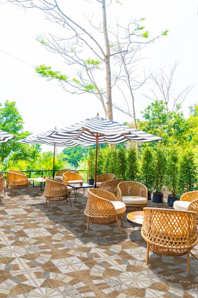
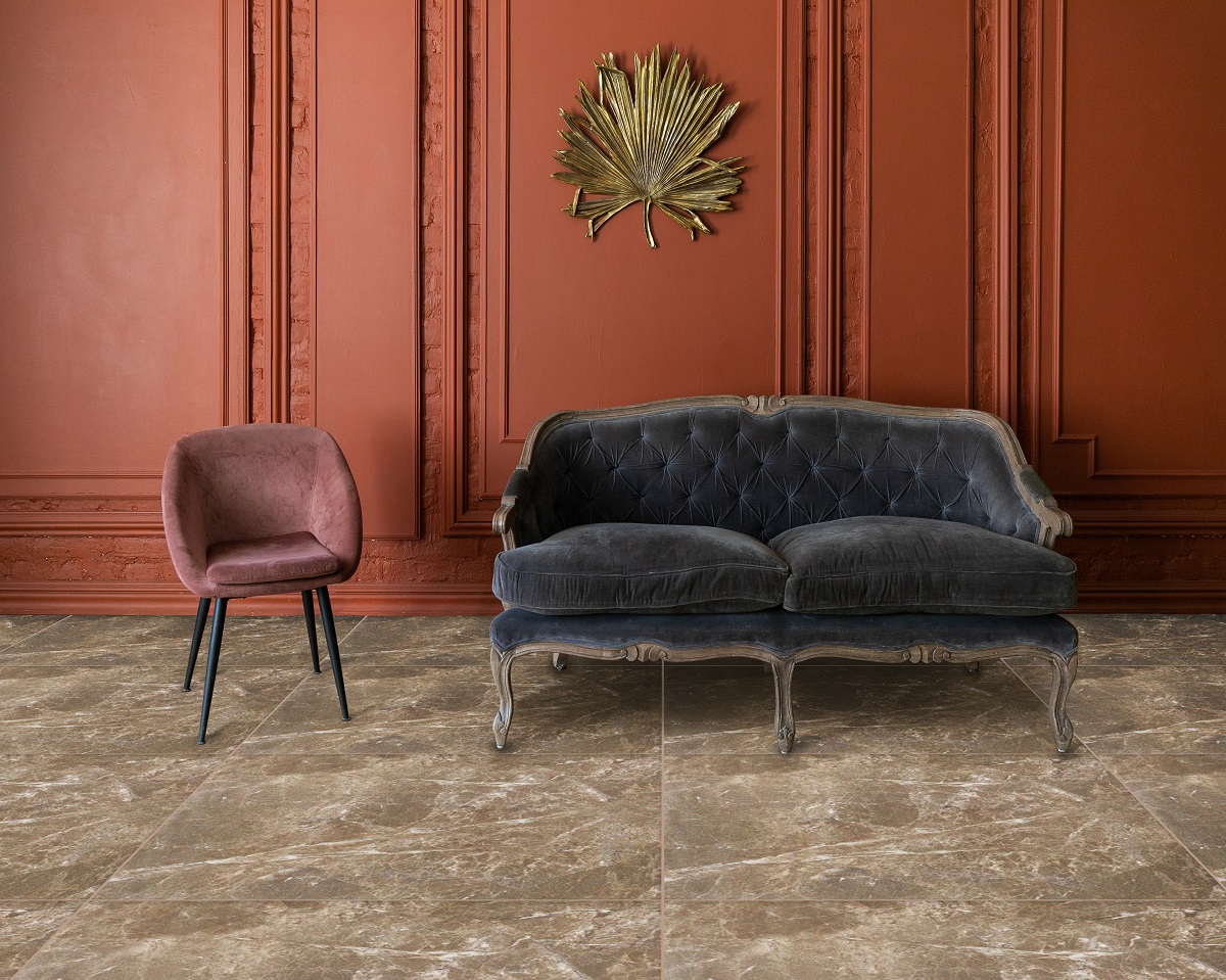
The color brown can also add another rustic layer to your outdoor areas. Black or gray tones might not necessarily be your cup of tea, so the brownstone I-3465 presents a welcome departure from most of the tile designs that you’ve encountered on the list so far.

If you’re overhauling your outdoors, you just simply want a tile that can bring all the elements together. The versatility of the I-3465 allows you to pair it with almost any kind of outdoor installation project that you may have in mind.

For example, you can stay cool in your outdoors even during the summer by adding a makeshift hammock with a light-colored fabric that can go well with the tile design. If you’re planning on incorporating Mediterranean styles, then this tile is also a great choice. Try incorporating exposed wood beam structures with climbing vines to create that natural outdoor Mediterranean vibe.


Key Takeaway

Floor Center has just the right tiles for your outdoor areas. A design tip that you should always remember is that your walls, flooring, and arrangement can make all the difference when it comes to cultivating your dream outdoor setup. The perfect set of tiles and outdoor accents help you achieve so much in creating beautiful exterior spaces.

Want to check out other available tiles by Floor Center? Click here to view more!

We’re also on Viber! Be the first to know the latest tile tips, trends, and promos! Join our FC Tile Viber Community.

5 Wall Tiles to Brighten Up Your Home

[60x60] EG20

What are some wall tiles that can brighten up your home?

  1. Mosaic
  2. Concrete-look
  3. Light wood
  4. Pebble patterned
  5. Marble-look


There’s never an inopportune time to transform the appearance of your walls. Sometimes, you just need a fresh new set of wall tiles for your home. You’ve probably done all kinds of home renovation ideas, but you just can’t simply get the design right. No amount of paint coating change, furniture arrangement, or lighting fixture installation can achieve the allure of vibrant spaces. But did you know that a simple wall tile can already do so many wonders? Featuring a mix of bright colors, muted shades, stone-looks, and rustic designs, these tiles might just be the missing piece for a beautiful dwelling space.


Mosaic Pattern

[30x30] W-02

 [30×30] W-02

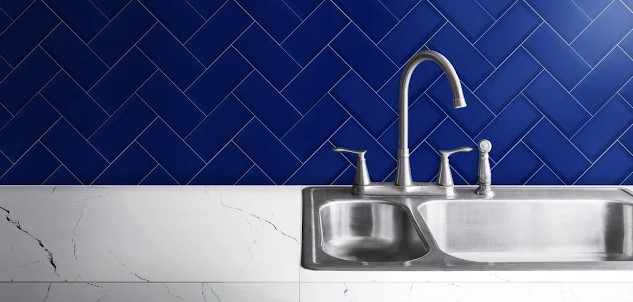
Based on one simple glance, the mosaic-patterned [30×30] W-02 has all the makings of the perfect kitchen wall tile. The cool color combination of modern grey, light, sky blue, and white are unmistakably reminiscent of refreshing splashes of water after a tiring cooking session.

If you’re not necessarily a fan of mosaic patterns, then this is the tile that can change your mind. The design is just so versatile to work with — it can complement various colors like black, wood-color, white, or any other shade of your preference. Have this tile as part of your mini-backsplash, or for your kitchen walls. Your kitchen’s contemporary fixtures will blend right in.


Concrete-Look

[30x60] I02-T

 [30×60] I02-T

This design can only be attributed to the reliable craftsmanship of Floor Center tile designers. You certainly won’t find this ideal design anywhere else in your ventures — and that’s exactly what the [30×60] I02-T does. It functions as a sleek, universal bathroom tile that provides you with a versatile design you’ll definitely want to try out.

Concrete-look tile designs offer an industrial touch that can fit every bathroom. Its modern allure creates warm and relaxing tones that are welcome to the eyes and perfect for exuding tranquility in your space.


Light Wood Patterned

Bedroom with corkboard

 [30×90] G2C-14MEA

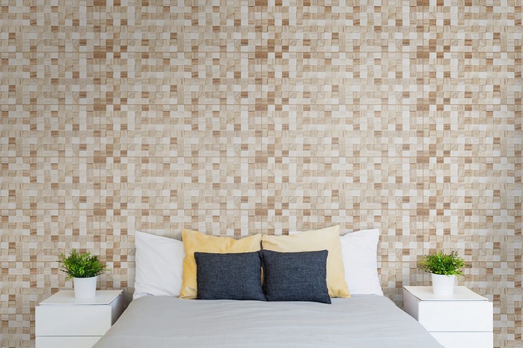
 Anyone who’s ever been to a luxury suite understands the time and effort it takes to create a beautiful interior space. Popular tile designs of patterned wood works are what you might just find in these kinds of spaces. The appeal behind wood-patterned tiles is the sheer aesthetically-appealing look that they exude. If you want to achieve this vibe for your house, then the [30×90] G2C-14MEA is just the tile you’re looking for.

This light wood-look tile can very give your bedroom a down-to-earth outdoor appeal. As this design takes inspiration from the ever-changing yet always beautiful nature, so can your walls. Wash these tiles over with the bright, yet unassuming glow created by warm light, or natural lighting from your windows.


Pebble Patterned

empty chair in restaurant

 [29.2×59.2] H-3B59913

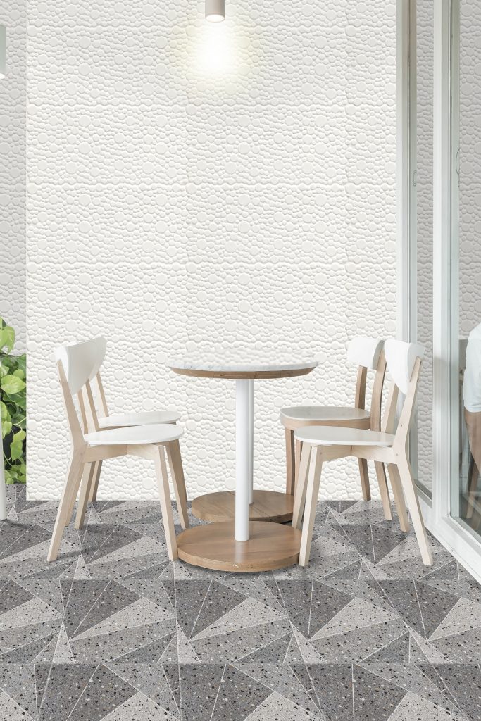
Oftentimes, you just need something simple to create awe-inspiring wall spaces for your home. Instead of patterned designs or intricate looks, you might turn to basic yet exquisite charm. With its simple matte white pebble design, the [29.2×59.2] H-3B59913 is the trusty design partner that can make this happen for you.

This pearl white colored tile is best for your patio and outdoor areas. Have this tile as part of your standalone wall design, or combine it with other clean, modern-look tiles to achieve a contemporary look for your own patio area.


Marble-Look

[30x90] Q83-001MGA + [30x90] Q83-001PGA

 [30×90] Q83-001MGA + [30×90] Q83-001PGA

There is just so much to admire from Greek architecture. The great artists of this time have produced marvelous sculptures like the Parthenon and Venus de Milo that are still admired to this day. For all that ancient Greek artistry has to offer, the Combination of [30×90] Q83-001MGA + [30×90] Q83-001PGA are certainly your gateway to making this type of architecture a part of your home.

This tile combination is both from the Muse Collection which has a smooth matte finish, making it a lovely addition to your walls. More than that, however, the simple, marbled look will definitely take you back to the rich Mediterranean microcosm. Make this tile a part of your living room design to add a splash of exquisiteness to your environment.


Key Takeaway

Floor Center has just the right wall tiles for your home. If you haven’t gotten around to it in the past, this is the opportunity for you to conduct a much-needed wall space redesign. From simple black-colored tiles and mosaic patterns to marble ivory looks, the tiles on this list are to die for.

Looking for something else? Click here to check out all other available tile designs!

We’re also on Viber! Be the first to know the latest tile tips, trends, and promos! Join our FC Tile Viber Community.

Transform Your Post COVID-19 Dining Rooms with These Tile Designs

[60x60] 6187P (1)

What are the best tile designs for your post COVID-19 dining room?

  1. Light blue
  2. Modern gray
  3. Going neutral
  4. Dark marble-look


There’s never a wrong time to think about undergoing a much-needed home remodeling for your dining room. Maybe you think that the floor, walls, and furniture just don’t do it anymore. You may be putting off any renovations because of the pandemic, but there is never an inopportune time to think about tile designs for your post COVID-19 dining rooms. A new and refreshed look is definitely long overdue for your possibly outdated dining room appearance. Make the decision to transform it by creating a brighter, sleek, and vibrant look with these tile designs.


Light blue with CL12

[60x60] CL12 [10X20] 12GBC1

 [60×60] CL12

If you’re dreaming of a light and calming vibe for your dining space, then the [60×60] CL12 tile is the right pick for you. At first glance, it may seem too bright for a high foot traffic area — you wouldn’t think about applying such light-colors to this part of your home. But this design might just be the missing piece for your dining room. This tile is actually in rustic surface which makes it easier to clean and maintain.


Modern gray with 6196

[60x60] 6196 and [30x30] Y1_

[60×60] 6196

Who says modern gray tiles can’t be fit for a dining room? Certainly not the [60×60] 6196. Maybe this is just the thing you need in order to add a touch of industrial look to your space.

This modern gray tile has been tailor-fit to make a great addition to your dining space. Streaks and splashes of naturally-patterned white lines give the tile a look that can fit any type of modern dining space. You wouldn’t find a difficult time trying to match the predominantly grey-colored flooring with your dining room because of this highly-versatile color.


Going neutral with V-K

[60X60] V-K

 [60×60] V-K

 Ever wanted to pull of that stunningly minimalist interior style but don’t know where to start? Fortunately for you, achieving an authentic Scandinavian look is as simple as choosing the perfect tile for your dining room. With the clean lines and polished texture of [60×60] V-K, you can never go wrong.

This neutral colored tile is highly reminiscent of modern Scandinavian kitchen styles that you may have encountered in your interior design endeavors. Unlike many designs in the market, this tile doesn’t seem to overwhelm, but rather offers just the right amount of blending for any dining room environment.

Its cream color palette is magnificently easy on the eyes — which is exactly what your dining room floor needs. Pair this tile with light furniture or any subtle wooden accent.


Dark marble-look with Polisa

[30x90] G2C-25NPEA 1

 [30×90] G2C-25NPEA

You might have always considered using marble-look floor paneling for your dining room. Marble material, after all, offers a more natural vibe for any type of environment. It can be customized according to preference, or it can also be applied with a shiny polishing look to enhance the appearance. However, wood can be difficult to maintain without the proper techniques. A great alternative would be to go for a marble-look in a porcelain material tiles like the [30×90] G2C-25NPEA.

This tile has all the natural markings of excellent marble-look engineering. Each tile has been precisely measured, ensuring both a natural yet neat look that has eluded marble-look interior designs.

With the dark design, this rustic surface tile is best paired with any light-colored dining room furniture. Mix and match different styles like white or light brown dining tables.


Key Takeaway

These tile designs for your post COVID-19 dining rooms are just some of the best decisions you can make for your interiors. Take the time you spend in quarantine to think about how you can improve this part of your home.

Maybe it’s time to change the styles of your floors and walls. If your current design is getting bleaker and bleaker as every single day passes, then you may need to enlist the help of the right dining room tile designs. From dark glossy tiles to Grecian-style looks, these tiles should definitely be on your list. Click here for more design tips with Floor Center!

We’re also on Viber! Be the first to know the latest tile tips, trends, and promos! Join our FC Tile Viber Community.

4 Effective Ways to Use Neutral Colors for Your Space

4 Effective Ways to Use Neutral Colors for Your Space

What are the different ways to use neutral colors for your space?

  1. Use wood furniture
  2. Style with neutral backgrounds
  3. Focus on your layers and fixtures
  4. Keep it simple


Looking to start a new home redesign? This may be the perfect opportunity for you to play around with neutral styles. But what are neutral colors, exactly? Well, the word “neutral” is simply defined as bereft or lacking in color. Though this style may sound unassuming, there are many different ways to use neutral colors for your space that can create depth and harmony in any interior. Continue reading to find out how!


Use wood furniture

[60X60] V-K

[60X60] V-K

One of the best ways to get beautiful neutral looks for your space is by adding a set of wooden furniture. If you want to achieve a more contemporary design, you may want to check out different types of wooden furniture that you can incorporate with neutral looks or finishes.

For your dining room, try to find contemporary wood furniture that is lighter in tone. Style with popular cross-back chairs or wooden-legged Eiffel-style chairs with plastic seating that matches the tone of your space. You could also add any wooden accent of your choice.

Of course, what would neutral be without changing the look of your floors and walls? Complete this look by painting your dining room background with a neutral blue background. As for your floors, the cream 60×60 V-K tile from Floor Center will work perfectly well with your desired neutral interior.


Style with neutral backgrounds

[60x60] M116 + [30x30] I-3455-6

[60×60] M116 + [30×30] I-3455-6

At first, styling with neutral backgrounds can be tricky, if you’re not necessarily the kind of person who likes sticking in single-toned and monochrome colors. Fortunately, it doesn’t have to be this way. Using the right neutral-colored tile combination can bring out the best in your interiors.

Floor Center’s 30×30 tiles are the perfect fit for your living room walls. The I-3456-6 in particular boasts a light, yet rich beige color that is distinctively neutral. Have it installed as part of an alternating pattern with the I-3455-6 light brown tile. Make your living room feel like home by adding accents like contemporary, wooden, wall-mounted shelves for storage, and neutral-colored sectional sofas for the seating.


Focus on your layers and fixtures

[60x60] M91-4

[60×60] M91-4

Layering is one of the best ways to work with neutral colors. Layering can be done not only in your bedroom, but also in your dining rooms, kitchen spaces, living rooms, or even recreational rooms.

Aside from adding a bit of texture, layers can provide your room with a touch of liveliness and space. The more neutral elements you add to your bedroom, the more it will feel like you actually did a complete redesign and not just on your floors or walls.

Try working around with the same neutral color palette. For example, if you want to use cool, blue colors, incorporate it into your bedsheets, pillowcases, bedroom curtains, or wall paint. Mix up with colors like light steel blue, light cobalt blue, or dark pastel blue.

The right decorative fixtures can easily make your layers pop out. If you’ve ever done any home remodeling in the past, then you might have come across situations where your lighting or furniture simply doesn’t go together. With neutral-styled contemporary spaces, contemporary fixtures should be your go-to — the same goes with traditional fixtures. Don’t be afraid to decorate your space as you see fit, or else you’ll run the risk of bland looks that just seem empty.


Keep it simple

[60x60] V-D

[60×60] V-D

You certainly don’t want to overdo with neutral colors, which is why it’s important for you to keep in mind that simplicity is always key. This doesn’t mean that you won’t add any accents or elements of neutral interiors — this just simply means that you work within the neutral style to achieve that simple, yet sophisticated appeal.

With simple styles, you can still make your space more ergonomic. Try steering clear of haphazardly adding decorations and furniture here and there that don’t really match neutral styles. For example, for neutral tiled floors like the 60×60 M91-4, think of good color complements like darker neutral tones or shades.

On the other hand,  more vibrant shades of tiles like the V-D can fit any modern home that makes use of metal furnishings and decorations. If using this for your kitchen, a fresh set of steel appliances can already enhance the space.


Key Takeaway

Neutral colors appear to be bereft of color, but this is exactly what brings out their appeal. Many modern homes have been able to style with neutral looks through their furniture, tiles, decorations, and other accents.

In this article, you’ve discovered the many ways to use neutral colors for your space. When it comes to any home remodeling, it’s important that you exercise your creativity. Soon enough, you can have a neutral-inspired room that is fit to grace the covers of home design magazines. Click here to check out more tips with Floor Center and together, let’s Elevate Your Life’s Tile!

We’re also on Viber! Be the first to know the latest tile tips, trends, and promos! Join our FC Tile Viber Community.

5 Kitchen Countertop Ideas You Can Try at Home

Bright And Clean Kitchen With White Cabinets, Close Up. Cutting

What are some kitchen countertop ideas that you can try at home?

  1. Natural stone-look LF6708
  2. Black and gold LF6810
  3. Veiny-black style Y1GL25GE
  4. White-stone look Y1GL17GE
  5. Polished black LF6833


Do you find your kitchen old and shabby? Maybe it’s due for a renovation. You can come up with a wide range of designs for your countertops to breathe some life into the space. Fortunately for you, anyone can brighten up their space. There’s no wrong time to change how your kitchen looks. If you’re looking for the best home kitchen countertop ideas then you need not look further, because Floor Center’s tiles have got you covered. Check out some of the tiles that you may love.


Natural stone-look LF6708

Natural Stone

At some point in your life, you’ll come across kitchen styles that are able to tread the fine balance between natural and contemporary looks. Well now’s your chance to achieve that! The natural stone look of the LF6708 offers a sleek finish for your home without breaking the bank.

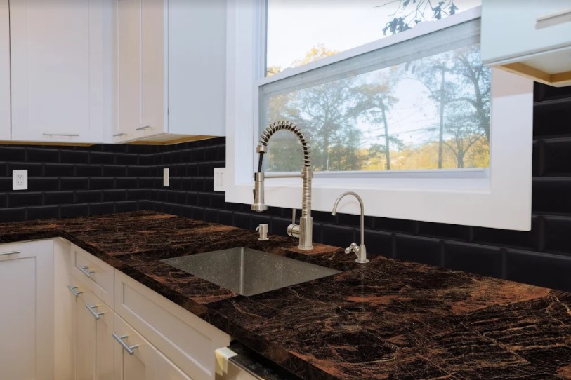
The LF6708 appears to have a fun, galactic design that you’ll surely love. Its beauty is enhanced by the lovely streaks of rose gold that surround the tile’s jet black color. Though the two colors belong to opposite sides of the design spectrum, what you’ll get is a perfectly-complemented look that simply works.

If you want to complete the look add a black subway tile backsplash with the 07NDH1. This kitchen countertop tile is also best paired with white Shaker-style cabinets and drawers that can give your kitchen a more classic, yet contemporary feel. Finish off your space by adding a much-needed undermount stainless steel sink and adorn the countertop with a fresh new set of stainless steel appliances.


Black and gold LF6810

Bright And Clean Kitchen With White Cabinets, Close Up. Cutting

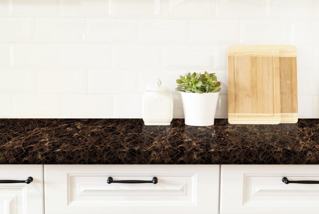
If you’re not really a fan of rose gold-colored detailing, then you may want to take a look at the LF6810. Much like the first tile on the list, this 60×60 tile would be the perfect addition to a newly-transformed kitchen space. This tile not only scores high on the design but also in functionality. It’s stain-resistant, meaning that any spill or dirt on the tile can easily be cleaned in just a few steps.

With its gold streaks, this countertop tile offers a slightly more yellow metallic look. For lighting fixtures, recessed kitchen lighting goes well with these countertops. Warm white light can easily provide a lovely shimmer as it bounces on the tile detailing.

This natural stone-look tile is best furnished with flat-paneled cabinet doors. If you want to add a backsplash, choose a white subway tile like the 12GAW1 for a neat appearance.


Veiny-black style Y1GL25GE

Detail of sink in a modern kitchen

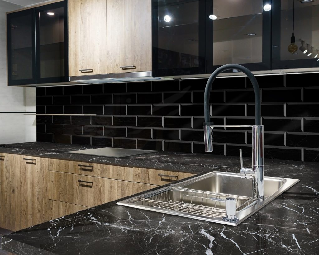
Basic designs don’t necessarily mean bland looks for your kitchen. Instead, their appearance can actually create a simplistic environment with the right styling. For a minimalist kitchen, the Y1GL25GE will do the job for you.

Unlike the first two countertop tiles on the list, the beauty of this black-veined tile stands out better under minimal or low-lighting conditions. When you’re choosing kitchen furnishing such as cabinets, lighting, sinks, it’s best to go for unassuming colors and styles that can still pull-off a rustic, yet modern look.

You may choose louvered wooden cabinets in darker shades. For the lighting, you can play around with the typical cabinet lighting installation, or install a fun spotlight that can enliven the entire space.


White stone-look Y1GL17GE

White stone-look Y1GL17GE

A departure from the black stone-look tiles that you have encountered in this article, the white stone-look Y1GL17GE makes for a lovely alternative. White-stoned, with minimal black streaks, this is the tile that can bring out the creativity in you.

Light colors like white are usually enhanced by more colorful counterparts, like black, blue, aqua green, or their pastel variations — some colors you might consider if you’re planning on adding a backsplash. The best thing about this tile is that you can play around with your choice of kitchen styles and designs because it’s just so easy to work with. Let’s say for example that you want to achieve a by-the-window kitchen counter layout — you can opt for popular styles like casement windows. Or, you could also go for the unconventional window-types like sliding or garden windows.


Polished black LF6833

[60x60] LF6833 + [20x100] AI212

The LF6833 polished black tile by Floor Center is similar to the white stone, in terms of the level of detailing, but the difference is that the colors are reversed. This doesn’t mean that you can’t put on the same level of creativity in designing your kitchen space around this countertop tile — but you’ll certainly do well with a few design tips and tricks here and there.

For kitchen furnishings such as cabinets, tables, and chairs, darker black varieties can easily bring out the sleekness of the entire space. Louvered cabinets that are in dark grey color are preferred not only because of their design — the slats present in louvered cabinets offer natural ventilation to create a cooler space despite the dark colors.

As for your lighting, on the other hand, a set of contemporary pendant light fixtures would do well to embrace the look of the countertops.


Key Takeaway

For your home kitchen countertop ideas, Floor Center’s natural-look tiles paired with their subway tiles are always the best choices. The tiles on this list are so versatile — you won’t have difficulty in finding the right countertop tile that works for you! With these polished and glossy-surface tiles, you’ll soon be able to create a fully-transformed, eye-catching look.

Want to learn how to style your kitchens? Floor Center has just the tiles you need. Get in touch with us here!

We’re also on Viber! Be the first to know the latest tile tips, trends, and promos! Join our FC Tile Viber Community.

Tiles Perfect for Outdoor Spaces

Tiles Perfect for Outdoor Spaces

What are the perfect tiles for your outdoor spaces?

  1. Stone-patterned I-3465
  2. Matte 1580P3
  3. Rustic I-3461-6
  4. Rustic dark gray ZX-W6613AGG-HT
  5. Brick-designed P-3614


Any time is always a good time to change up the look of your outdoor space. Or if you don’t have one and are planning to install a veranda, gazebo, or a classic wooden deck for your backyard, then you may want to look into outdoor tiles for this endeavor.

Sometimes, the right outdoor tile can already make the difference between beautiful backyard decks, awe-inspiring veranda installations, and slipshod looks. There are simply not enough words to describe how important tiles are in enhancing the look of any outdoor space. Featuring timeless and contemporary designs, now is your best chance of experiencing the great outdoors with these perfect tiles.


Stone-patterned I-3465

empty outdoor patio table and chair with cushions

[30×30] I-3465

The first tile on this list will certainly cater to anyone wanting to add a layer of texture and pattern for their outdoor spaces. The stone-patterned I-3465 is fit for both outdoor and indoor tilework, allowing for endless possibilities when it comes to versatile designs.

If you have a small garden in your backyard, then the lush greenery would do well to be complemented with this aesthetically-appealing and beautifully-textured tile. Use them as a garden walkway that separates the banal from the extraordinary. Or, you may also have this tile as part of larger-scale outdoor designs of your own choosing — it’s all up to you and your creativity.


Matte 1580P3

Dinner table setting in modern villa terrace

[15×80] 1580P3

Matte tiles also make the best outdoor tiles, but you may want to be more careful, especially when it comes to design. You’d want to incorporate pastel colors, or simply lighter shades of your favorite colors like beige, or dark brown. The matte-styled 1580P3 from Floor Center is your friend when it comes to these designs.

Though the tile appears to be plain at first glance, it’s able to bring a breath of fresh air to your patio. This light brown tile which features minimal linear textures on the bottom would be able to add a charming quality for your patio. Make your potted plants and outdoor lighting stand out with this attractive look.


Rustic I-3461-6

empty chair in restaurant

 [30×30] I-3461-6 and [29.2×59.2] H-3B59913

Rustic is your most trusted best friend when it comes to outdoor looks. You always want to go for natural designs which bring out the best for this kind of space. With the rustic look brought about by the I-3461-6, you’ll be able to experience rustic beauty in all of its glory.

Like most of the tiles already mentioned on this list, this patterned tile’s versatility is unparalleled. They can serve as great additions for balconies or verandas. If you have an overgrown backyard space, this tile can also help bring about a neat appearance. You may also use this tile as a patio walkway or garden entryway.


Rustic dark gray ZX-W6613AGG-HT

Young businessman with skateboard walking in rush

[60×60] ZX-W6613AGG-HT

Nothing says “outdoors” quite like the rustic dark gray ZX-W6613AGG-HT. You’ll be surprised at just how much the material is still able to produce such a magnificent design — this tile is truly able to subvert your expectations. Adopt this sleek look for your patio, porch, gardens, and other high traffic areas!


Brick-designed P-3614

[30x60] P-3614 Render

[30×60] P-3614

The P-3614 is your gateway to the great outdoors. It has all the classic elements of an outdoor tile that brings out the best in any outdoor project that you have in mind. You may find yourself one day looking at your bare garden and wondering how you were able to stand such bare-looking spaces for so long. Fortunately, this tile has all the answers for you.

There is such a thing as achieving a strategically-designed outdoor space without sacrificing on the appearance. For example, a 30×60 cm tile such as this one can easily brighten up the upper portions of outdoor walls.


Key Takeaway

Achieving a breezy, stylish, and rustic outdoor appearance can be made possible with the outdoor tiles mentioned above.

These tiles create versatile looks, allowing you to play around to get the one that best meets your design preferences. From stone-look to matte-black looks, this set of tiles is all you need to have an outdoors that is worthy to grace the front pages of interior design magazines. Click here to explore more products with Floor Center!

We’re also on Viber! Be the first to know the latest tile tips, trends, and promos! Join our  FC Tile Viber Community.

Achieve an Art-Deco Look with These Tile Designs

Minimalistic interior of living apartment room

What tile designs are perfect for an art deco look?

  1. Marble-look
  2. Cement-look
  3. Terrazo designs


Contemporary interior designs seem to be the trend nowadays. Modern residential or even commercial spaces make use of seamless looks with predominantly uniform patterns which are all characteristic of this style trend. It’s probably uncommon to find modern homes that make use of more vibrant and eye-popping visuals due to the demand for more of these minimalist-fusion styles. Styles like art deco have largely gone unnoticed – maybe because of the hesitation and a lack of knowledge on how to achieve this look. However, as long as you have the right tile designs for an art deco look, this elusive style of the early twentieth century will eventually be in your grasp.

The influence of the 1920s on interior design is probably one of the most underrated and overlooked movements, with respect to today’s current design trends. Designs of wildly-shaped geometrical patterns with precise finishes are not everyone’s cup of tea, after all. To dispel popular opinion, this style is actually one of the most versatile styles out there. It can be fused with contemporary, rustic, or even Mediterranean designs to create a modern look that is by all means art deco in nature. Continue reading for these art deco-appropriate tiles which can bring out your artistic expression and flair for interior design.


Marble-look

3d rendering living room sofa background

[60×60] QG26032

In the beginning, the natural finish brought about by marble look tiles may seem to defy all the conventions of an art deco style. The latter has largely focused on vibrant colors and striking shapes and patterns which are reminiscent of North American and European architecture styles in the 1920s.

Despite this, however, marble tiles actually make the perfect complement for any art-deco inspired design. The black marble-inspired design of Floor Center’s 60×60 QG26032 makes the best choice for this endeavor. Natural patterns emulating real marble are simply visually-appealing to anyone who sees it. Art deco is all about achieving the highest level of opulence – this beautifully-designed marble-like tile can easily polish and brighten up the spaces of any living room, bedroom, or dining room.


Cement-look

[60x60] 6186P

[60×60] 6186P

You’re probably wondering why cement-look tiles are part of this list. It’s quite simple, really – the industrial element of these tile designs will easily take anyone back to a time of visually-stunning architectural elements and sheer extravagance.

There is one bit of a challenge when it comes to selecting cement looks for your interior. It’s all about beautifully striking the balance between industrial, and art-deco style. Simply leaning too much into the former may achieve the outcome which is the exact opposite of your desired intent.

The right kind of tile for this job is the 60×60 6186P. A distinctive feature about this tile is that it has been applied with a matte finish, which can offer your interior with an enhanced look of smoothness. These style fusions tread the fine balance of industrial-art deco, resulting in a style which is just what you’re looking for.


Terrazo designs

[60x60] M107-4

[60×60] M107-4

For all this article has written about how art deco has taken inspiration from creative patterns and shapes, it sure does take a while to give you the perfectly-patterned idea to achieve the art deco look. So without further ado, it’s apt that we now look into a stylistically-marble pattern tile – Floor Center’s 60×60 M107-4.

As an art deco tile, this option meets all the basic elements: eye-popping, vibrant, and heavily-patterned. This tile is considerably more playful than the ones you’ve previously encountered in this article as it combines elemental marble looks in the varied colors of black, white, blue, and gray.

This is truly the poster-boy tile for art deco pieces – its vestiges of the early 20th-century architecture will truly take you back to a time of Haute living, fine dining, and fleeting moments of temperance.


Key Takeaway

Art deco is all about opulence and extravagance. You may find yourself second-guessing on incorporating this style because of its many patterns, colorful visuals, and countless shapes.

Luckily for you, you have the freedom to craft your own 1920s style with these tile designs for an art deco look. Click here to check out more design tips with Floor Center!